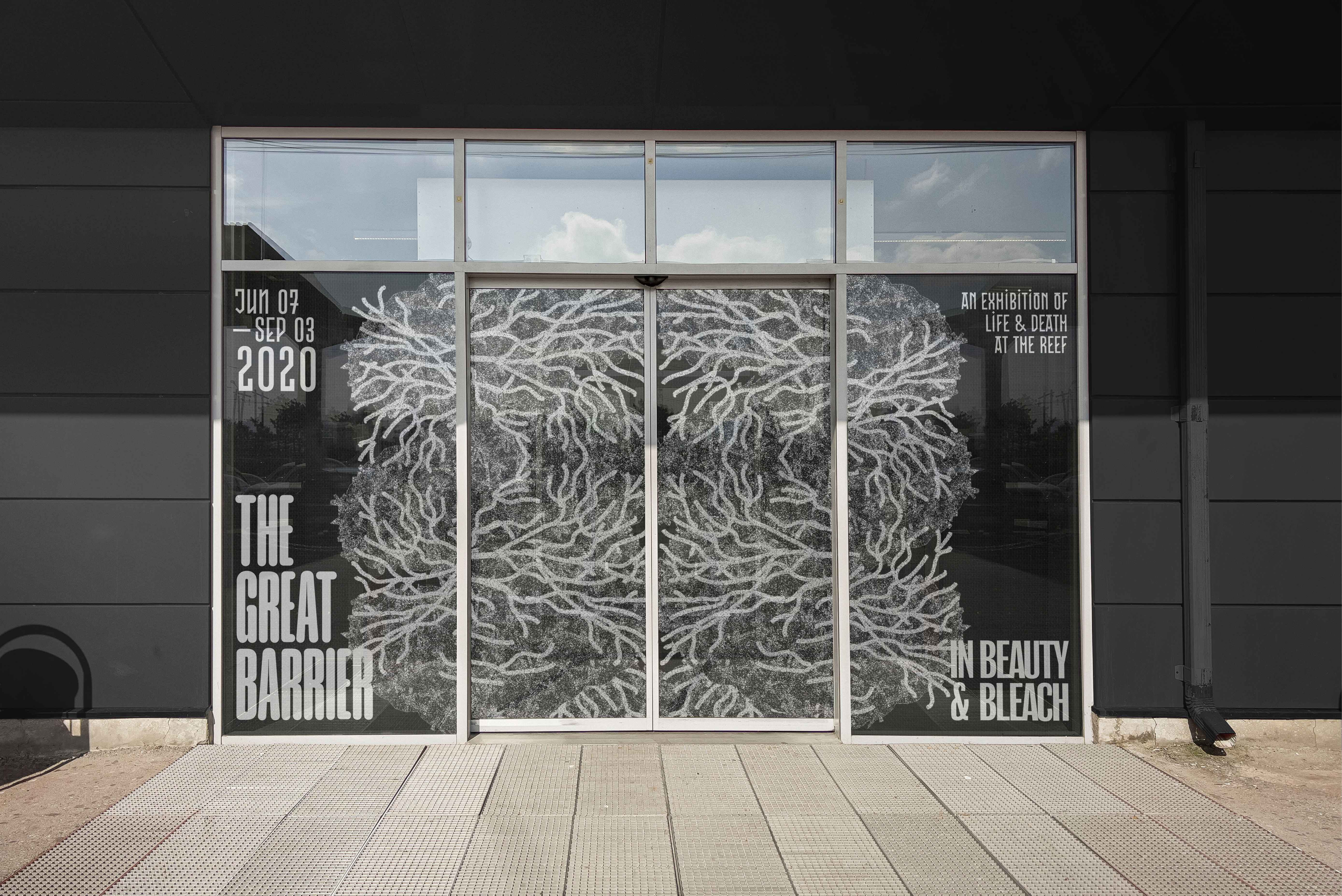
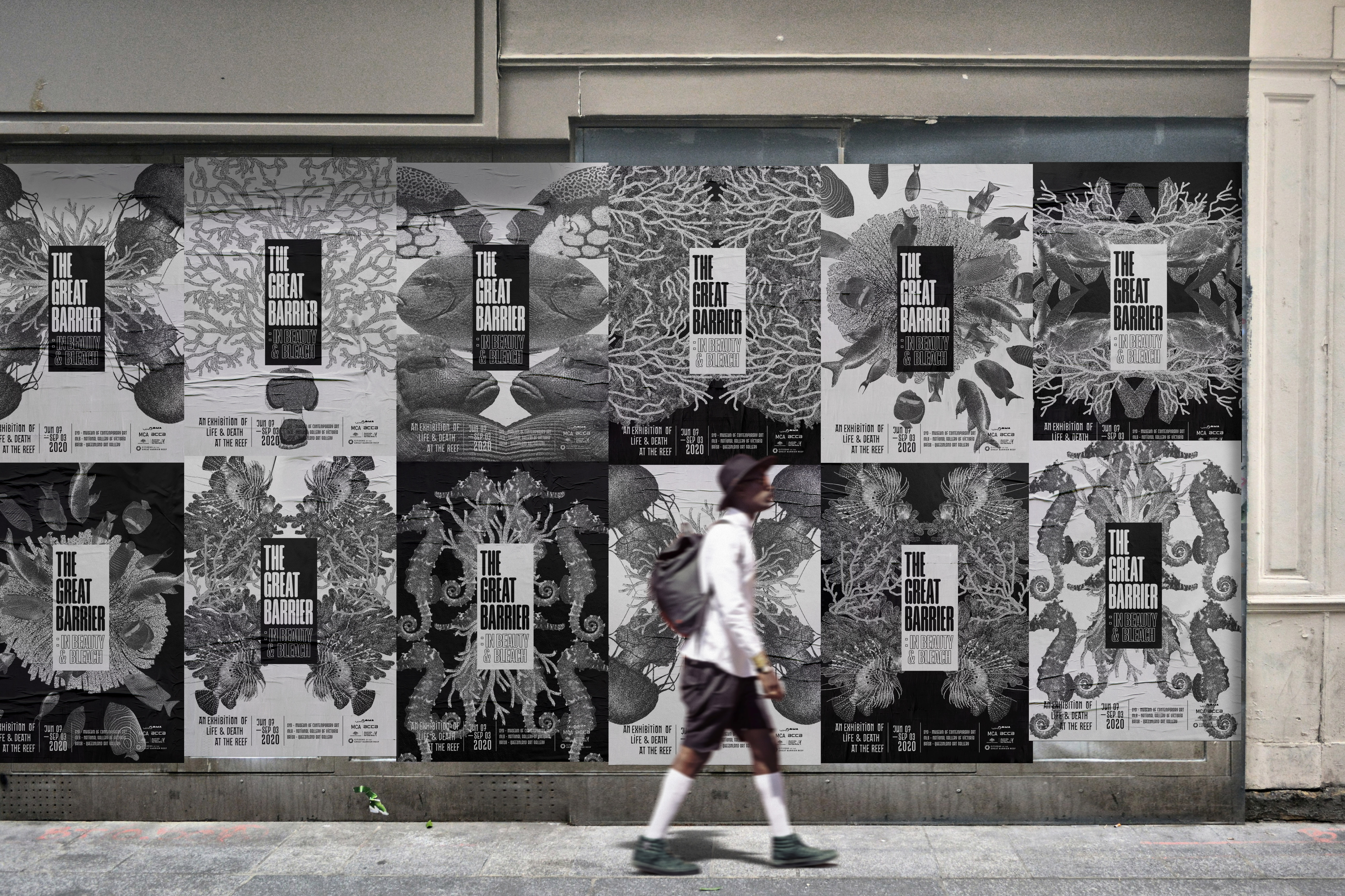
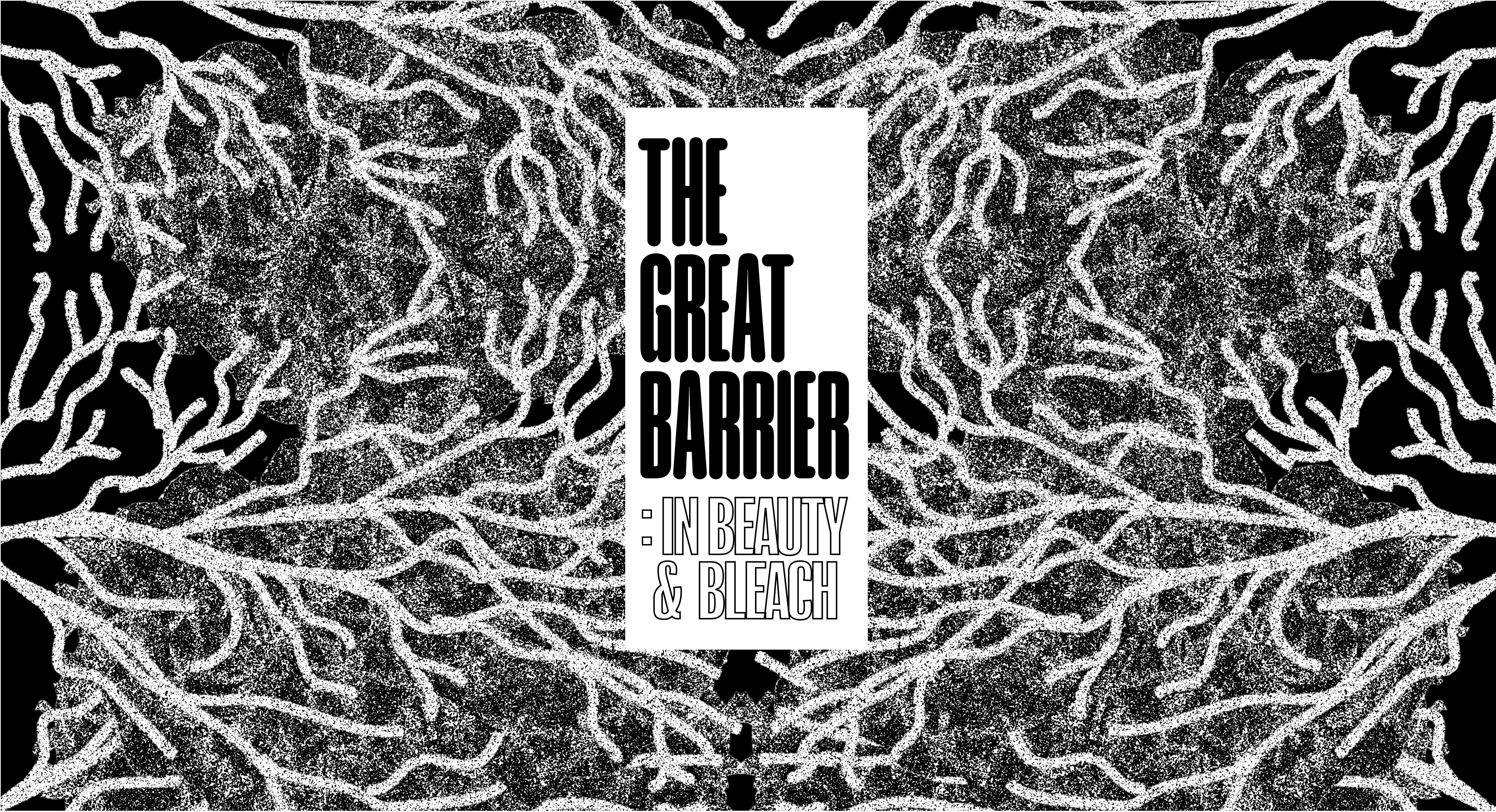
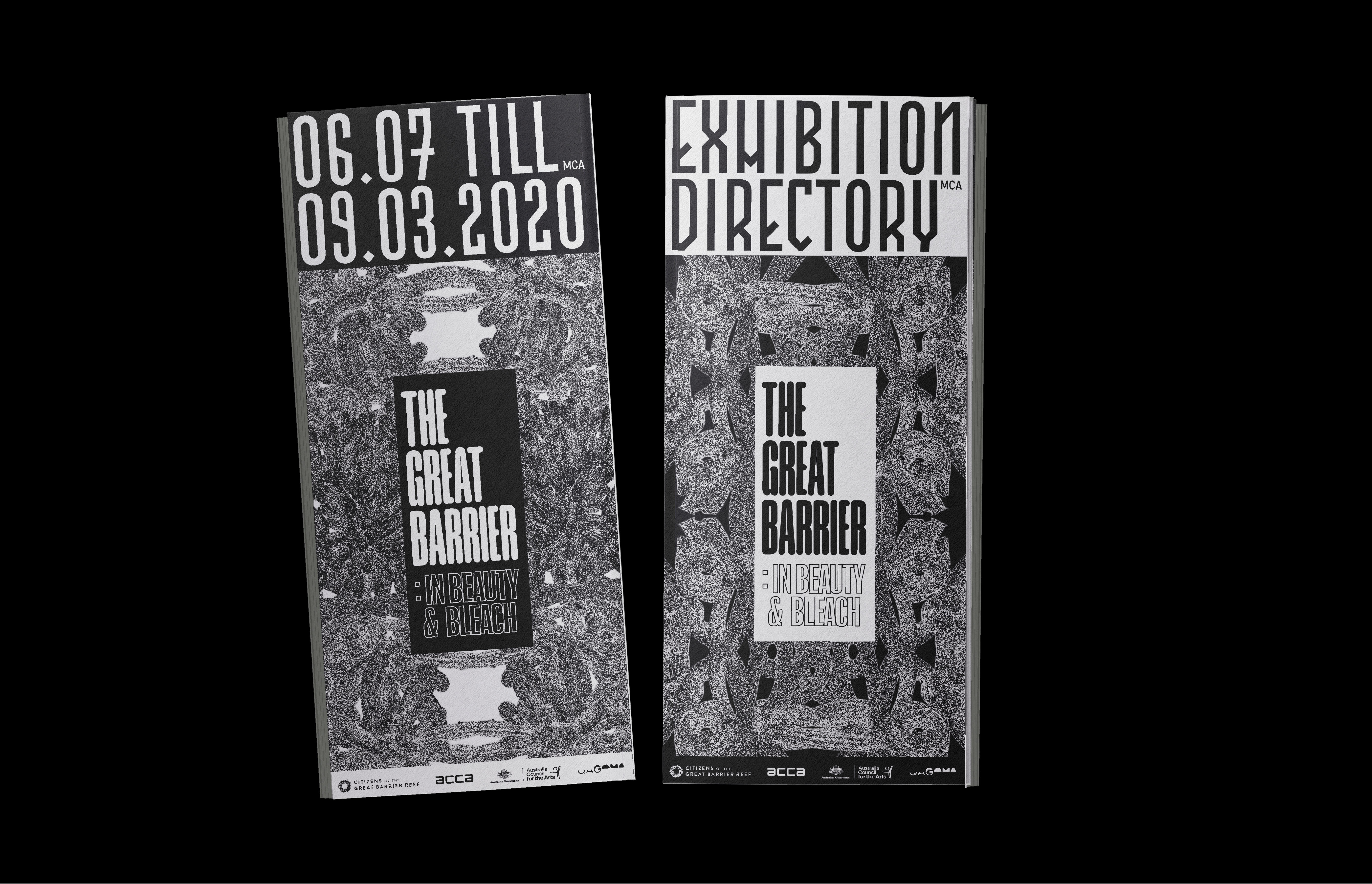
The Great Barrier
Event Identity
Designed a coordinated set of engaging and visually impactful promotional and informational material over an extensive range of screen and print-based media.
Academic project for UNSW Art & Design
Year: 2020 (modified 2023)
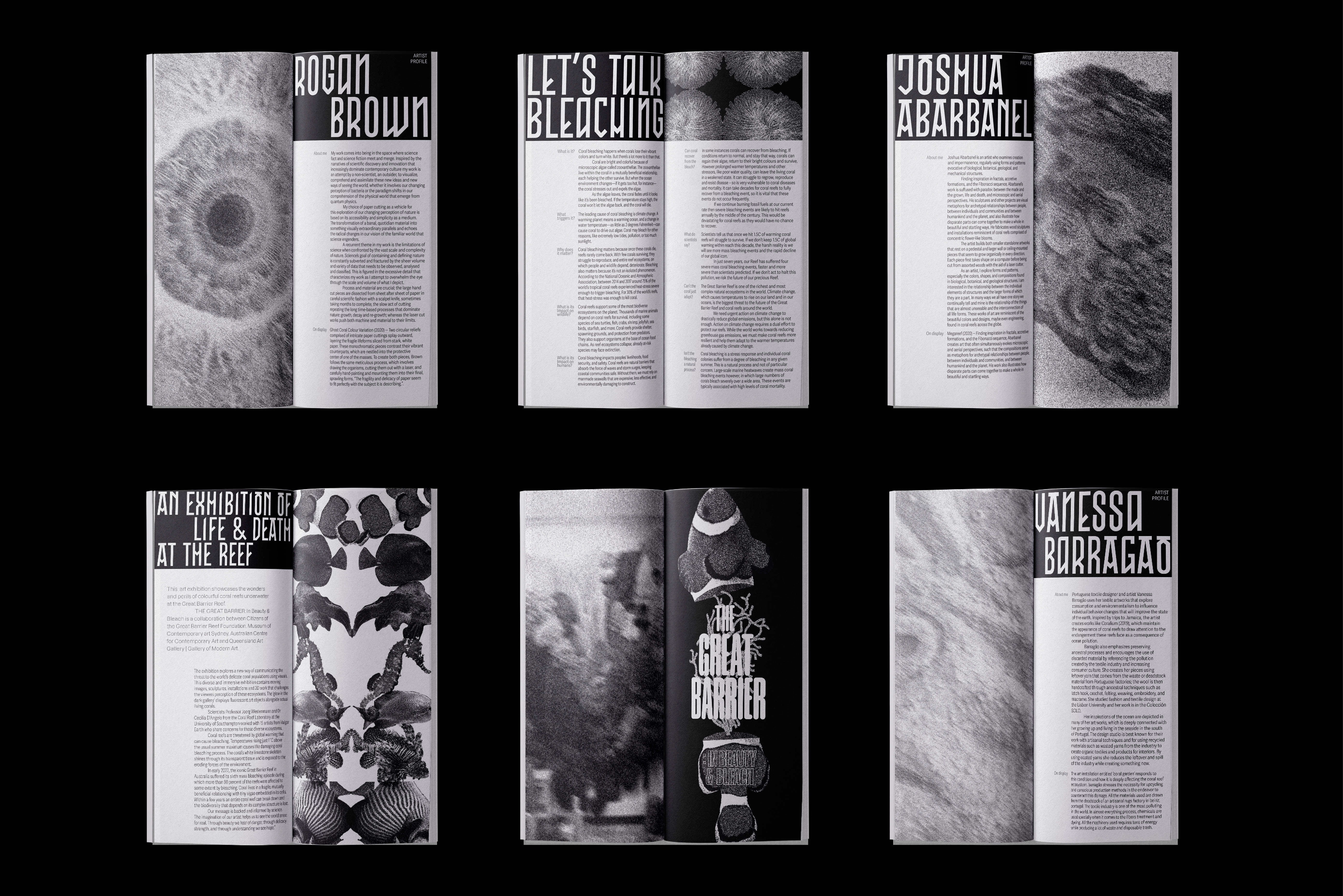
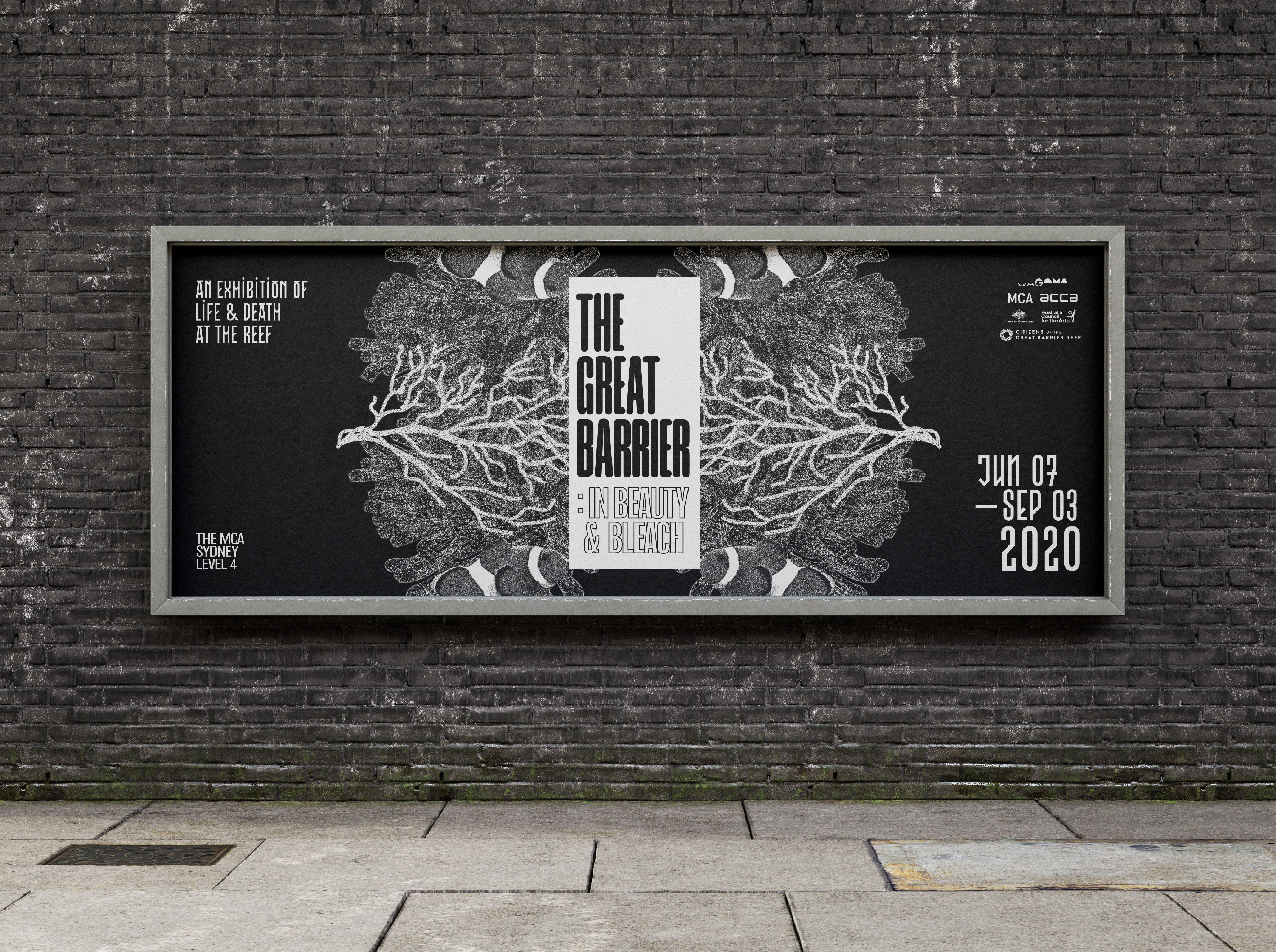
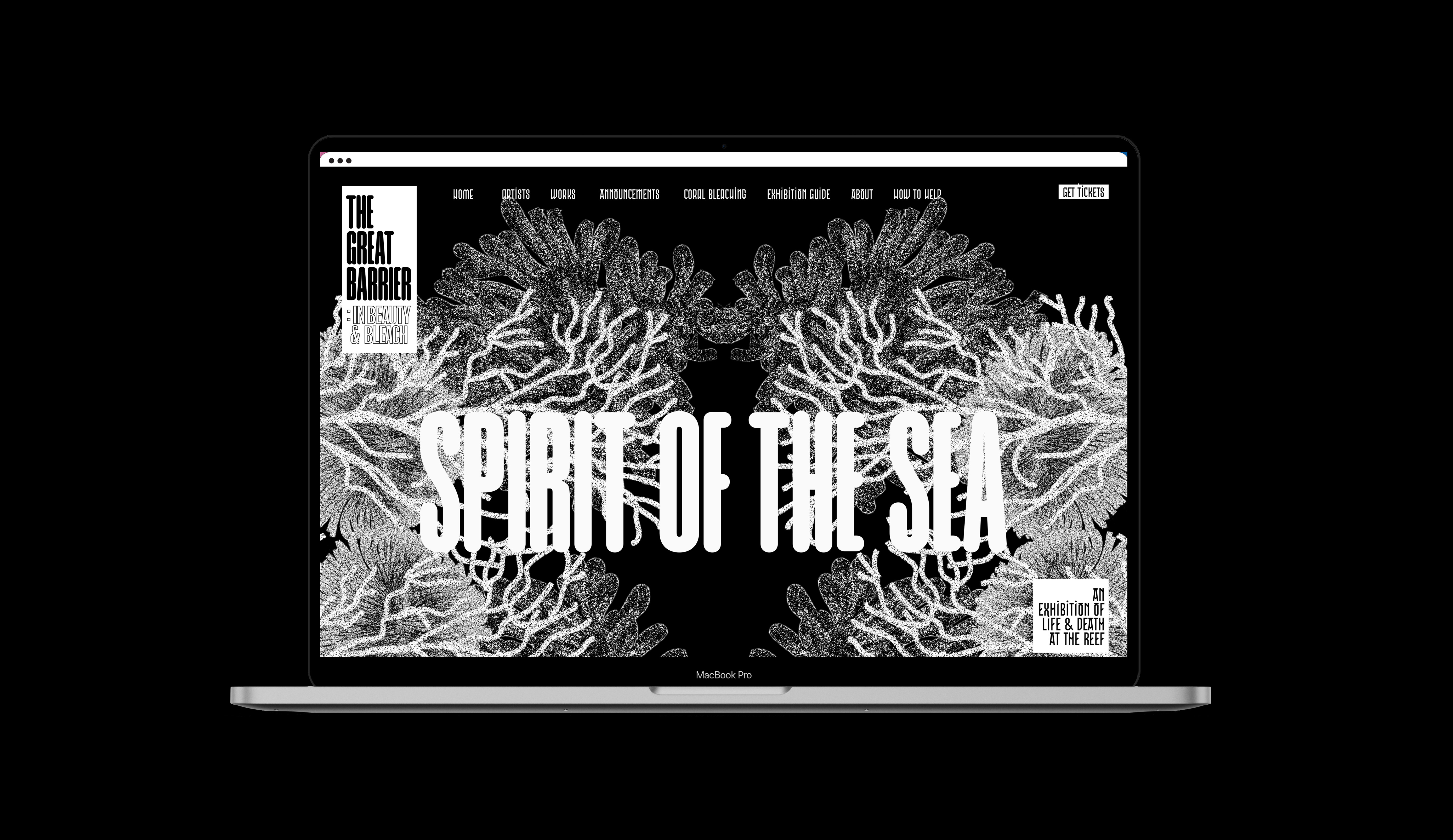
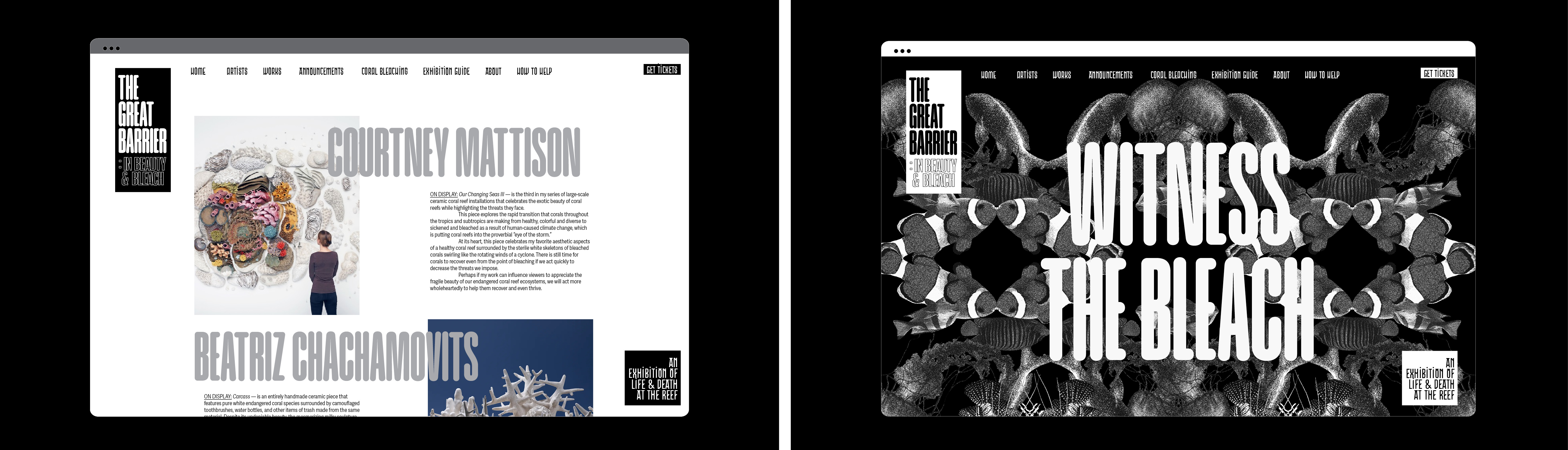
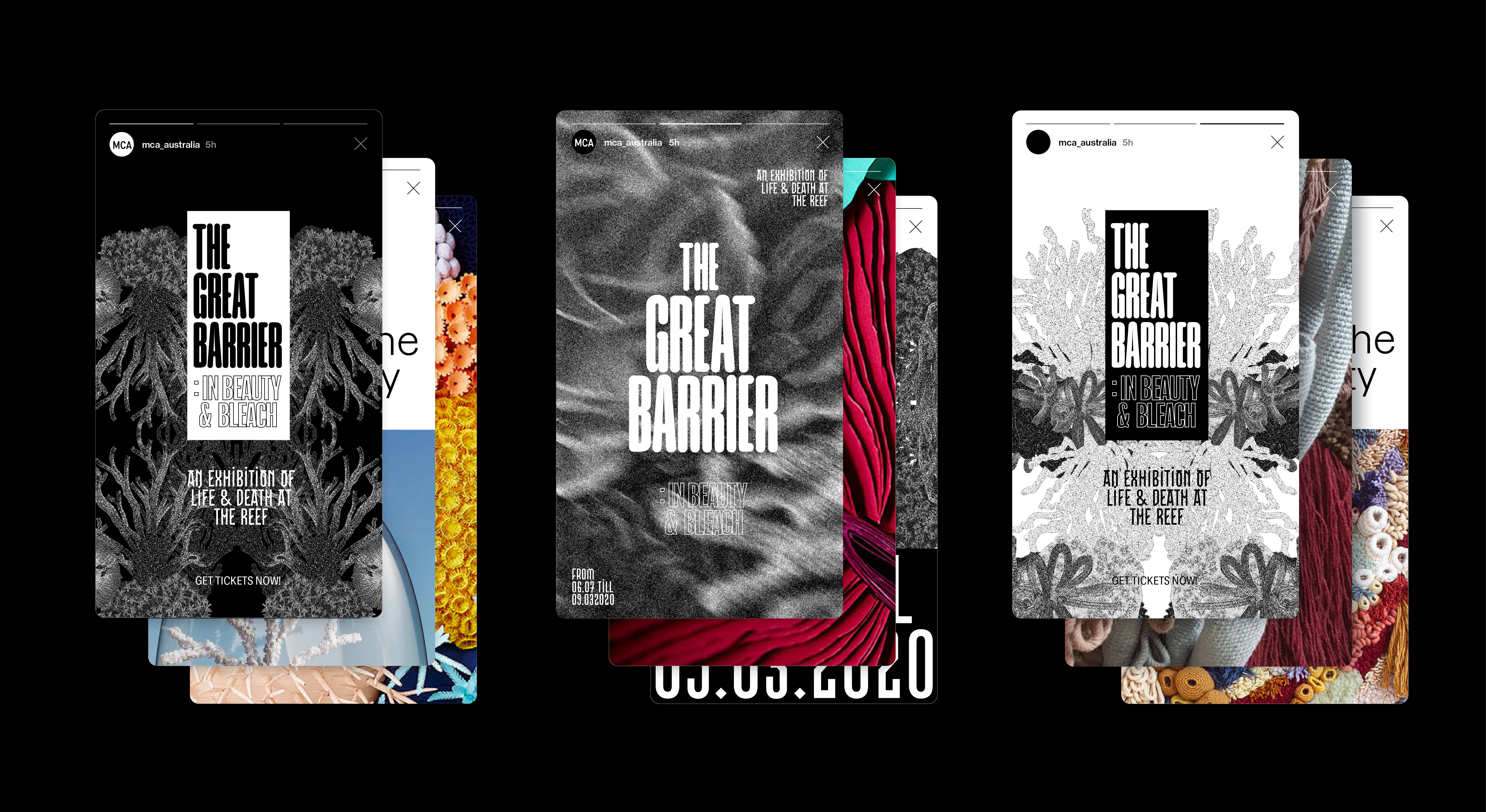
The Great Barrier: In Beauty & Bleach is an exhibition event conceptualised to facilitate interest on the Great Barrier Reef and the consistent global dilemma of coral bleaching. With the main agenda of bringing dialogue about the issues back into our public consciousness.
The event's campaign comprises of design decisions in direct connection to a narrative of the Great Barrier Reef's vibrant and complex life in contrast to its dimished cycle of living in the wake of devastating bleaching as precipitated by climate change.
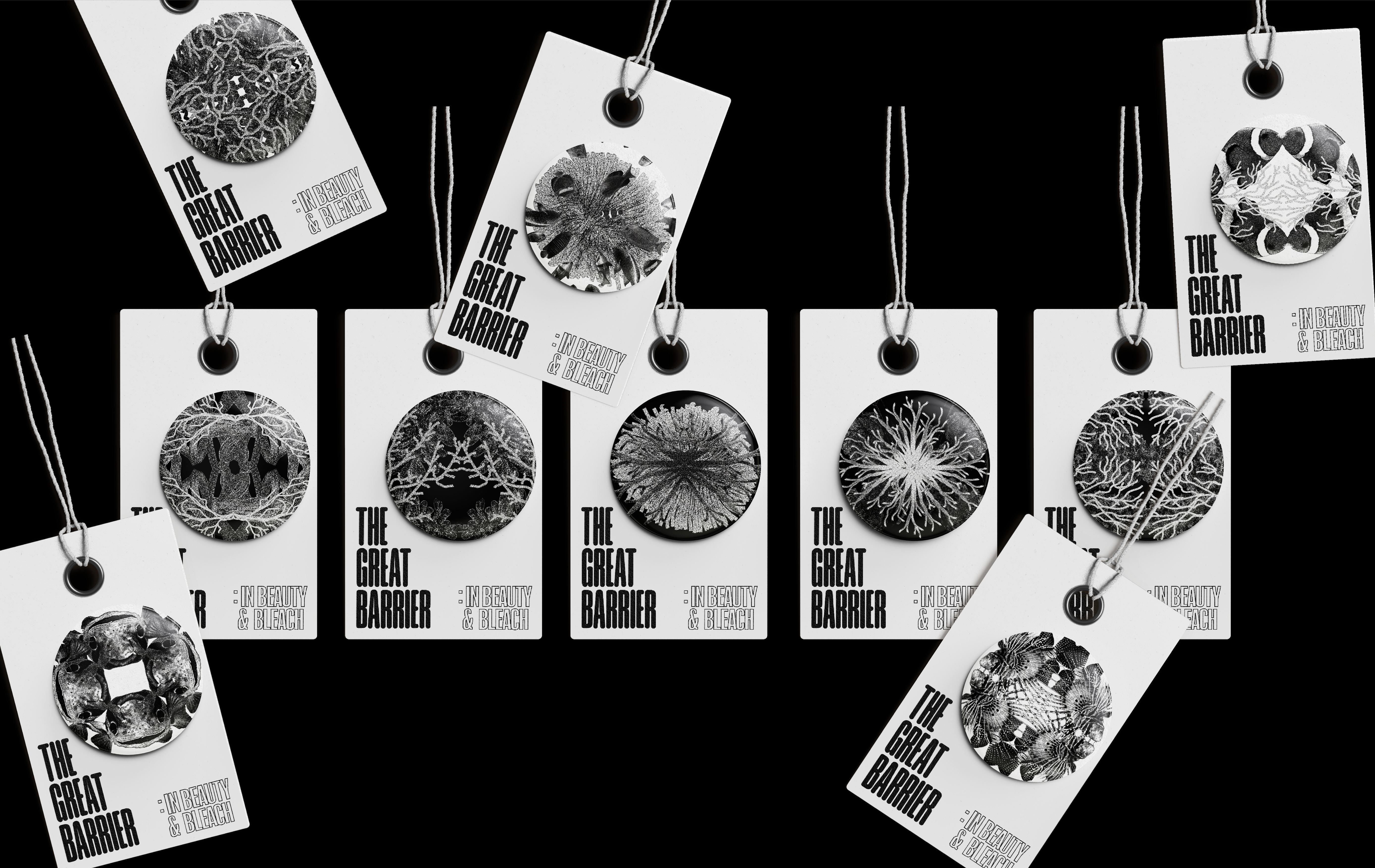
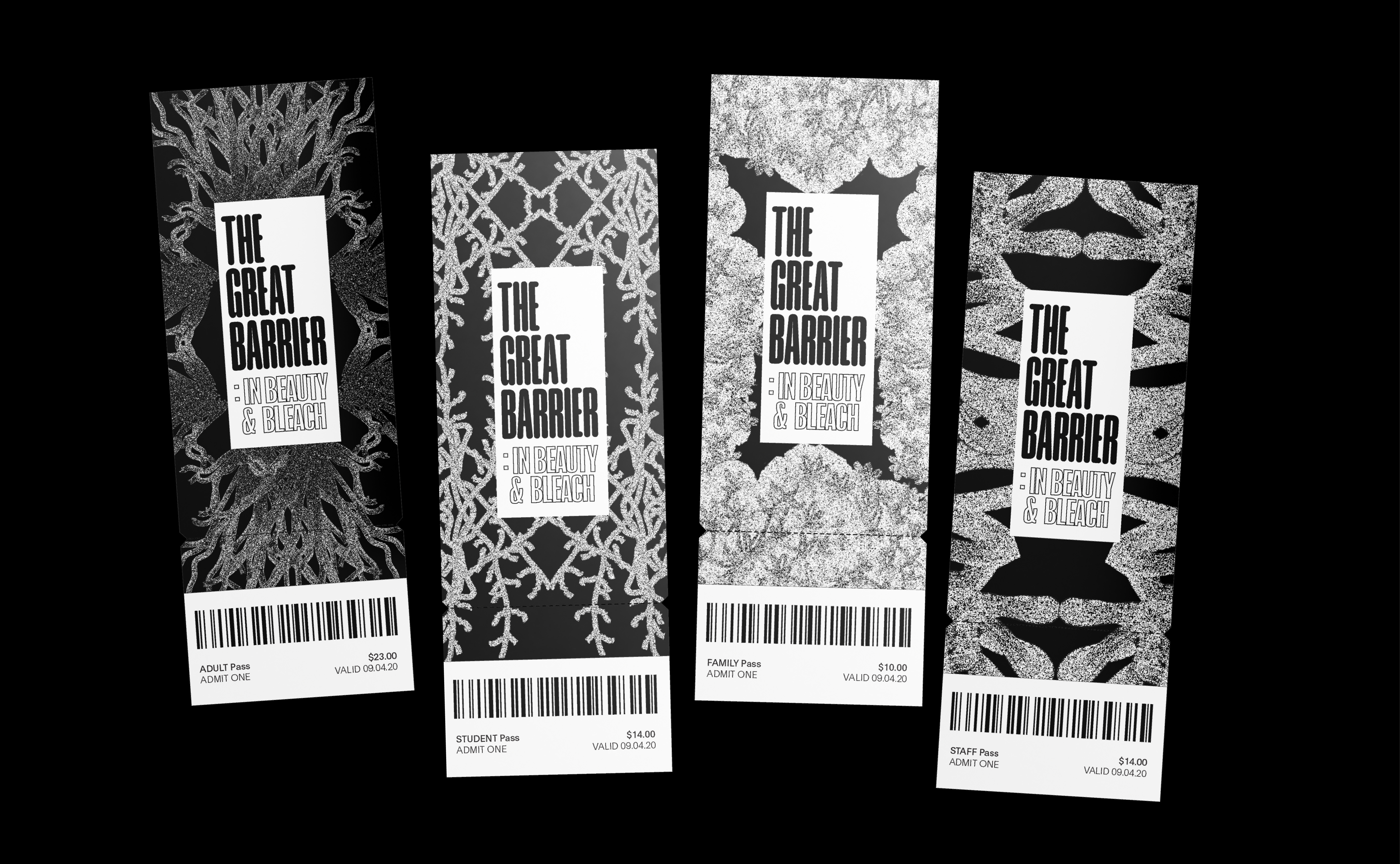
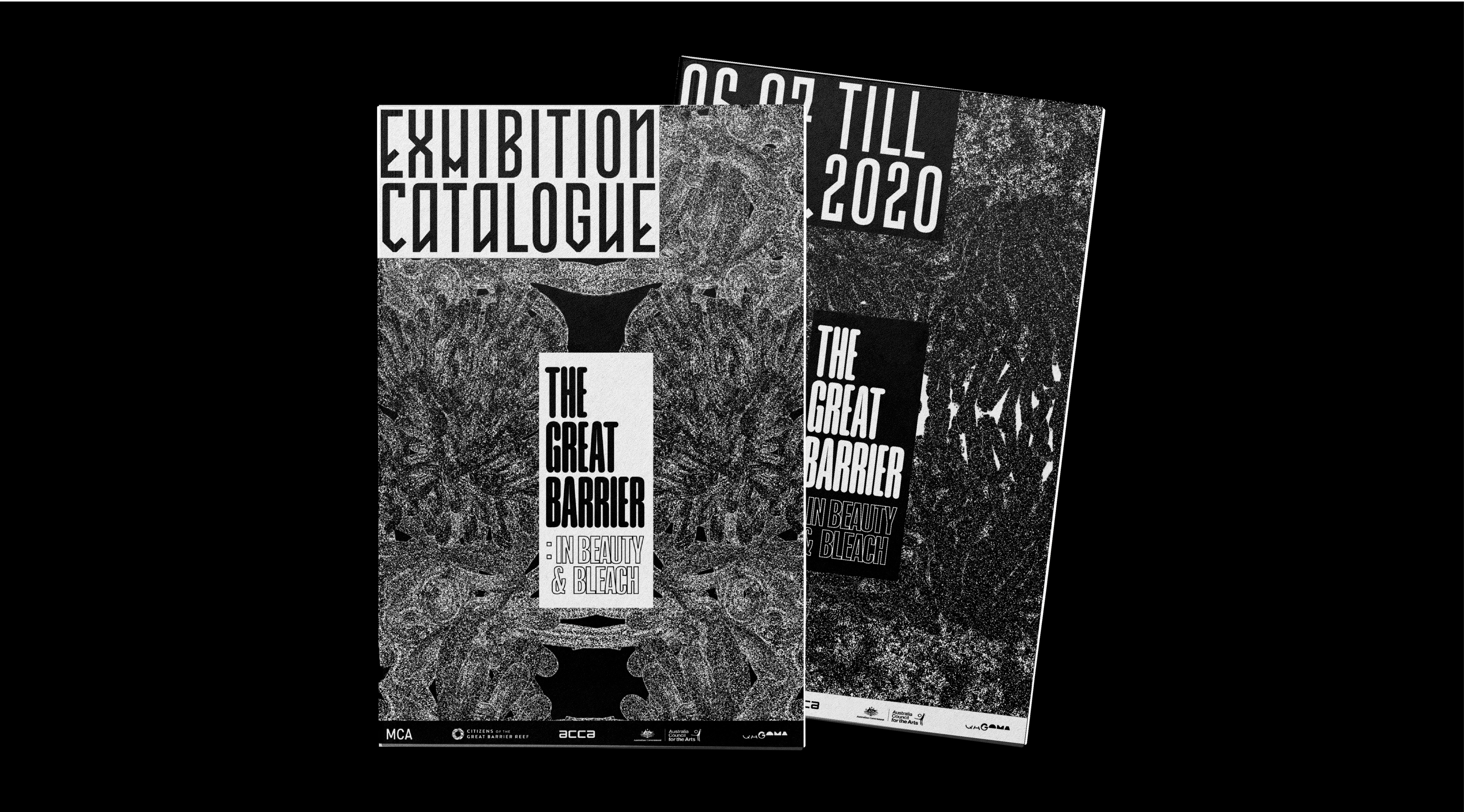
The visual identity of the event is centered on illustrations of corals native from the Great Barrier Reef; which are stylistically montaged in dynamic and fluid ways. The concept especially highlights the reef's beauty by way of its sylistic portrayals in black and white. The corals' gorgeous complexity and diverse ecosystem is magnified... yet without the colours, a certain destruction is acknowledged by effects of the bleaching.
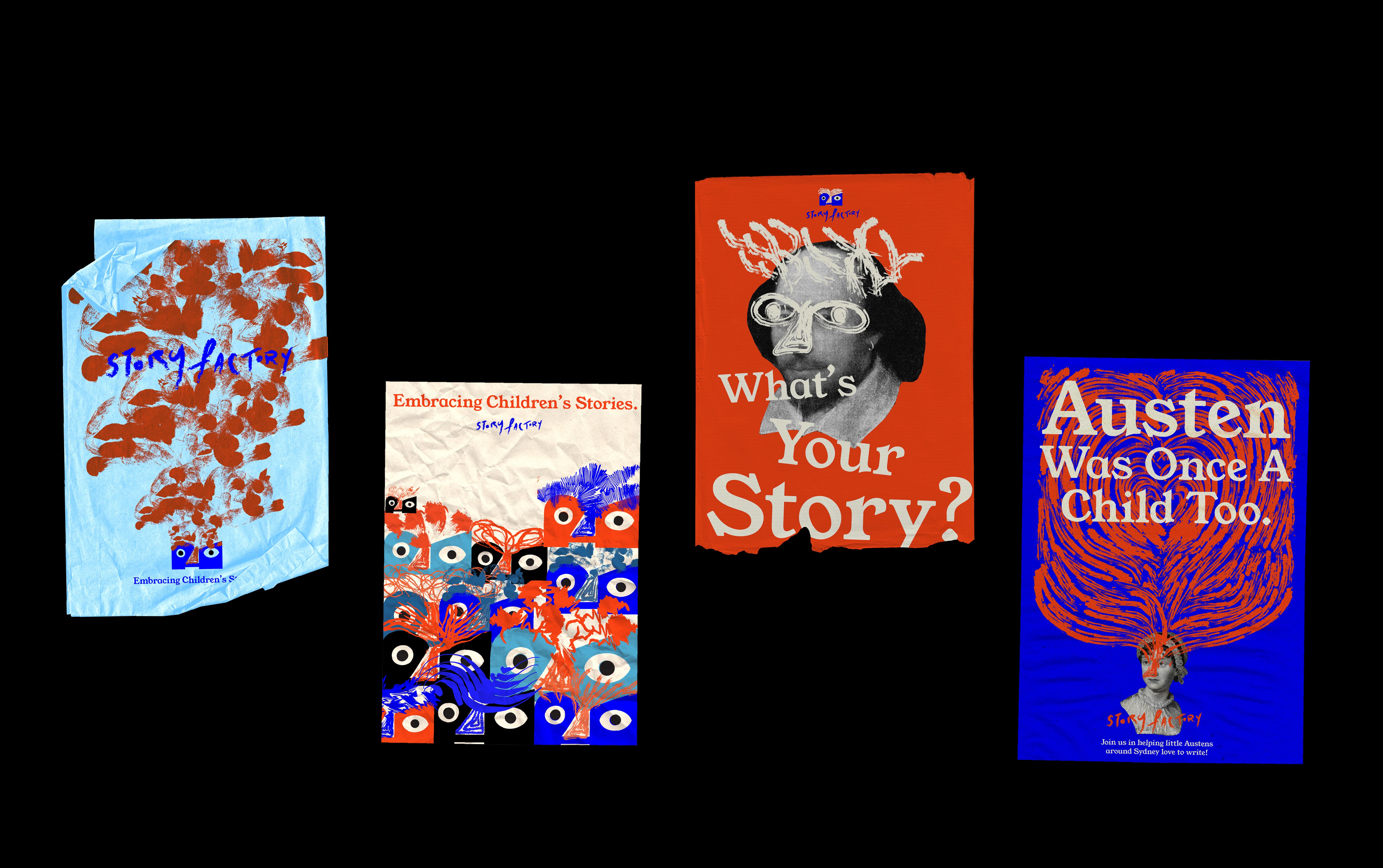
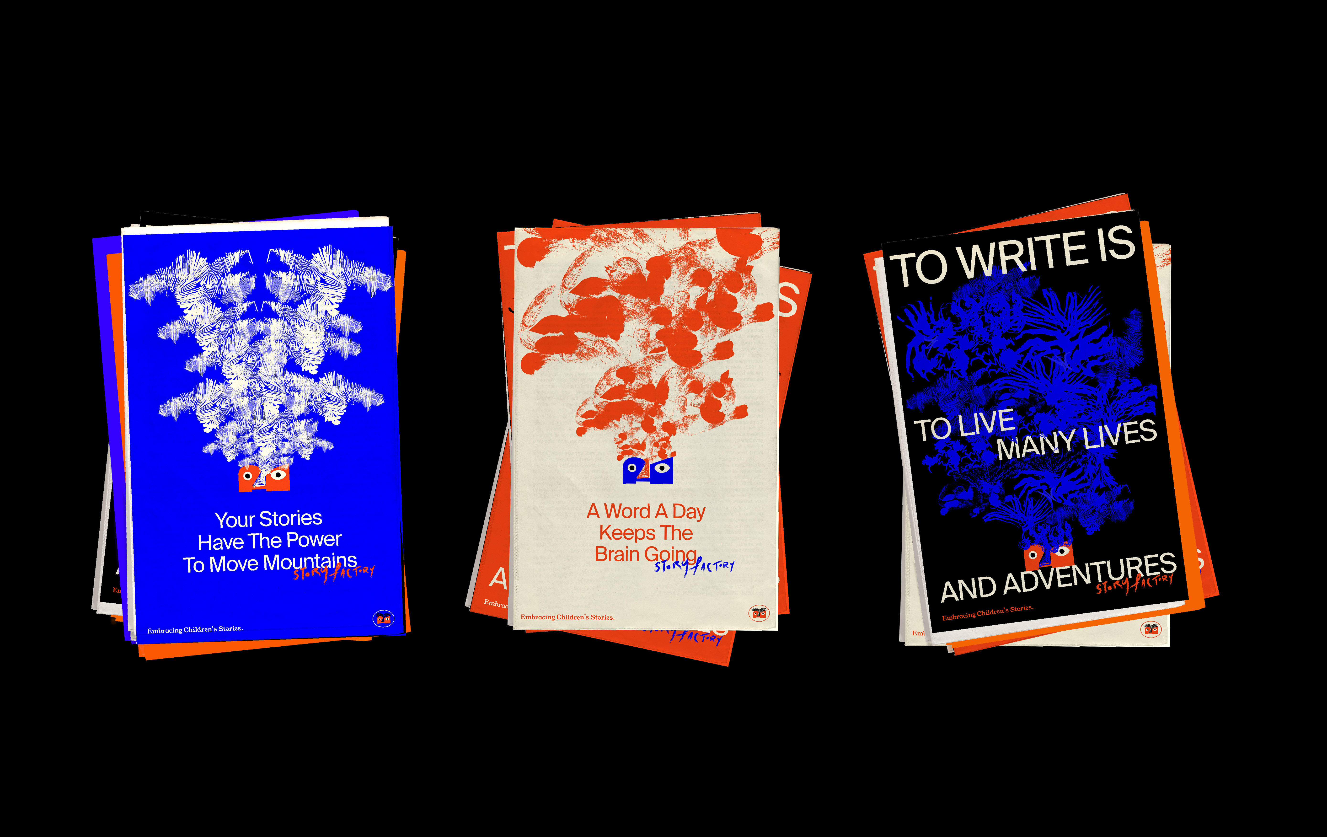
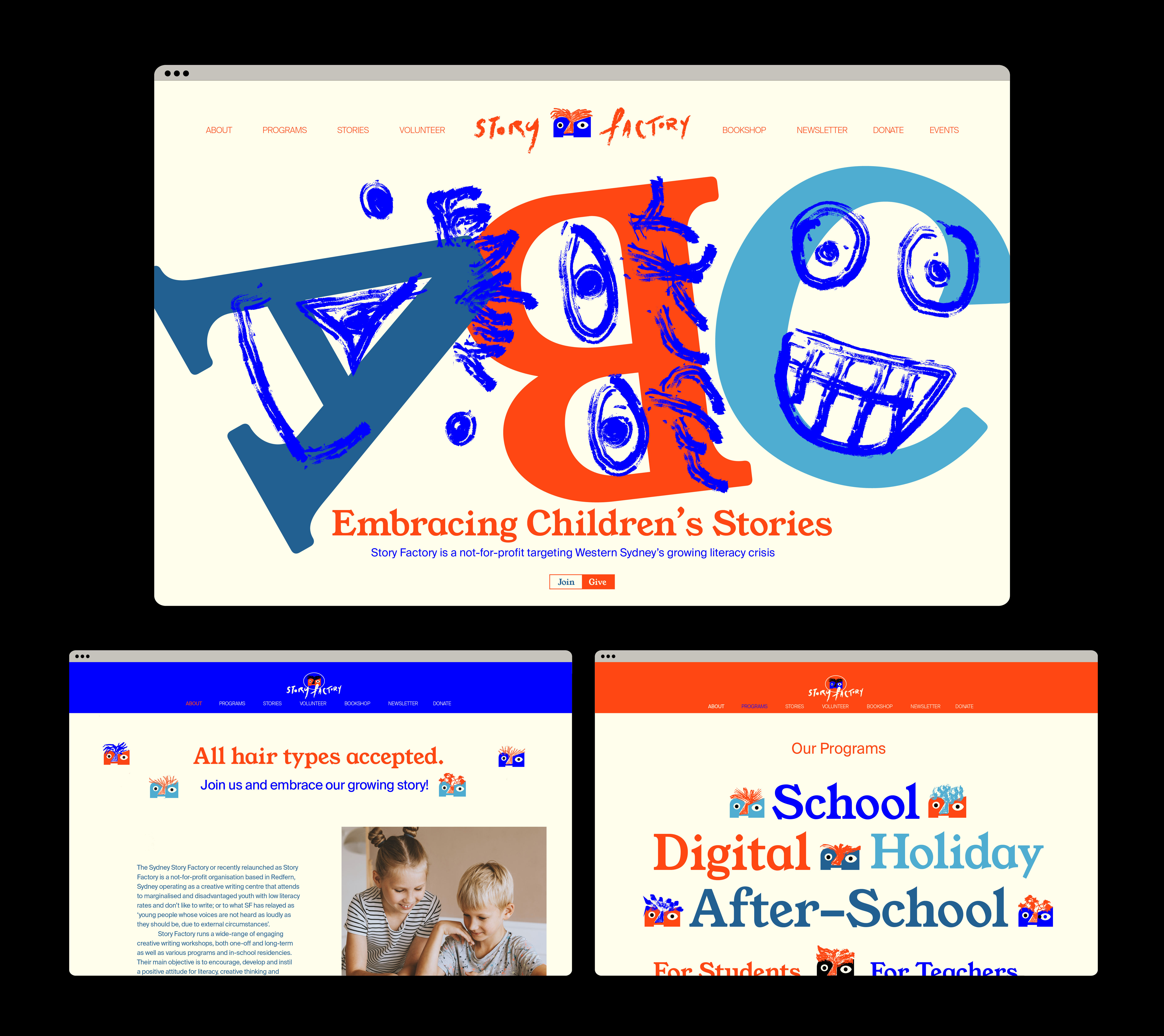
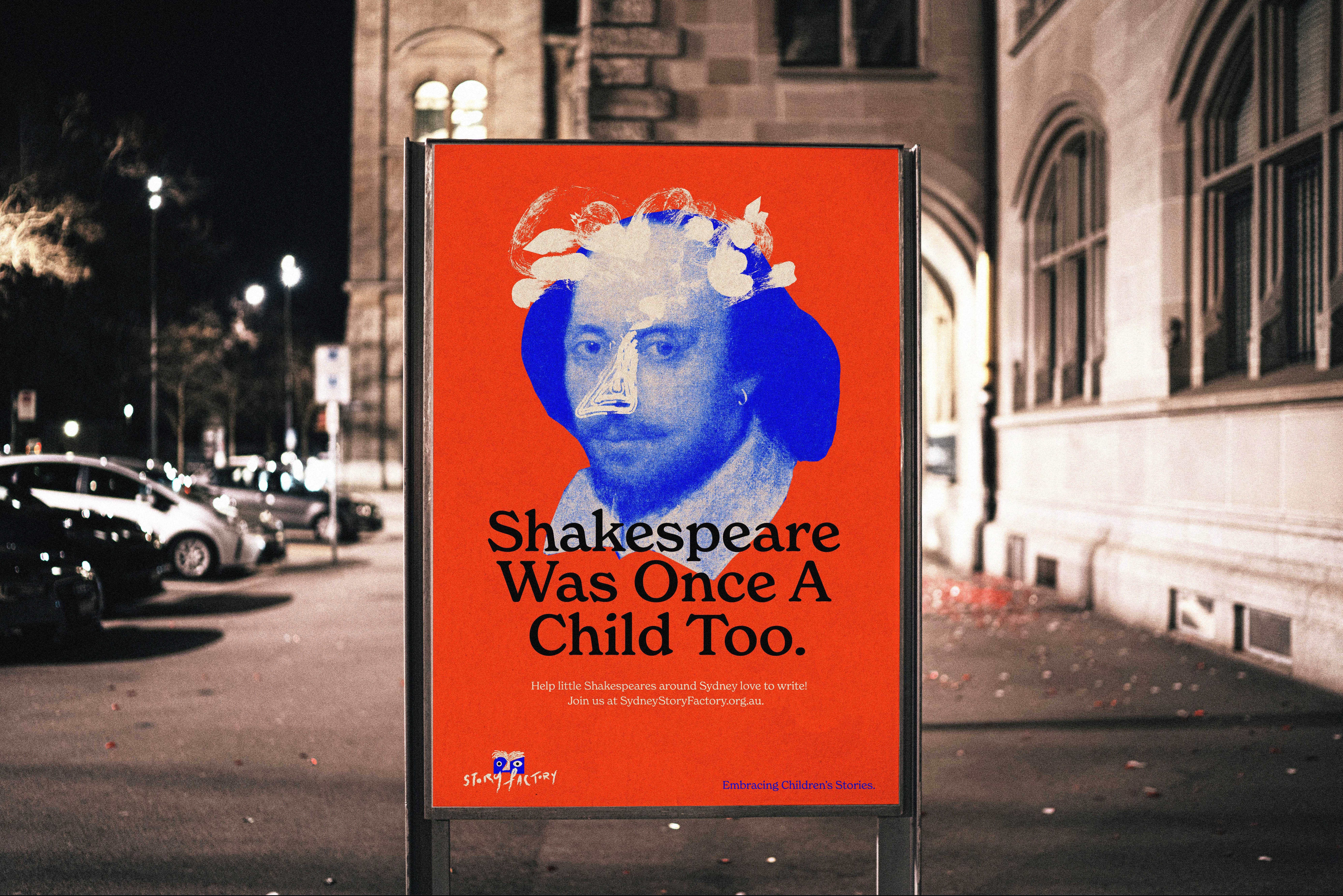
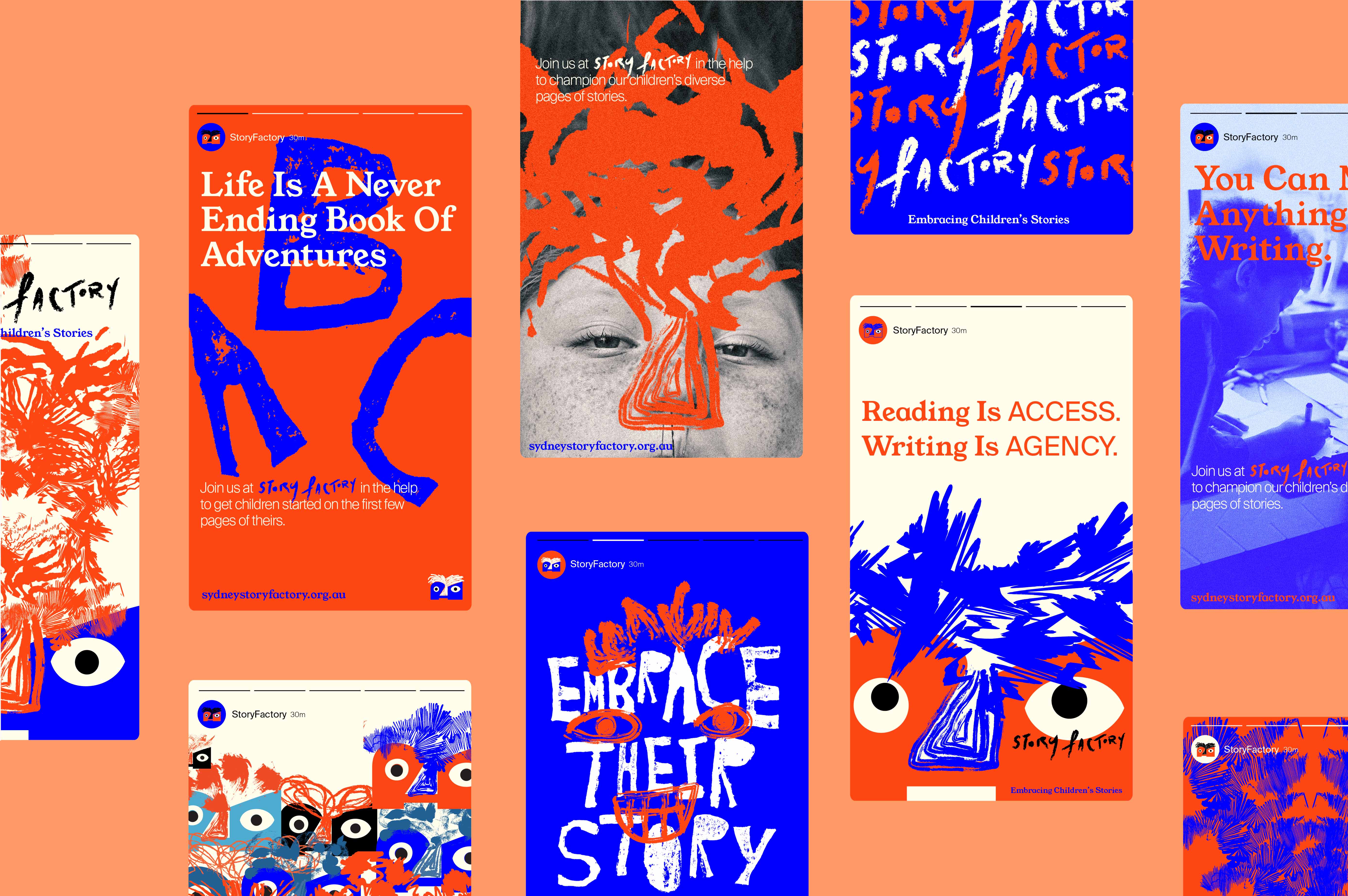
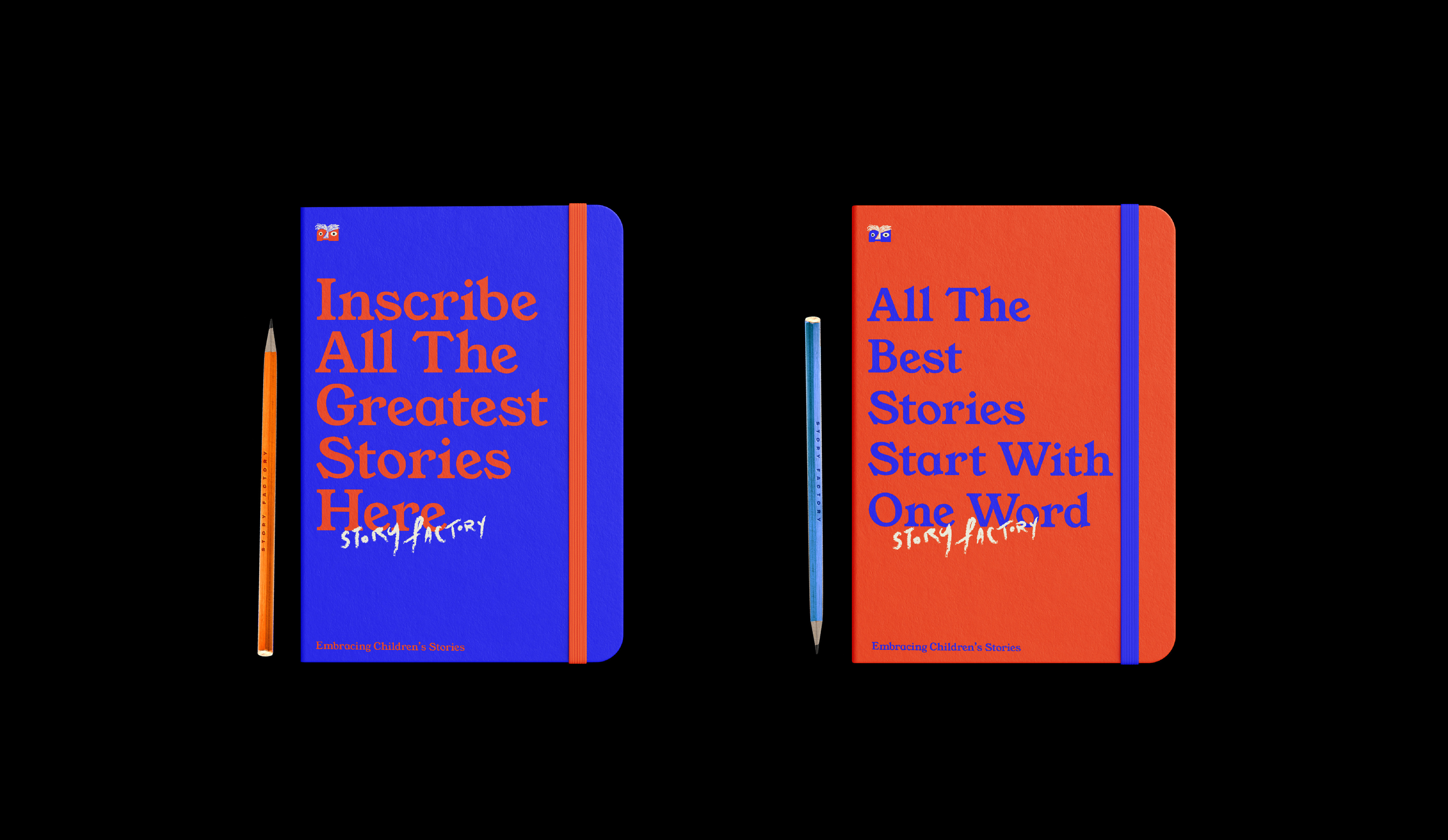
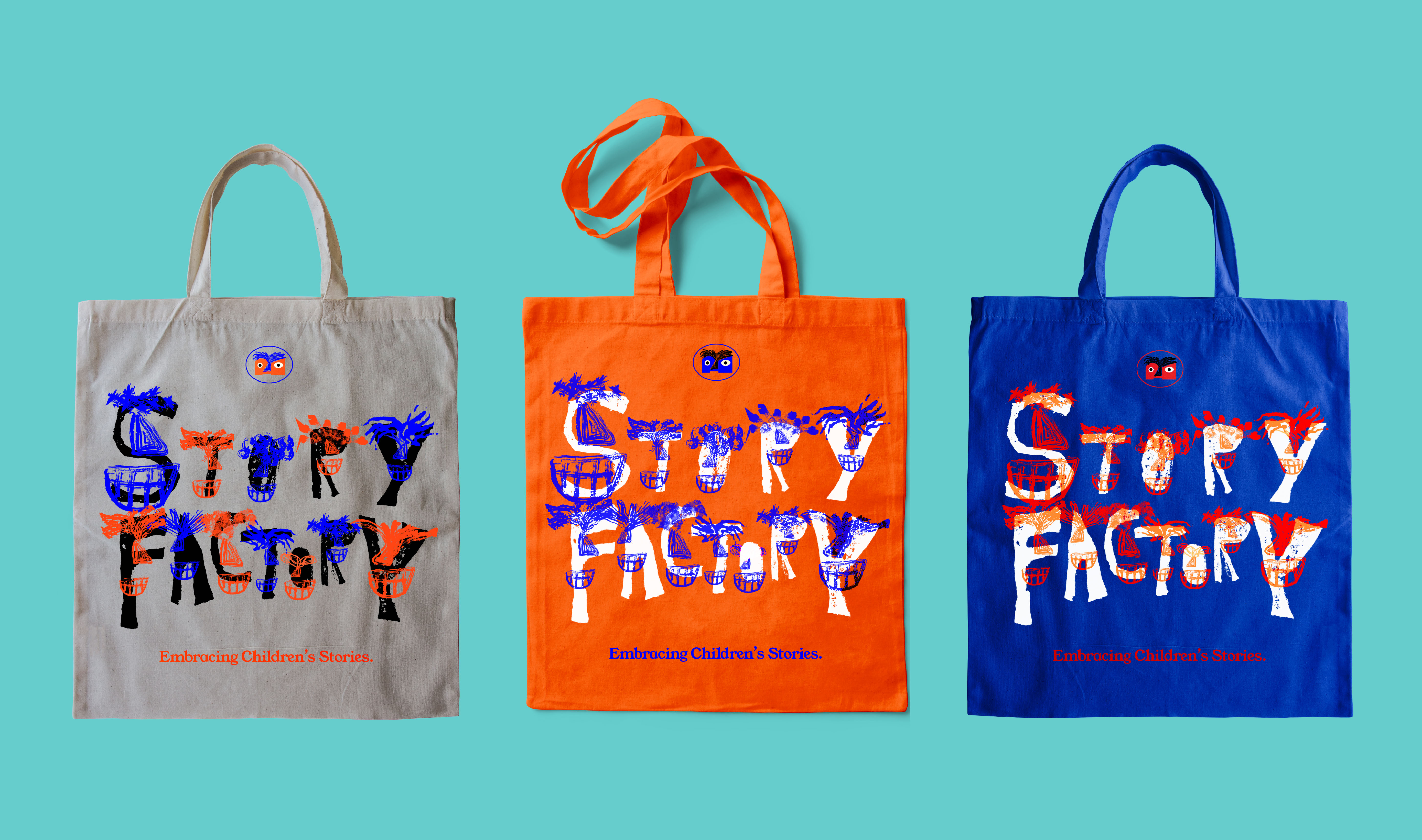
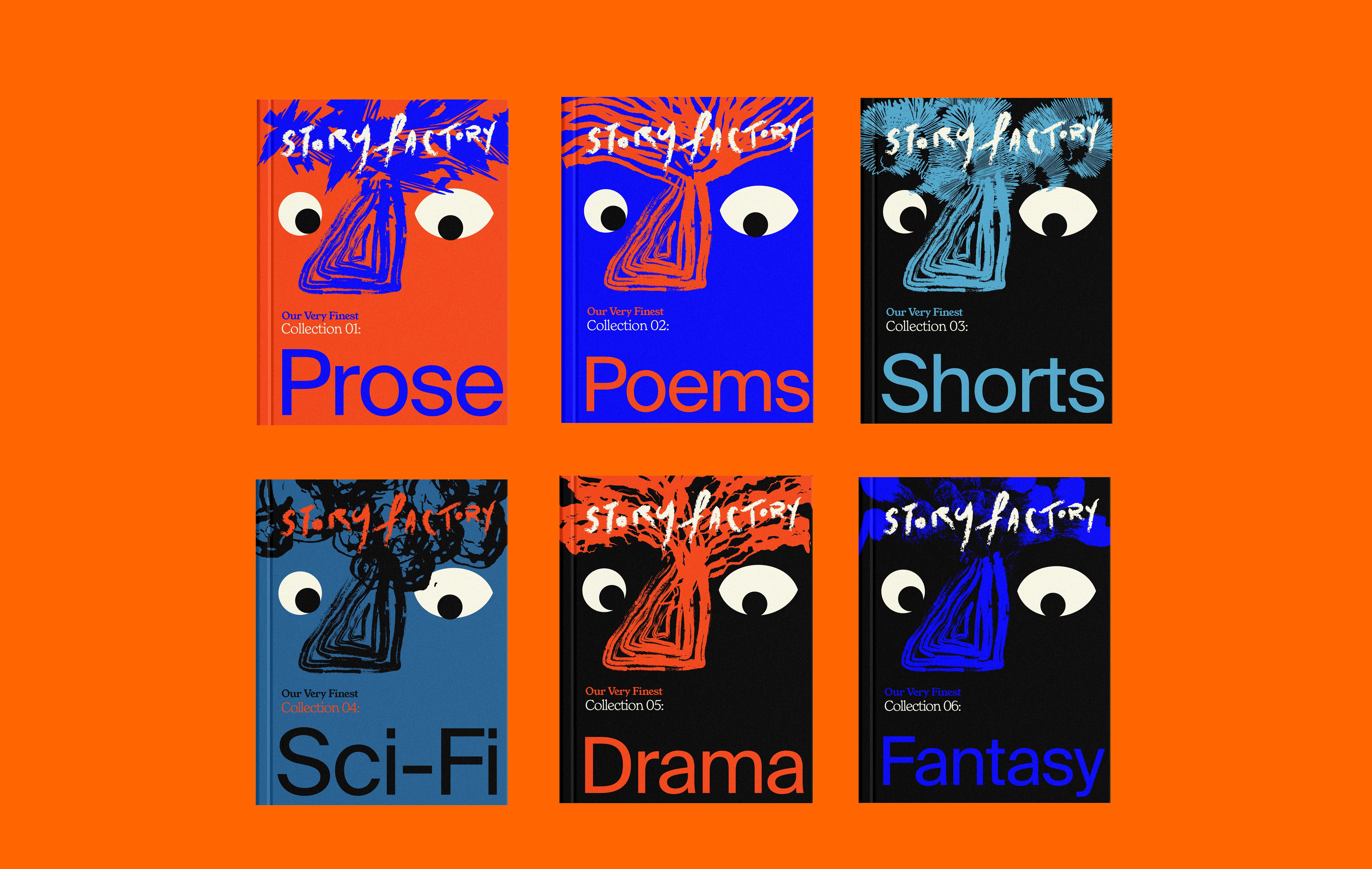
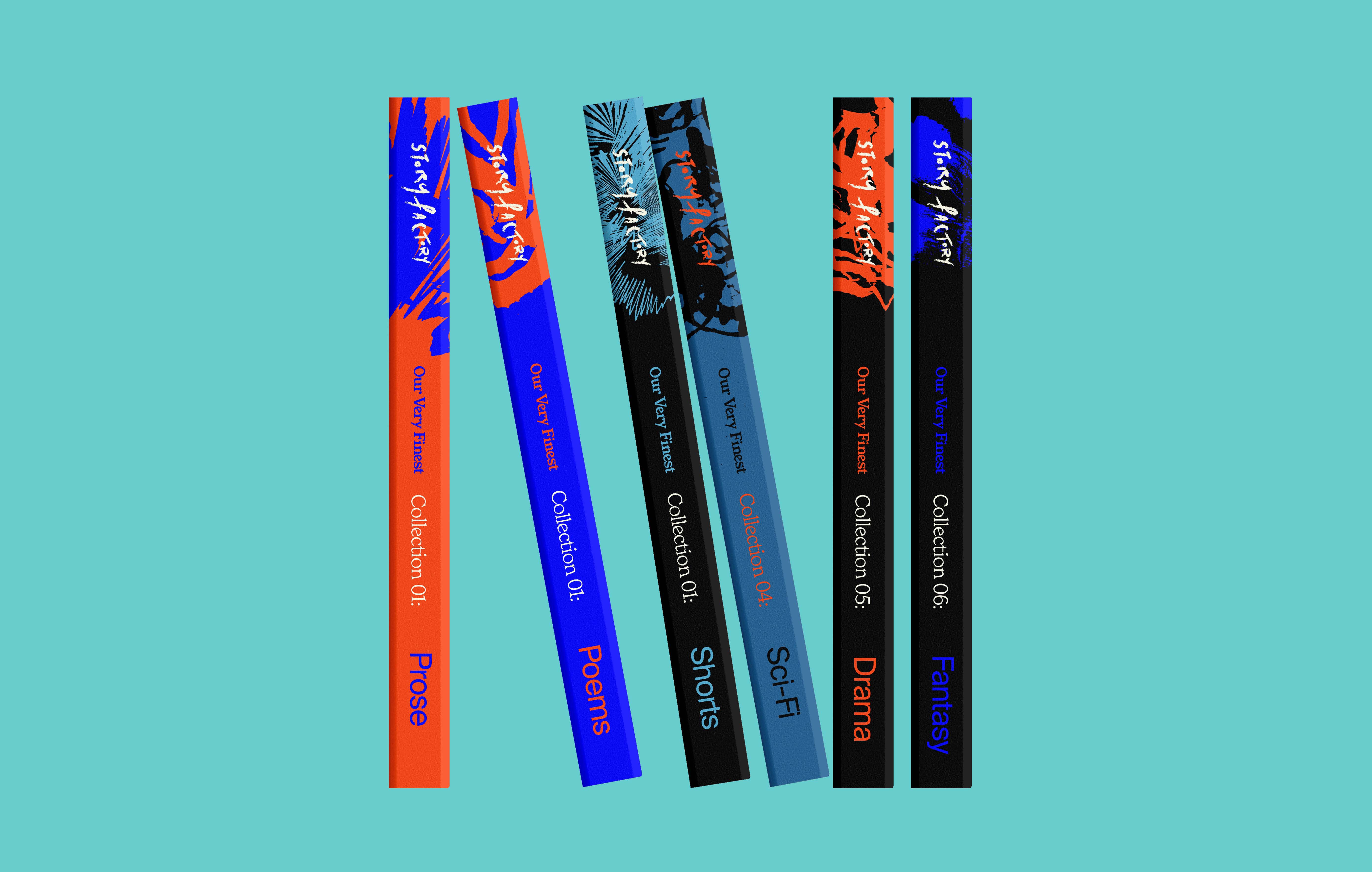
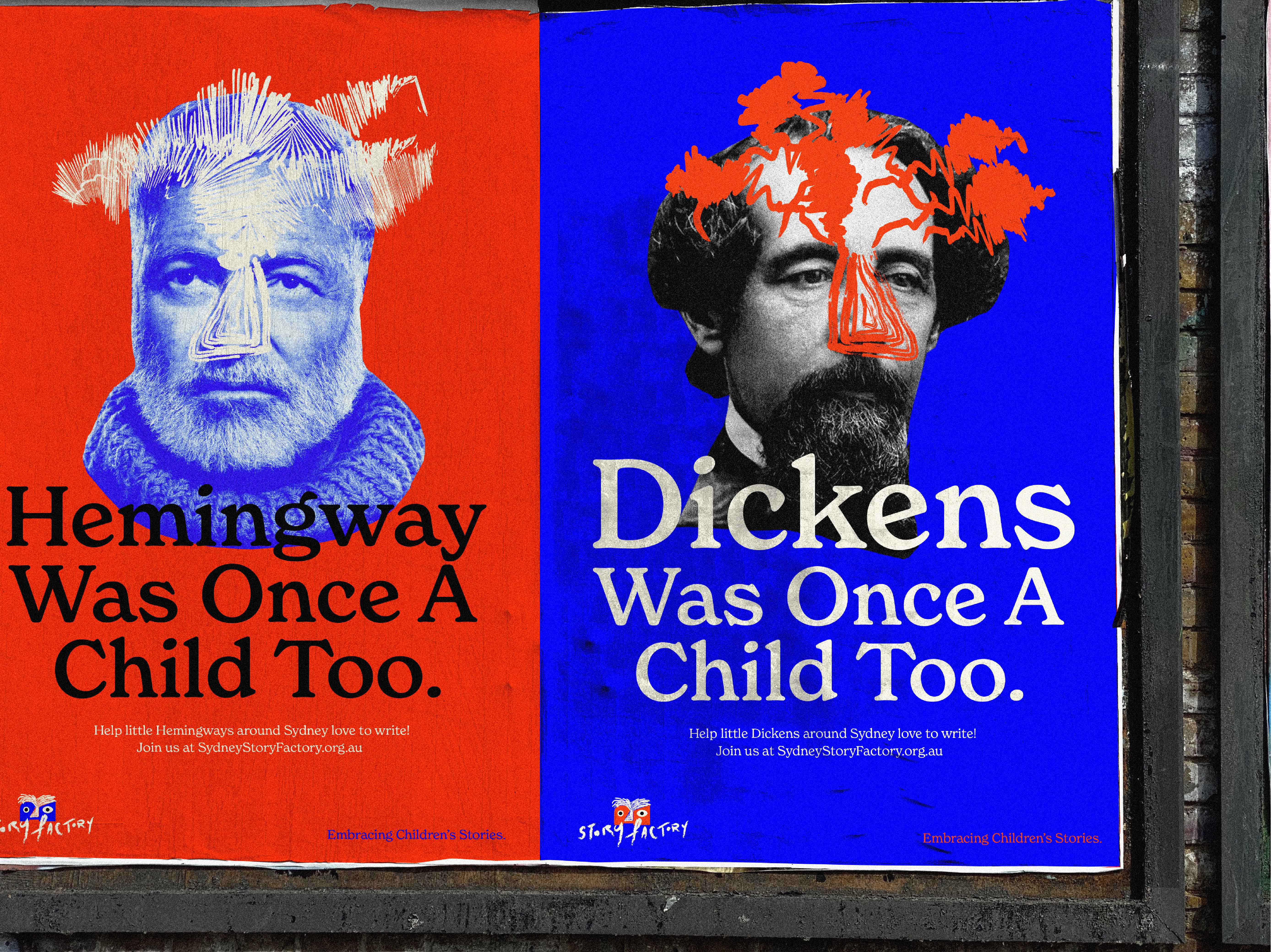
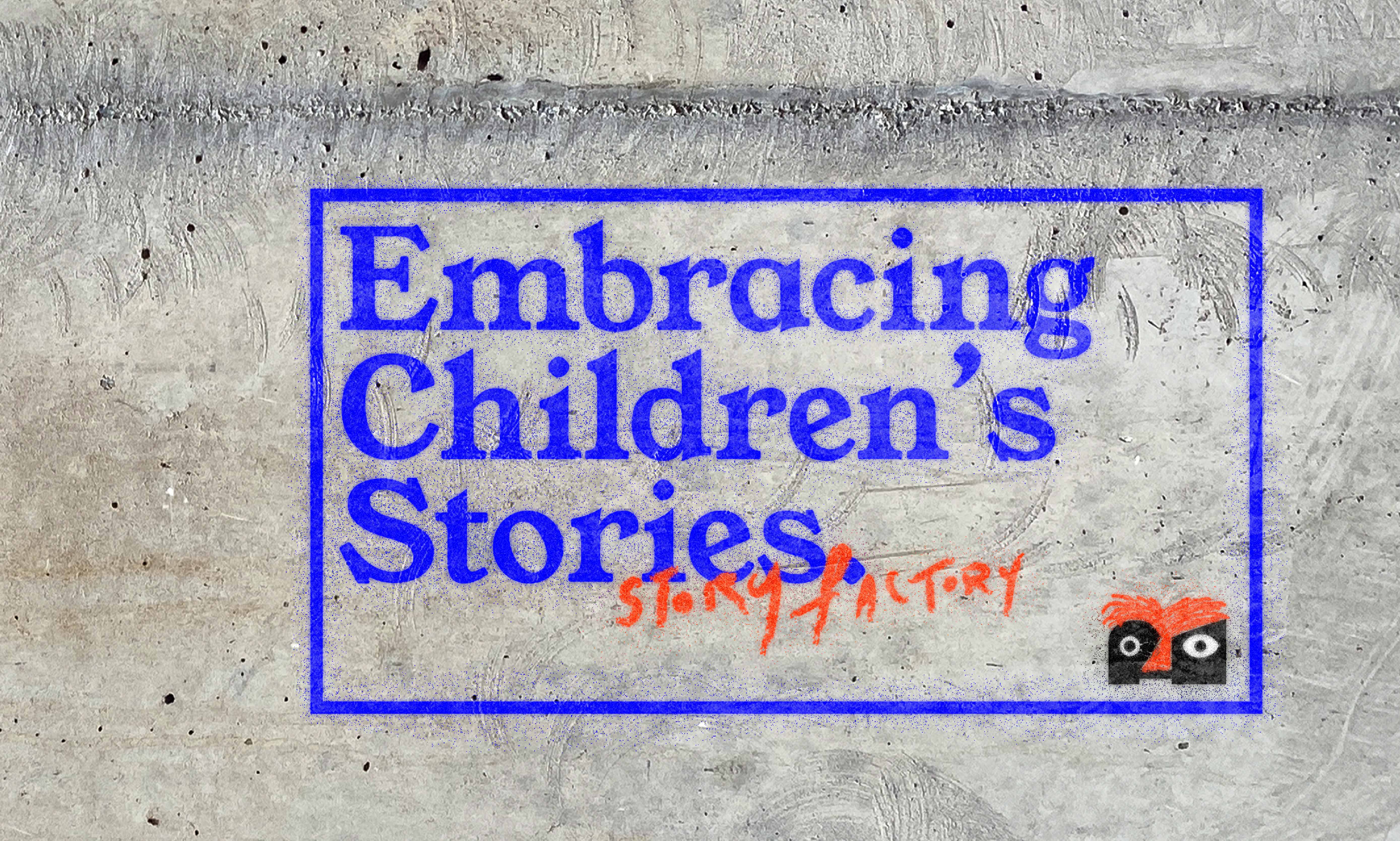
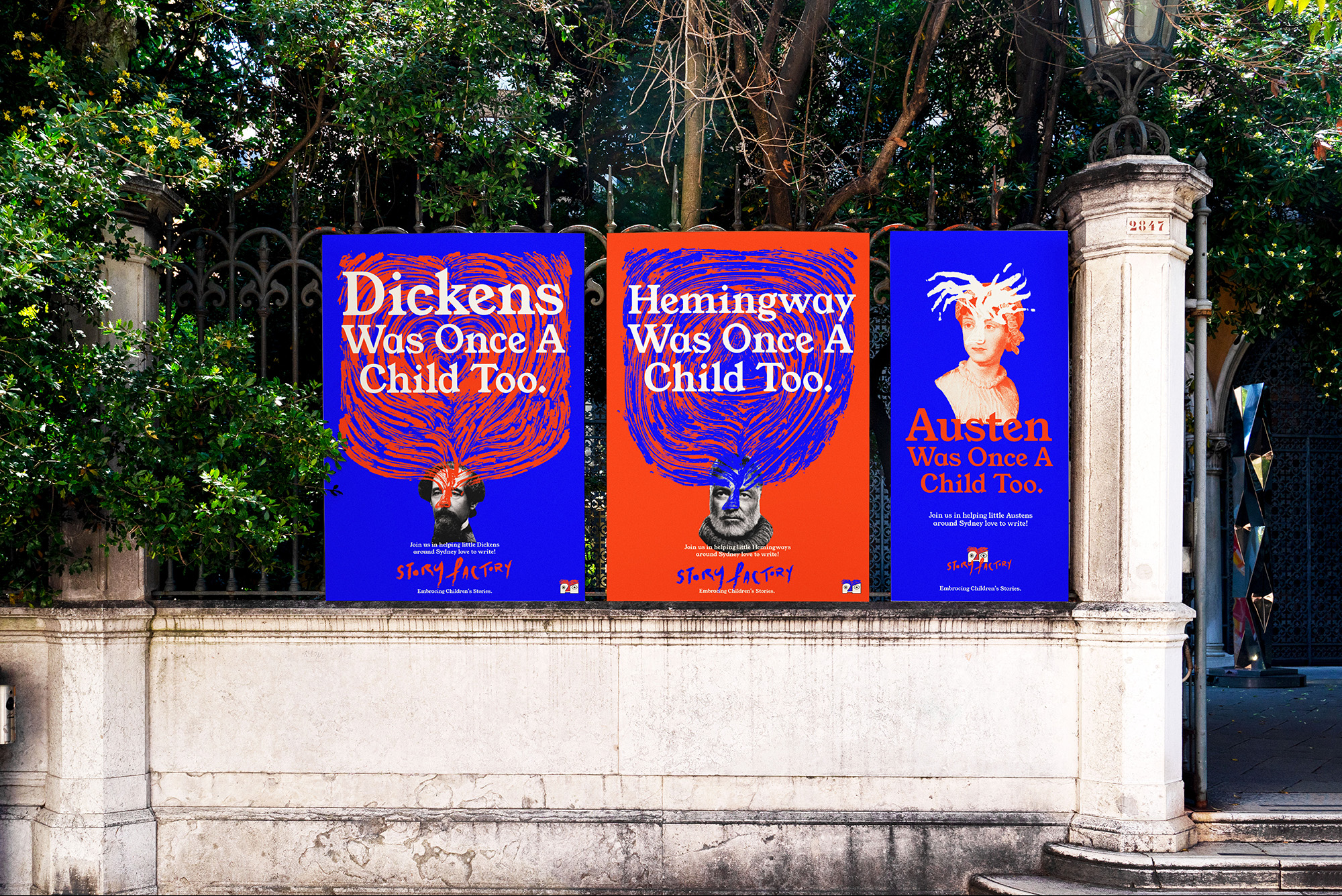
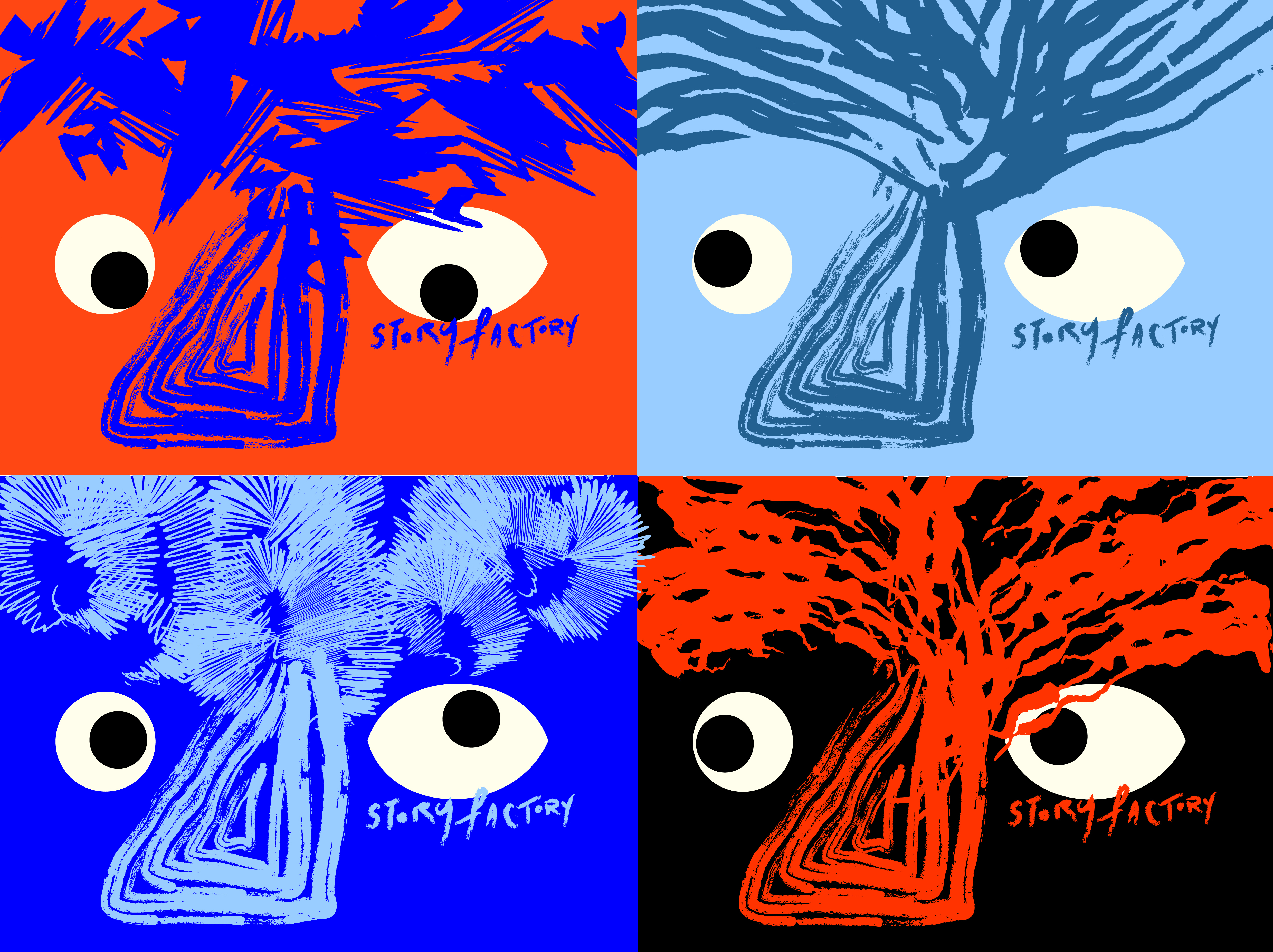
Story Factory
Branding and Identity
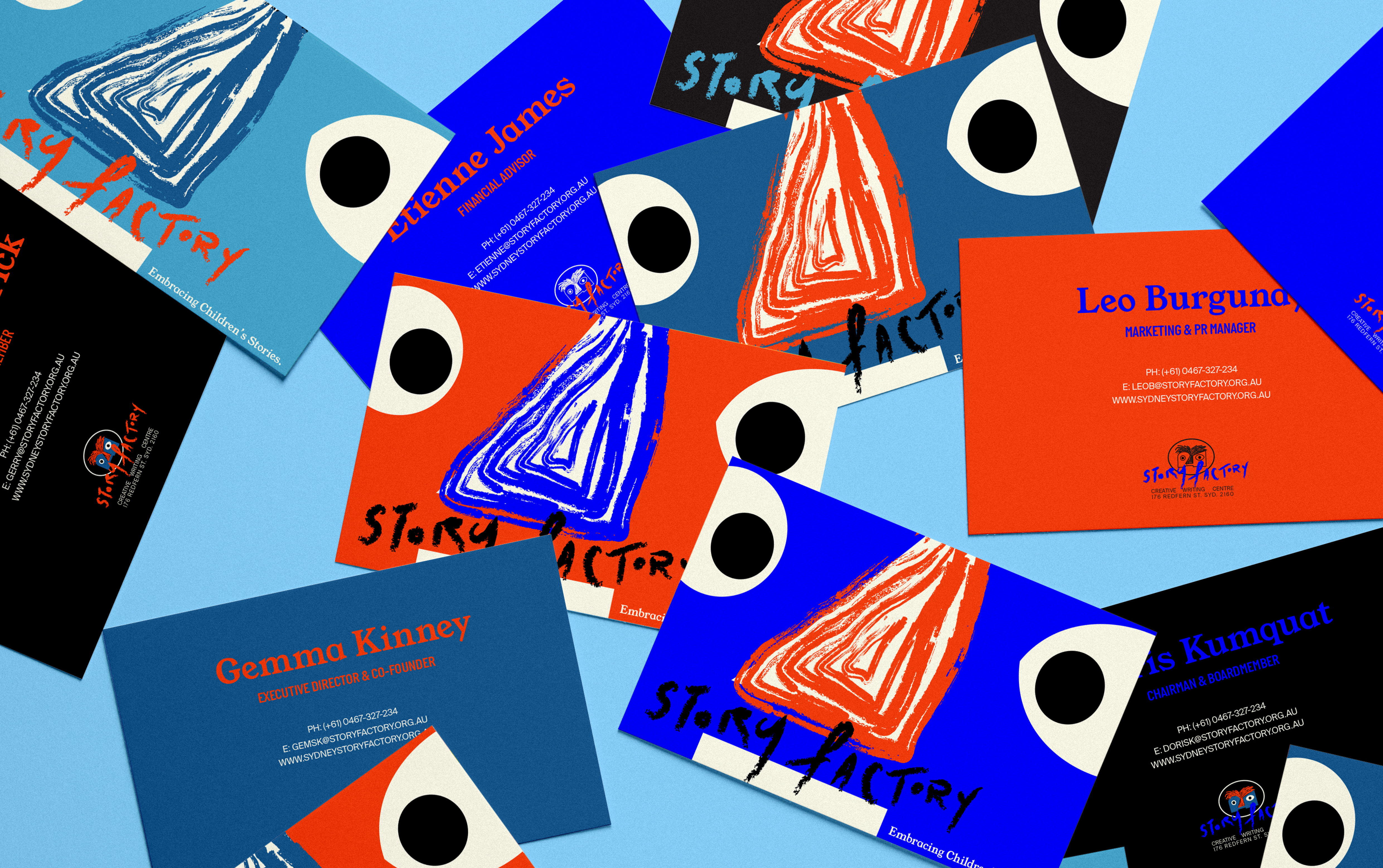
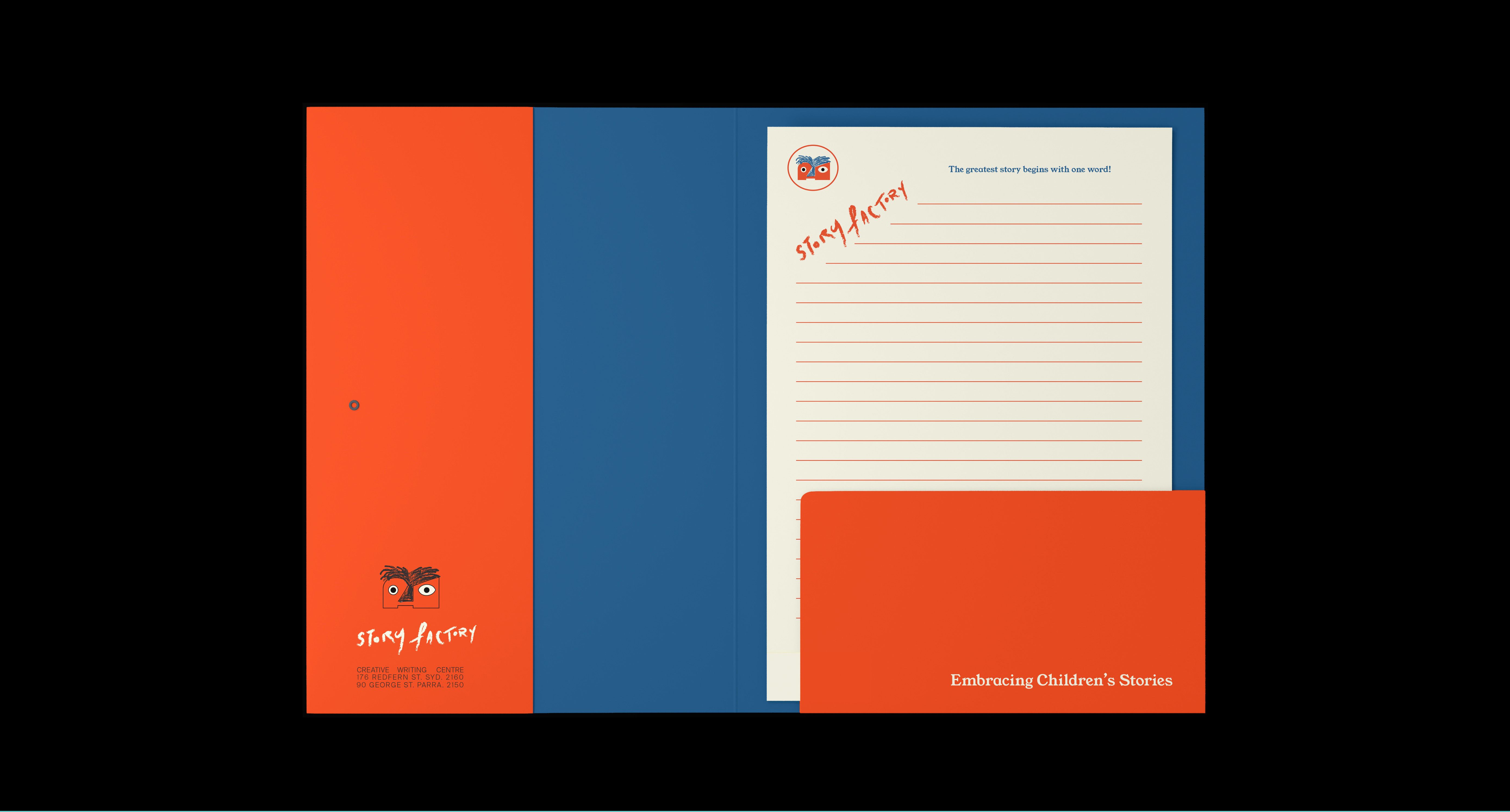
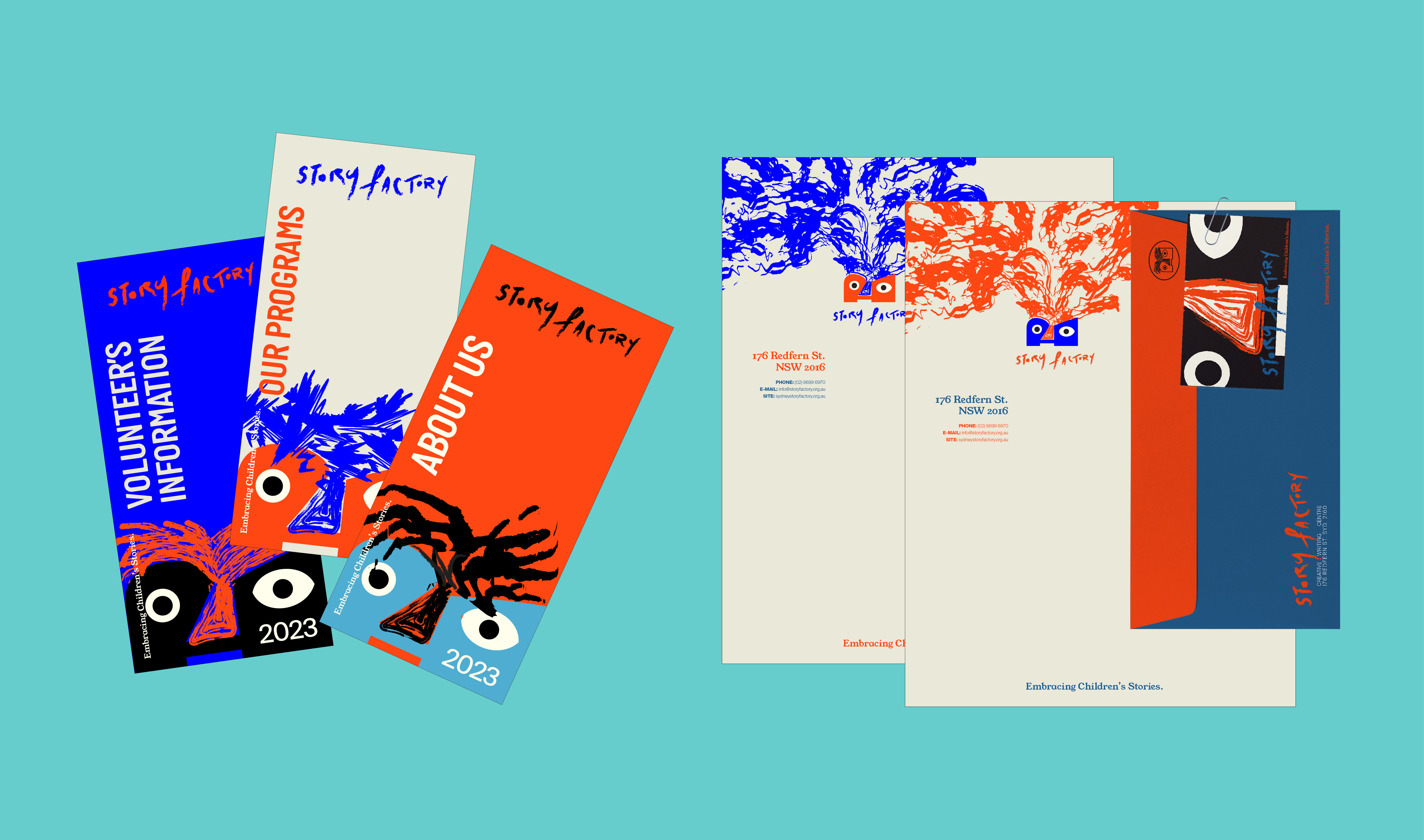
I designed an expansive new system guideline (including a variable set of logos, posters, corporate lineup, website + socials, merchandise, etc)
Academic project for UNSW Art & Design
Year: 2020 (modified 2023)
Story Factory is an Australian not-for-profit organisation based in Redfern, Sydney; operating as a creative writing centre that attends to marginalised and disadvantaged youth.
This project is a rebranding opportunity to tilt the brand identity of Story Factory on the children themselves and their capacities as creative thinkers and storytellers. Much like a child's vast imagination, we simply get by with what we have...and that is more than enough for us!
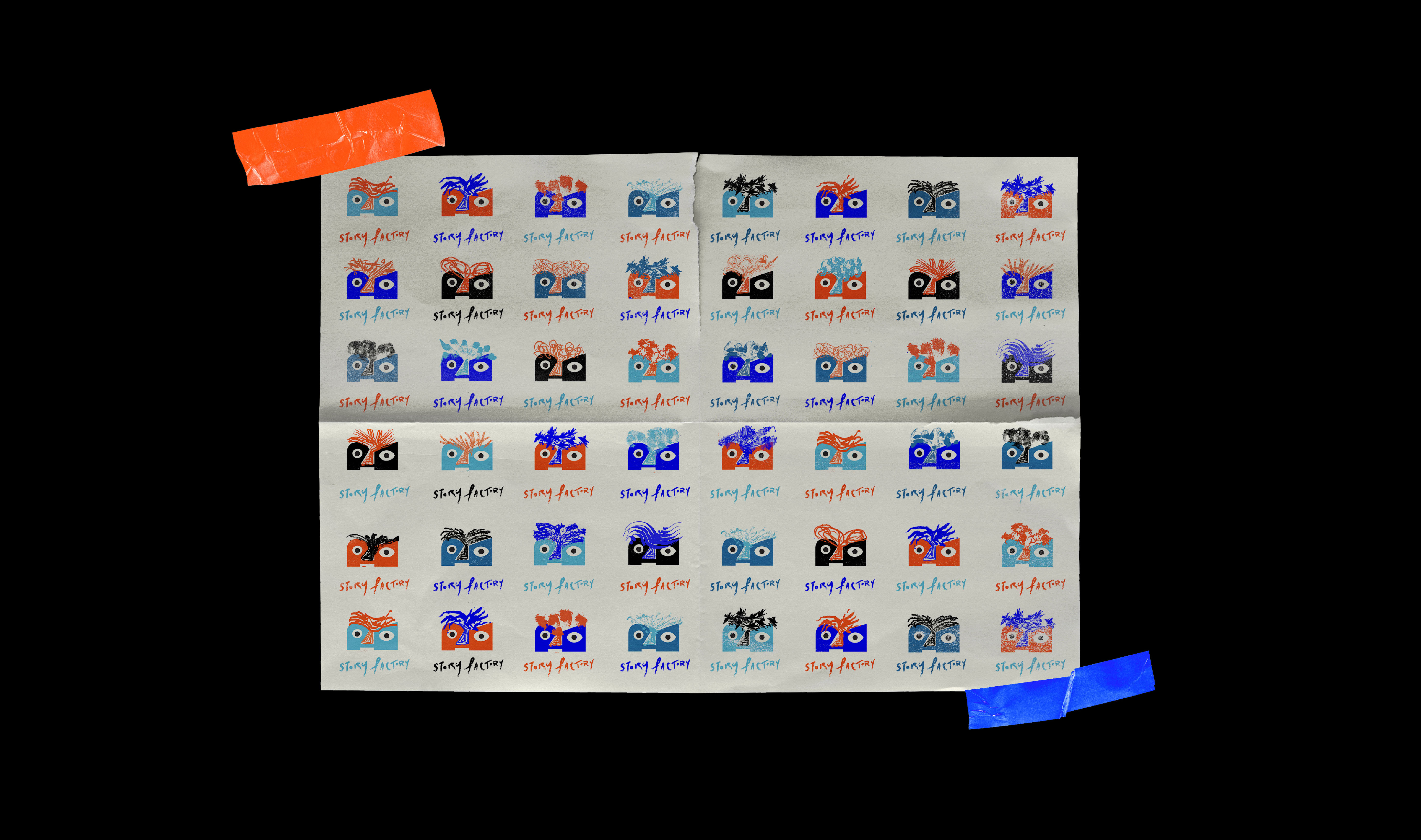
Story Factory's visual identity is a playful amalgam that reflect their diverse group of students. We aim to represent them always through this visual identity.
The signature logomark is an abstract render of a book fashioned in the form of a child's face. The ridges of the book's pages are exhibited as the child's nose out through to the hair and is an overall display of their creative capacity; essentially the crux of Story Factory. Story Factory's logo is designed to be a variable logo, which to us, is a comical and playful interpretation in our celebration of diversity and all children's stories.
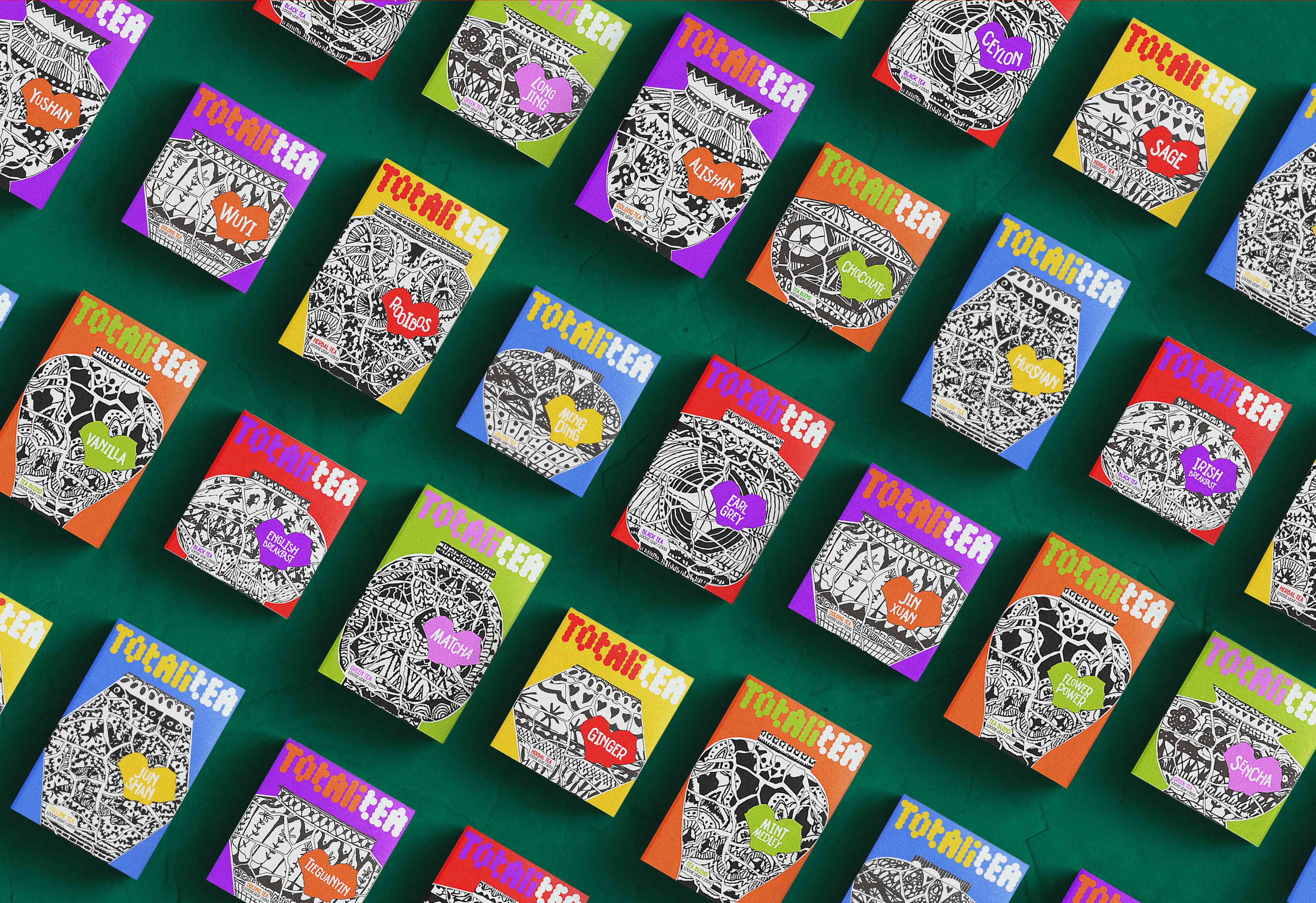
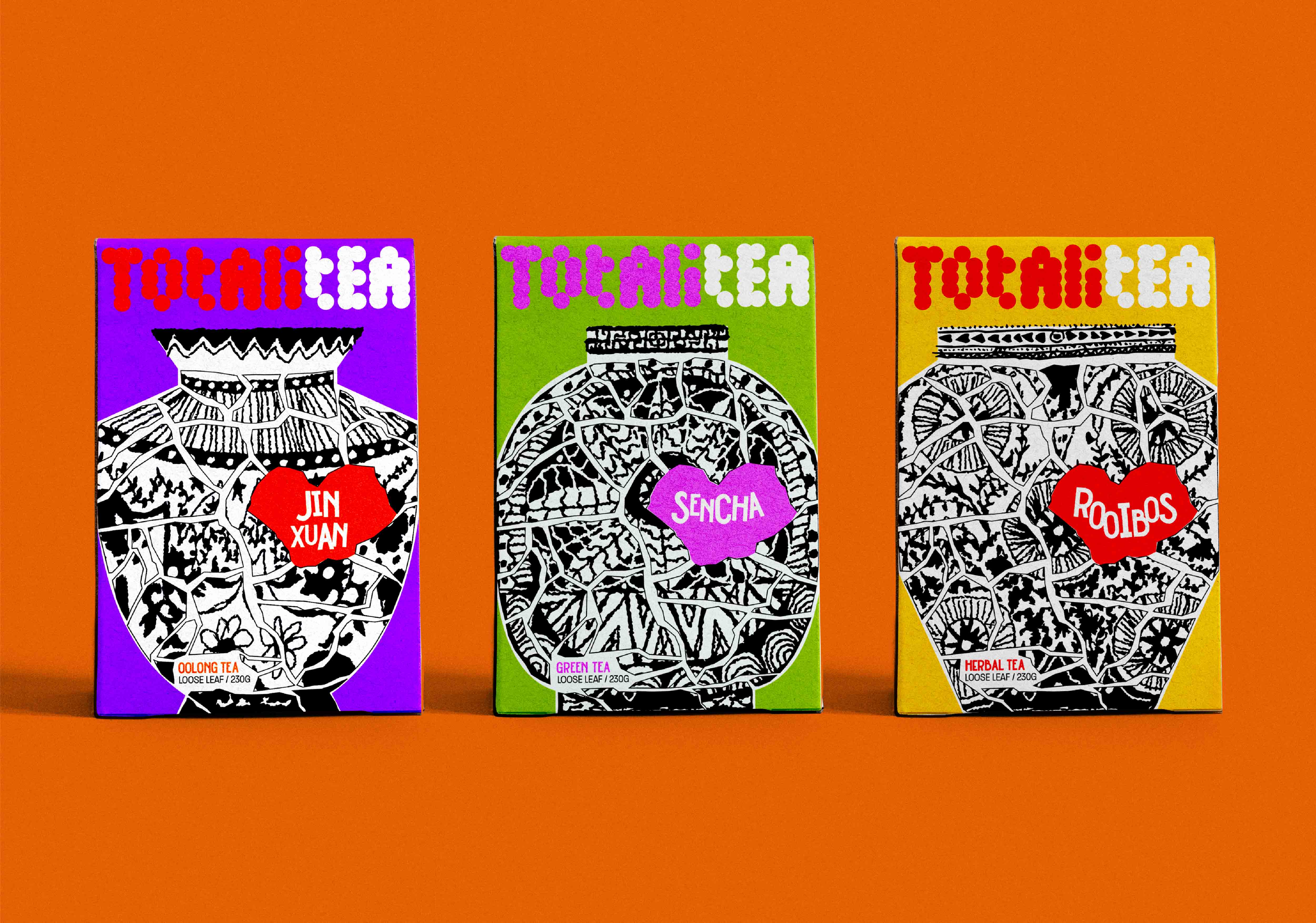
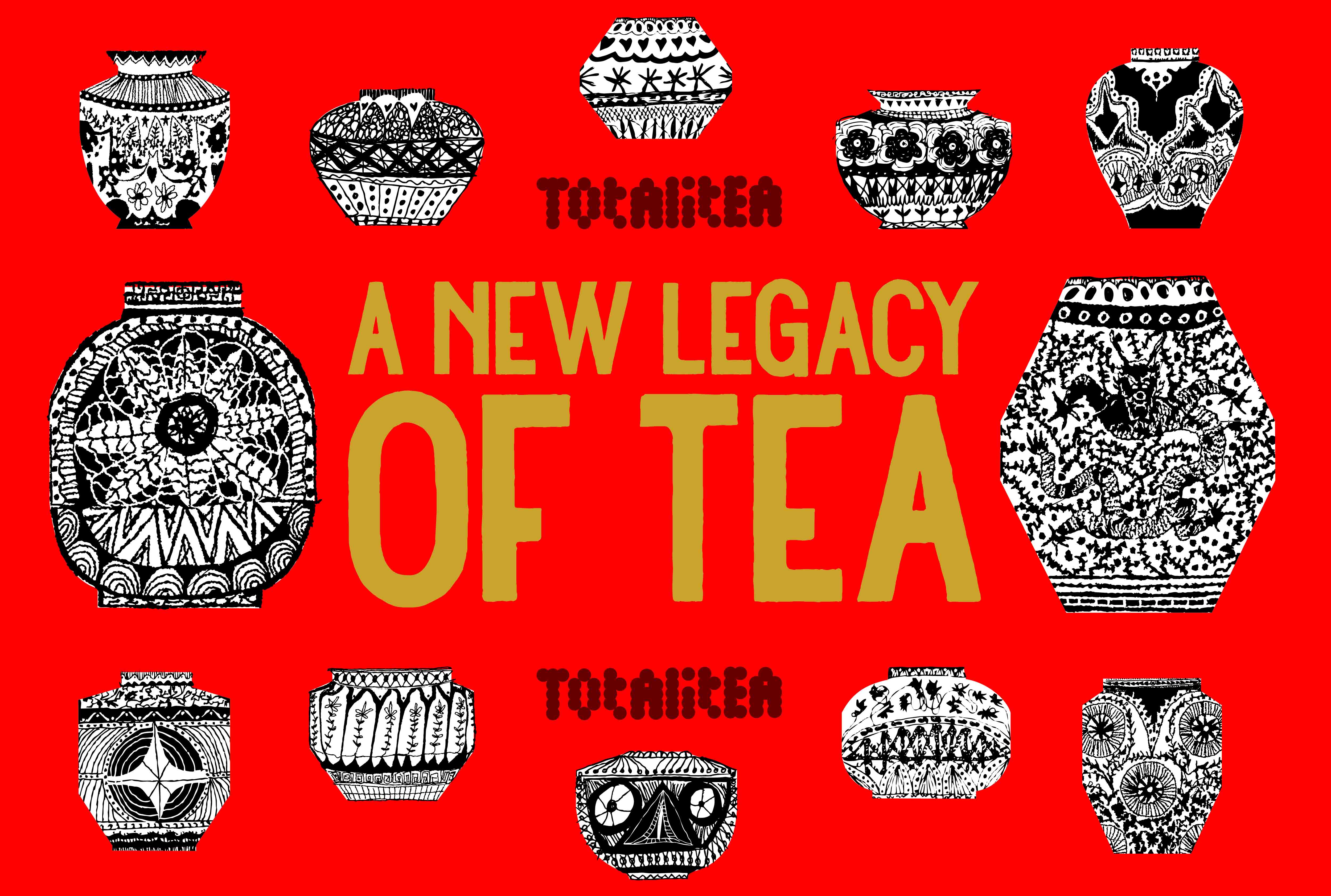
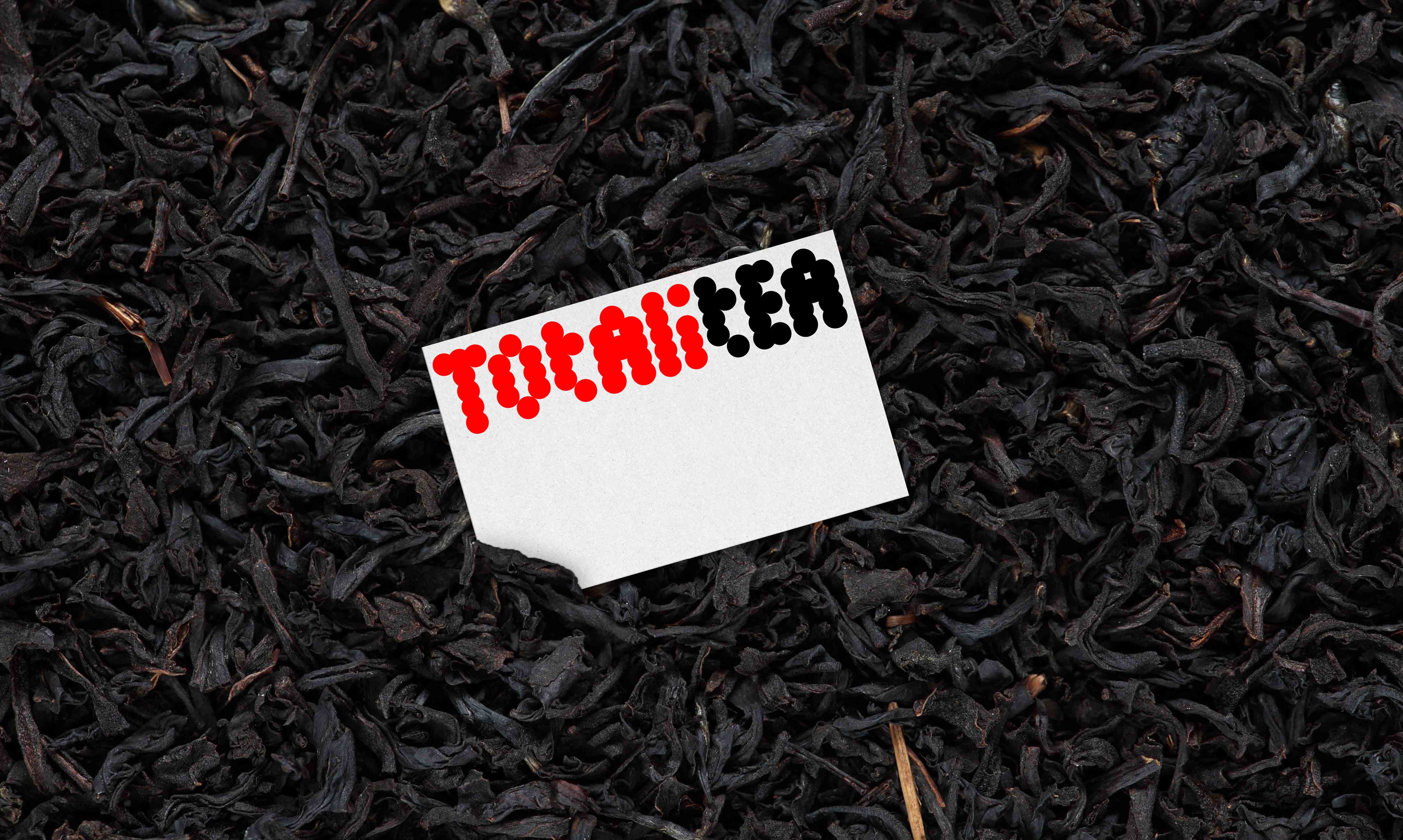
Totalitea Tea
Packaging & Branding
Academic project for UNSW Art & Design
Year: 2022
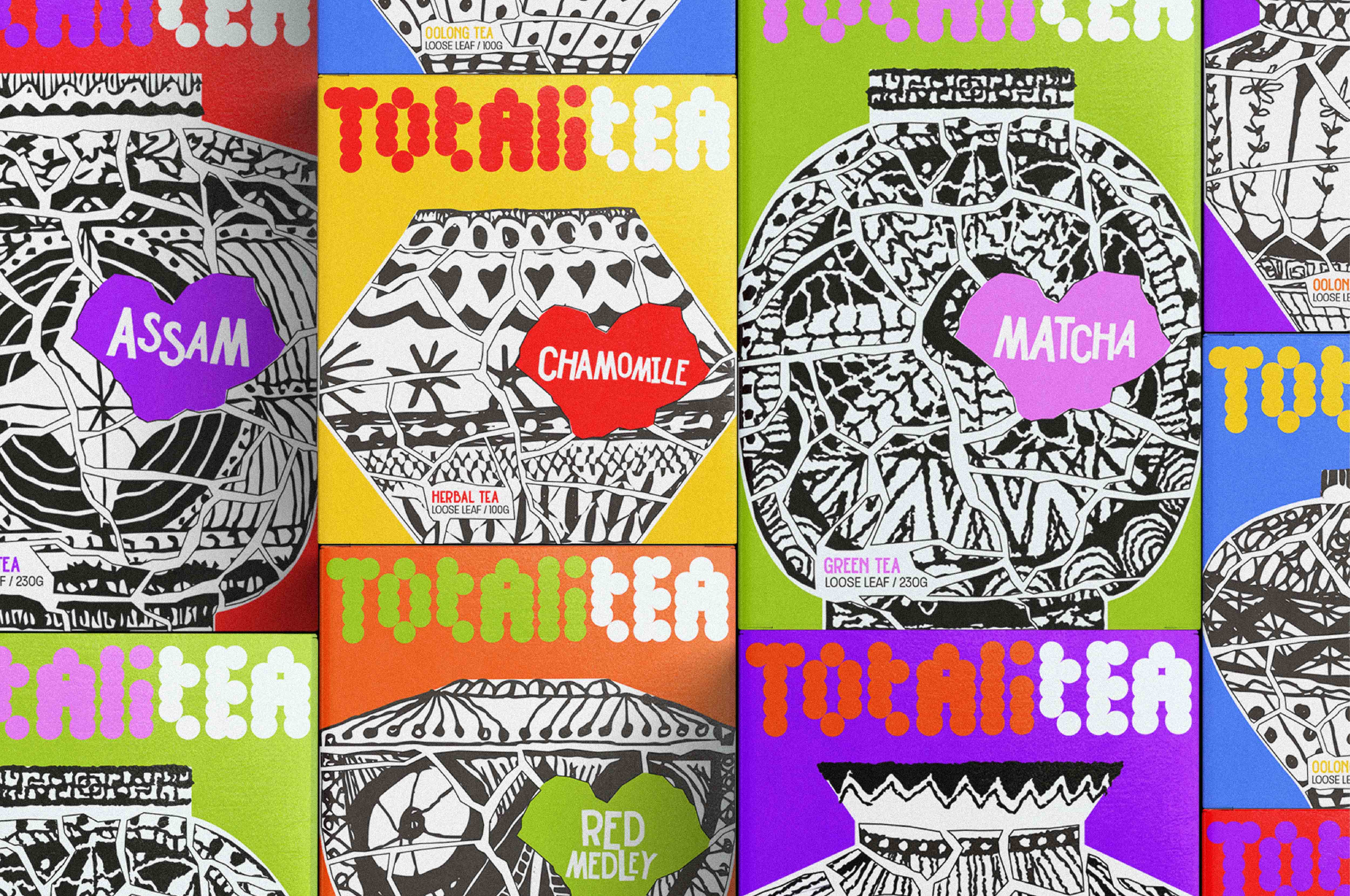
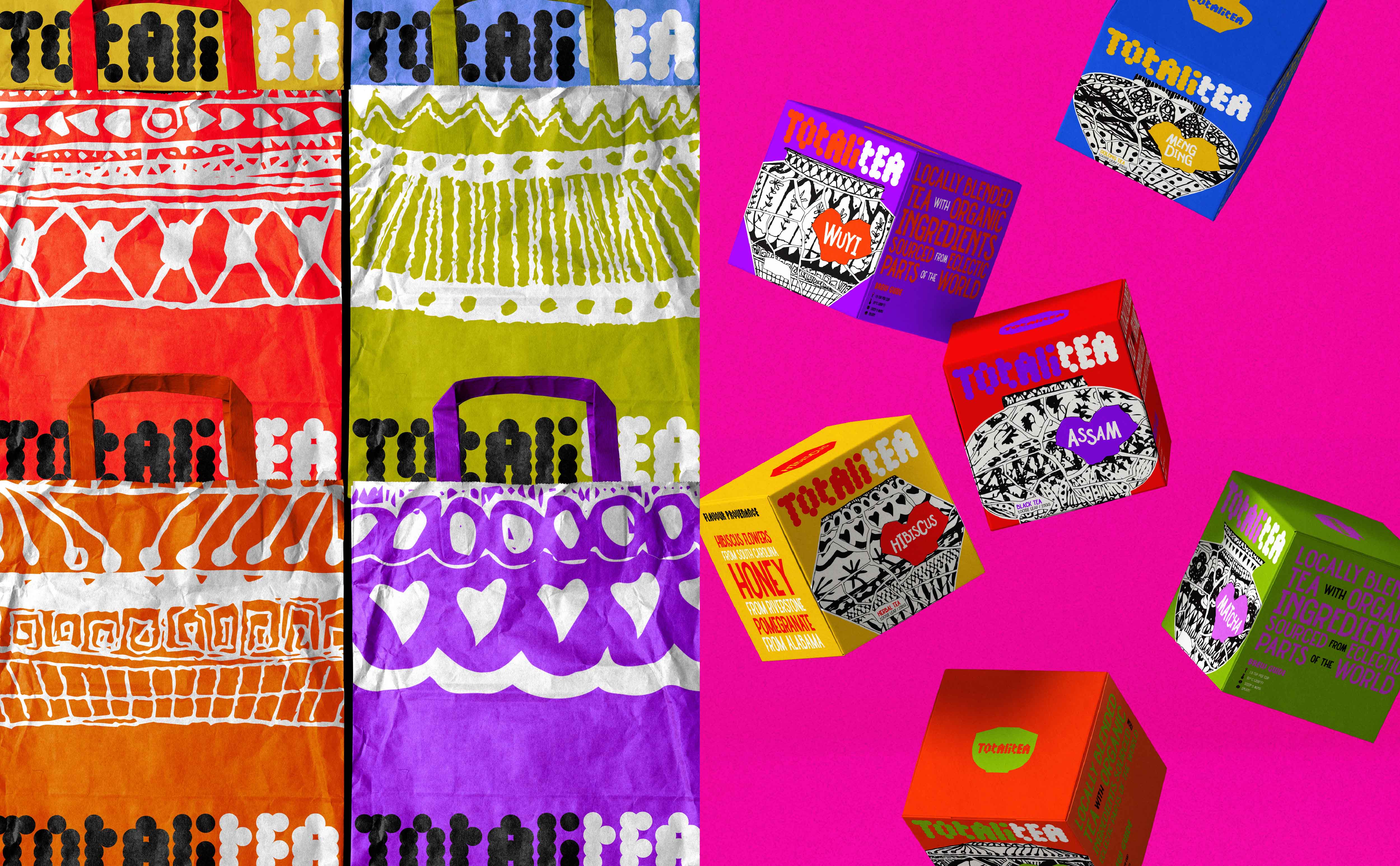
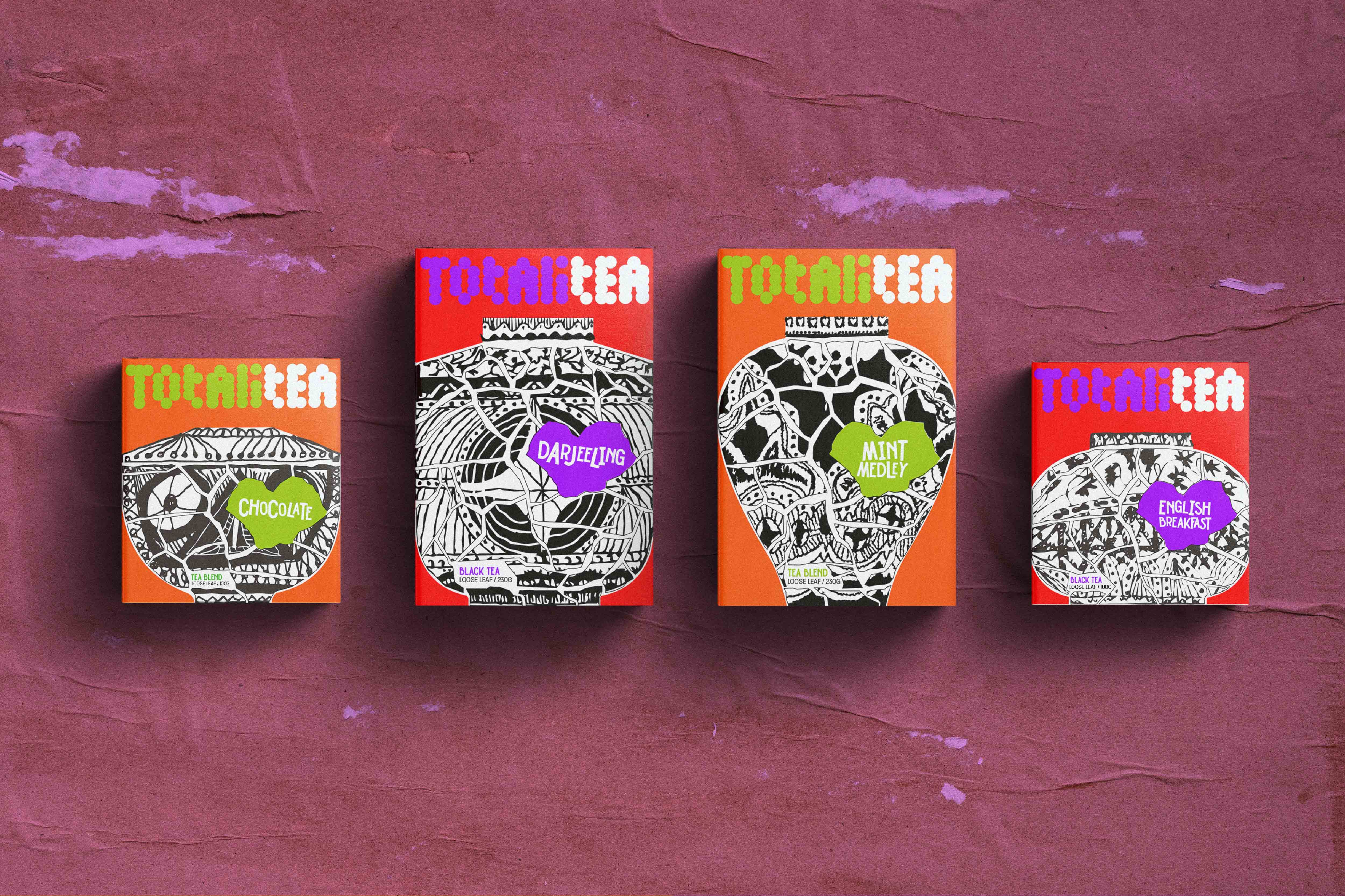
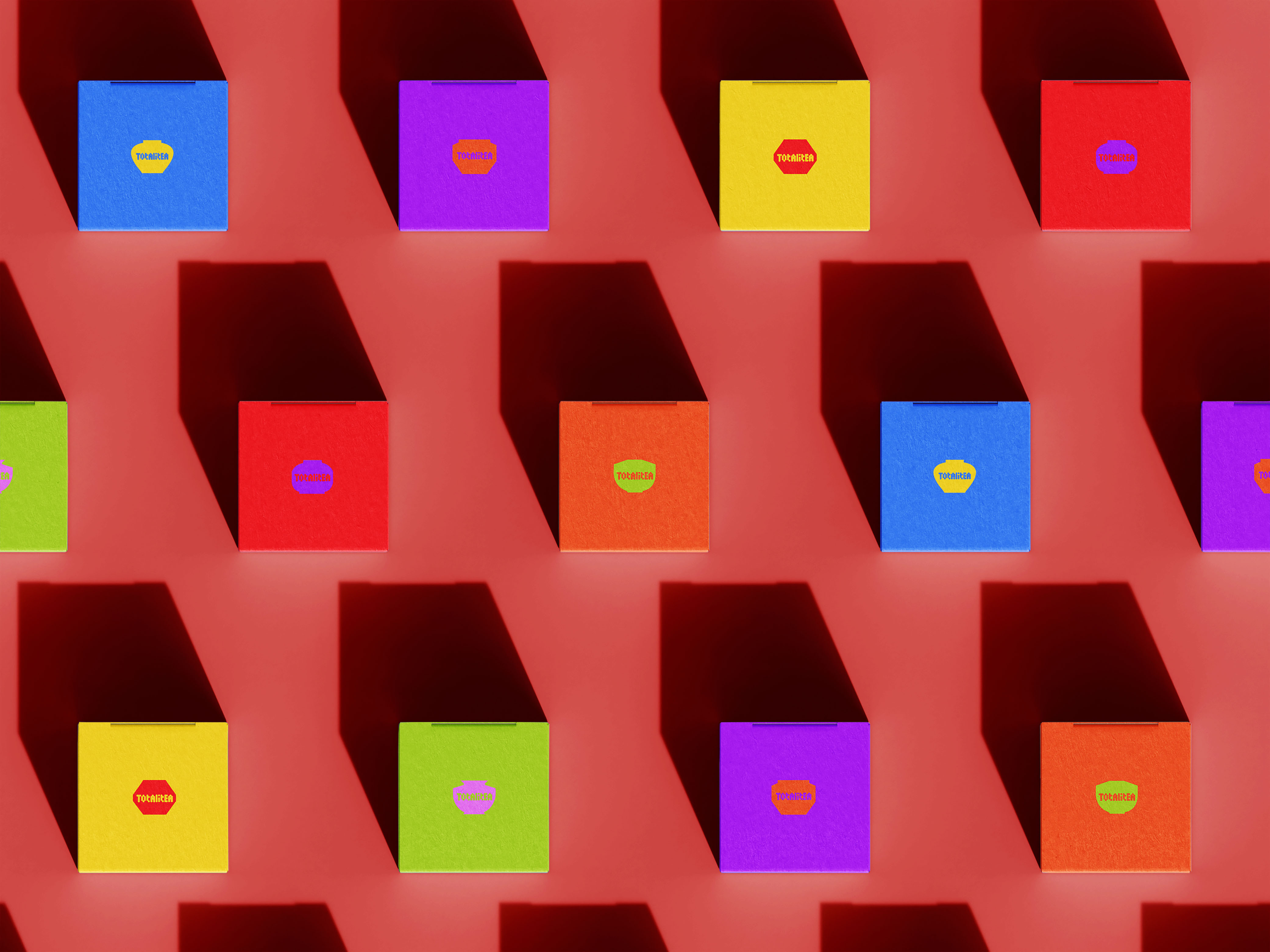
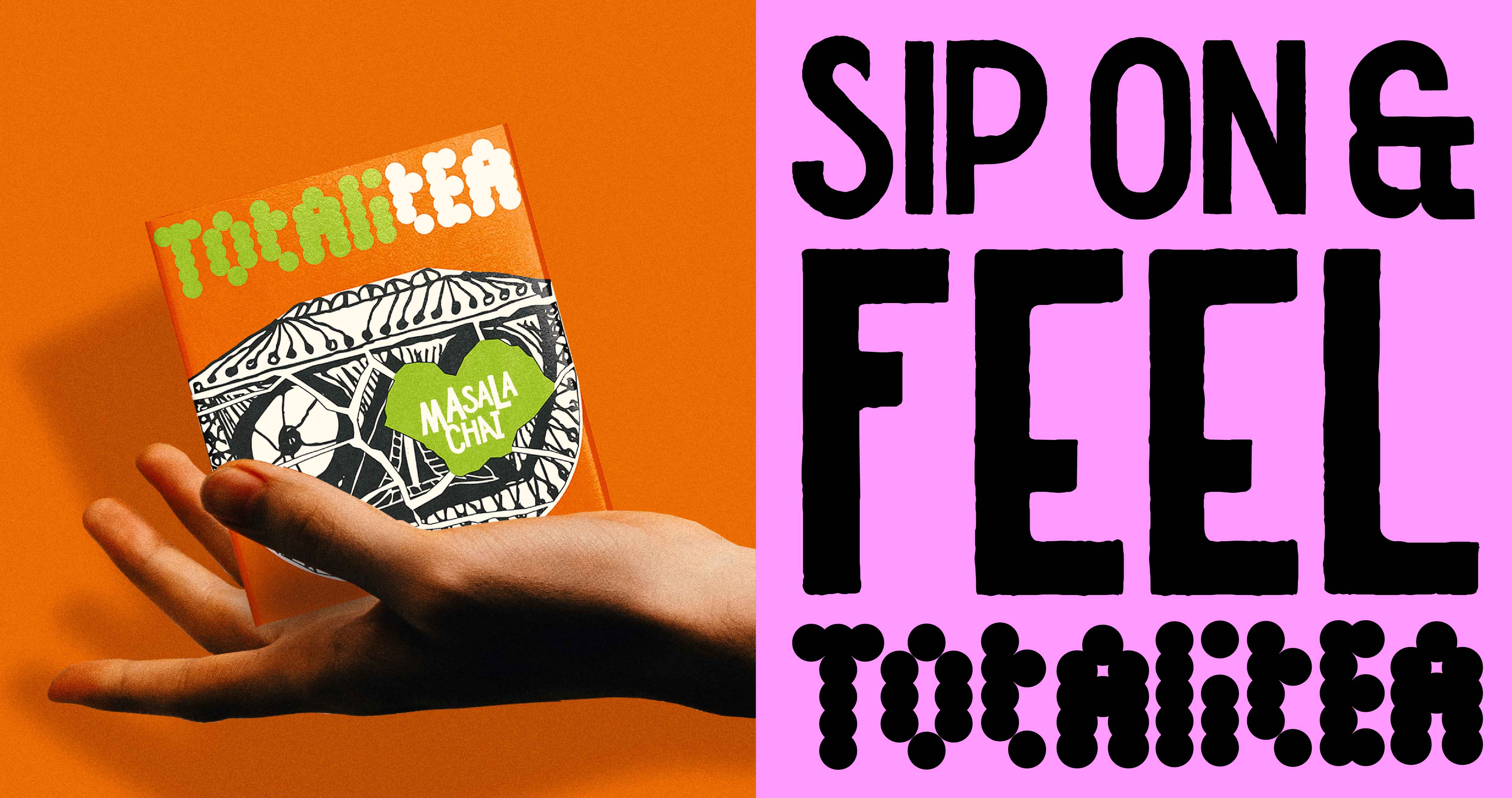
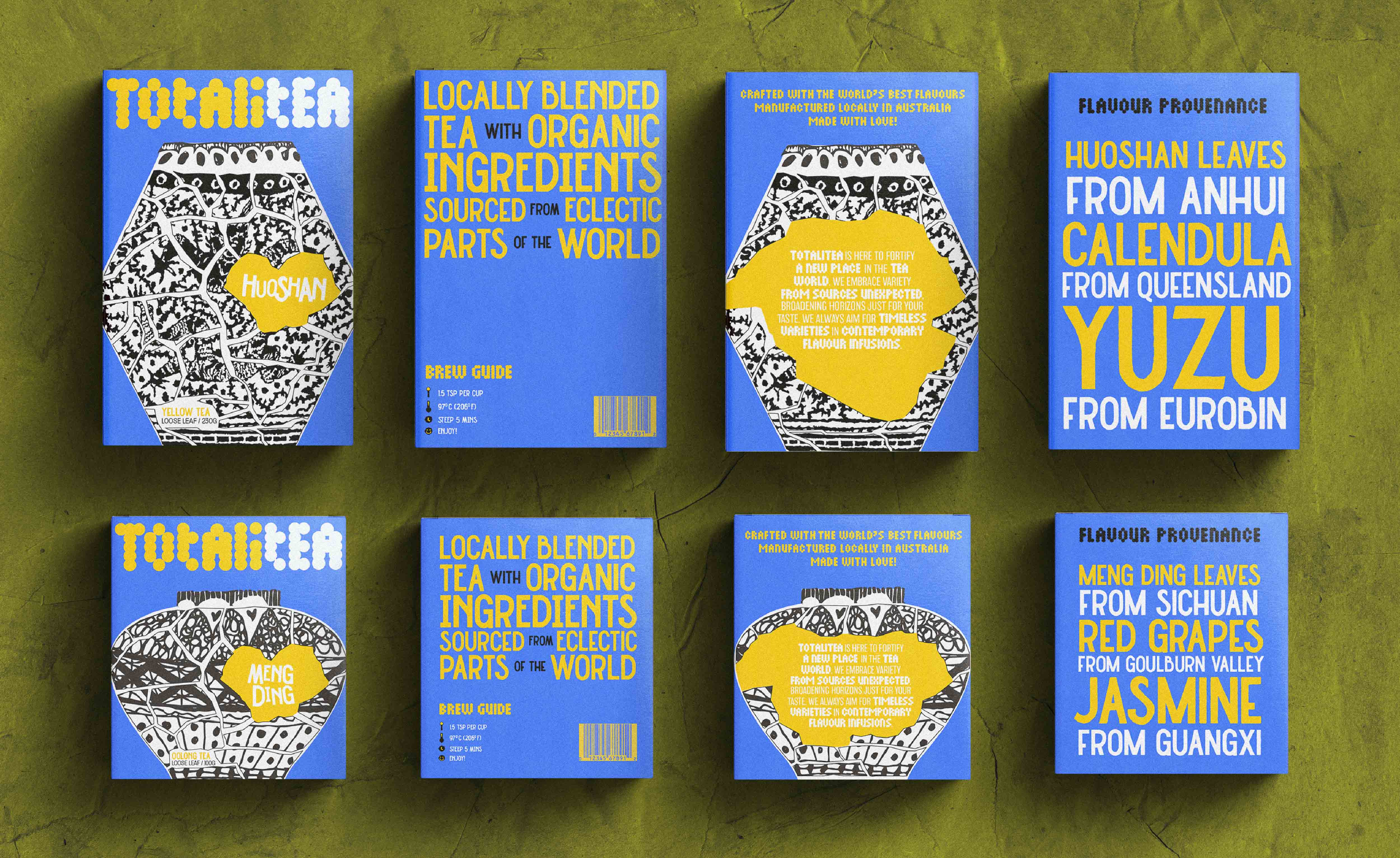
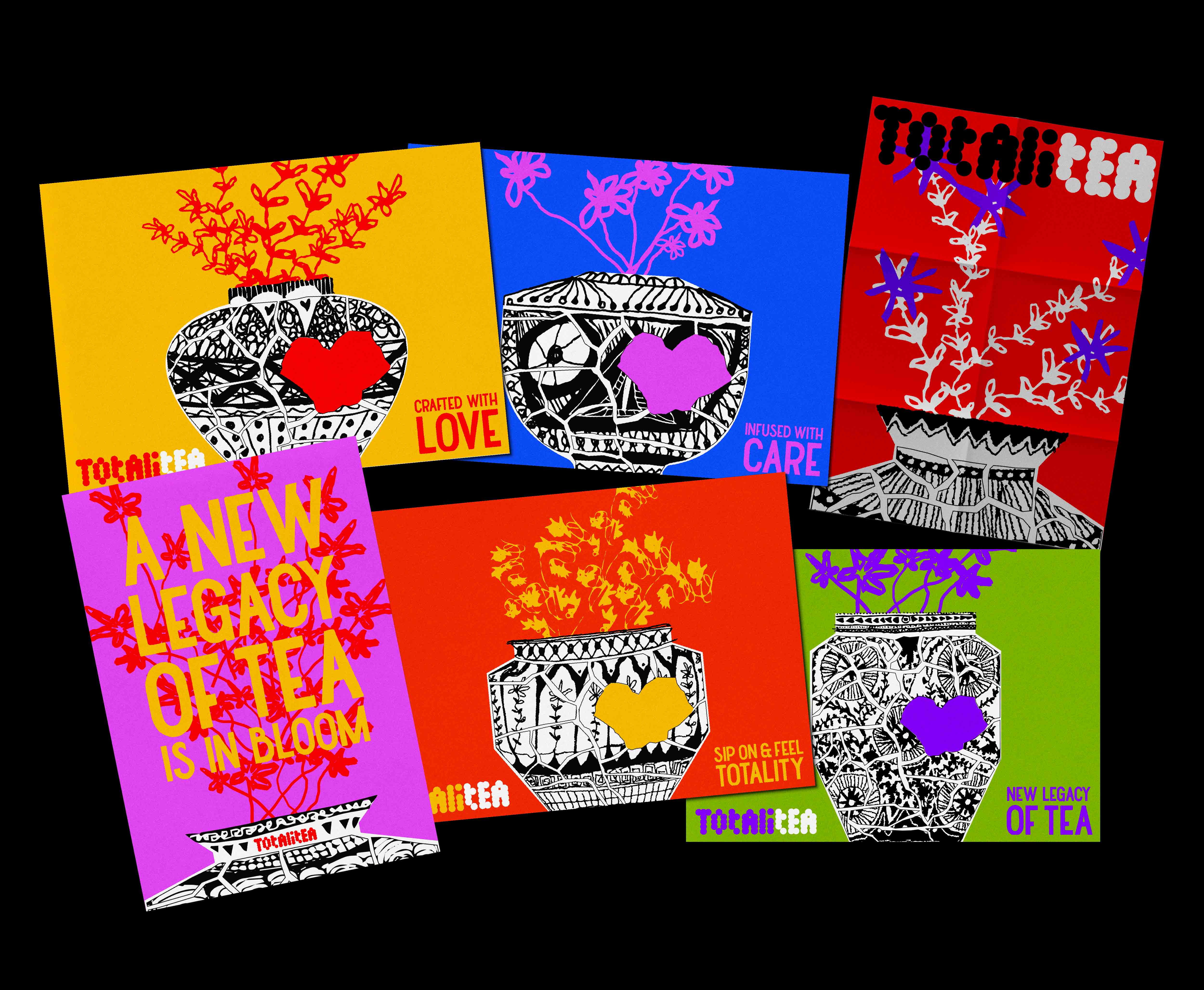
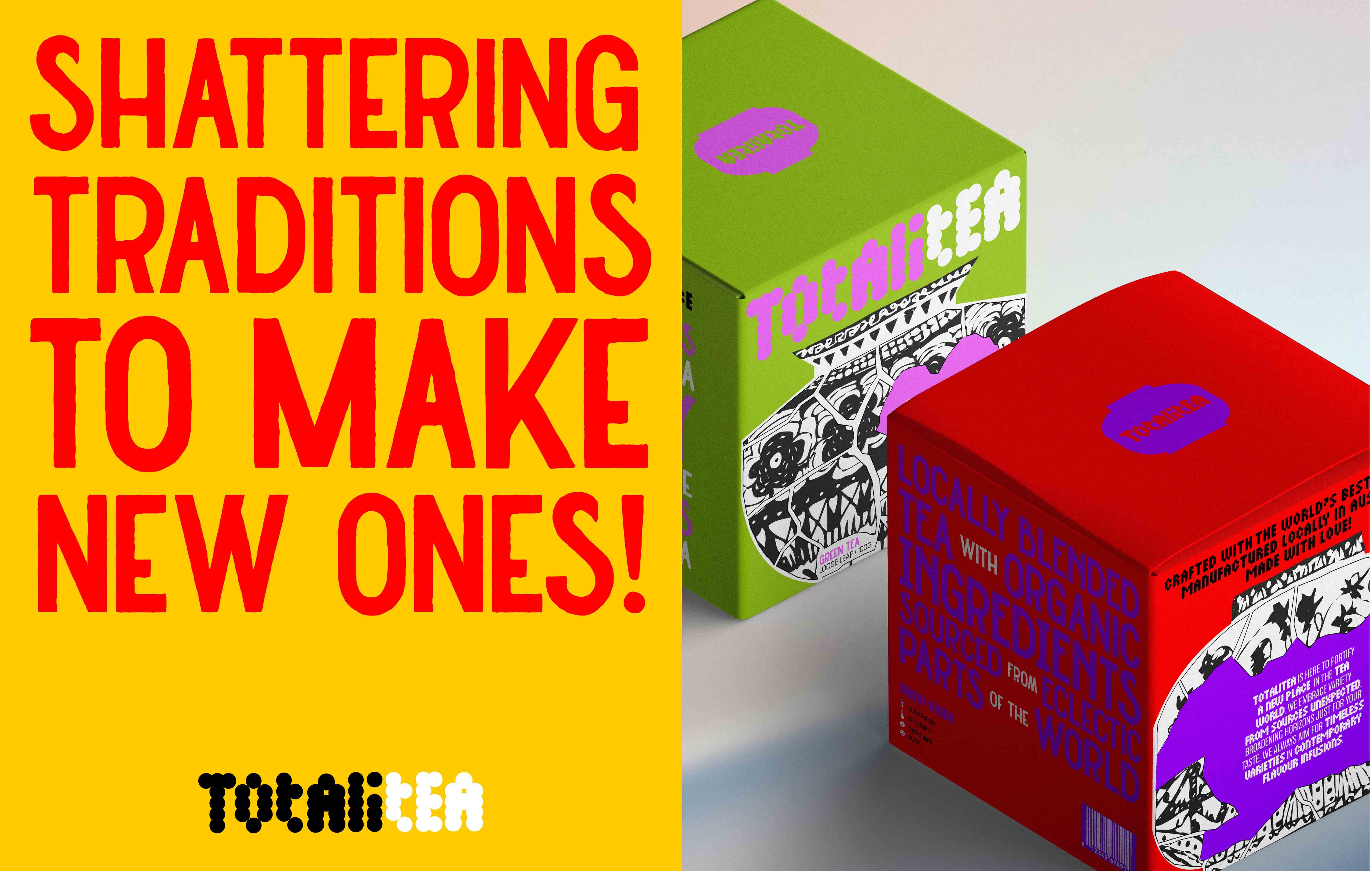
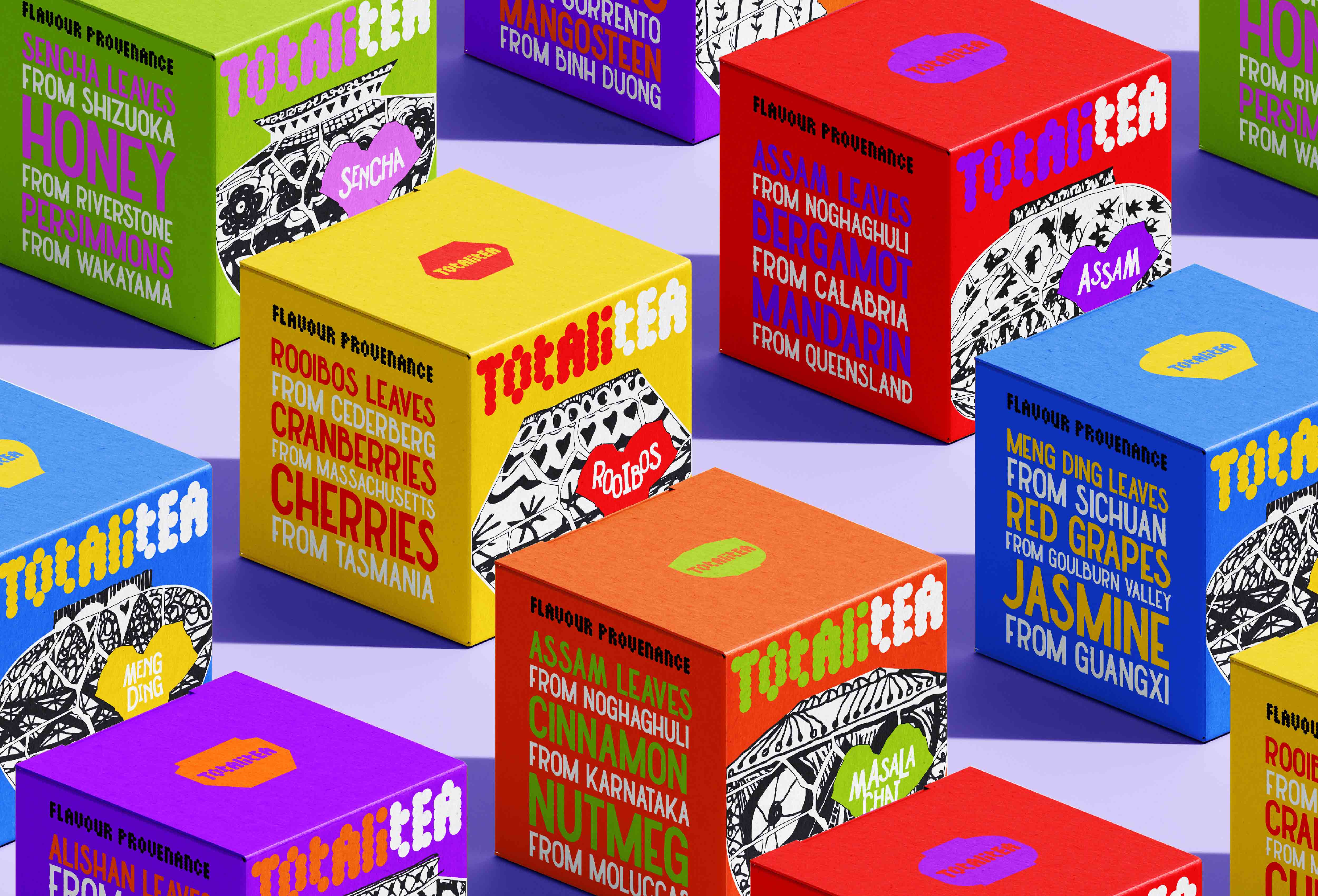
This project illustrates the brand identity and packaging design for TOTALITEA, the name of a fictitious new tea brand concocted by myself. The brand harnesses its visual identity by the intention of marketing the line to a younger demographic - with the hope that the customers will be encouraged to inherit these important cultural relics whilst simultaneously staking out for newer histories, traditions and rituals that are completely of their own as they embrace the product.
The narrative that headlines the identity and packaging strategy for TOTALITEA is inspired by the Japanese practice of Kintsugi and the embrace of broken things. Through the taste and ritual of our tea, the brand aims to shatter traditions in able to encounter something that is entirely new yet beautiful.
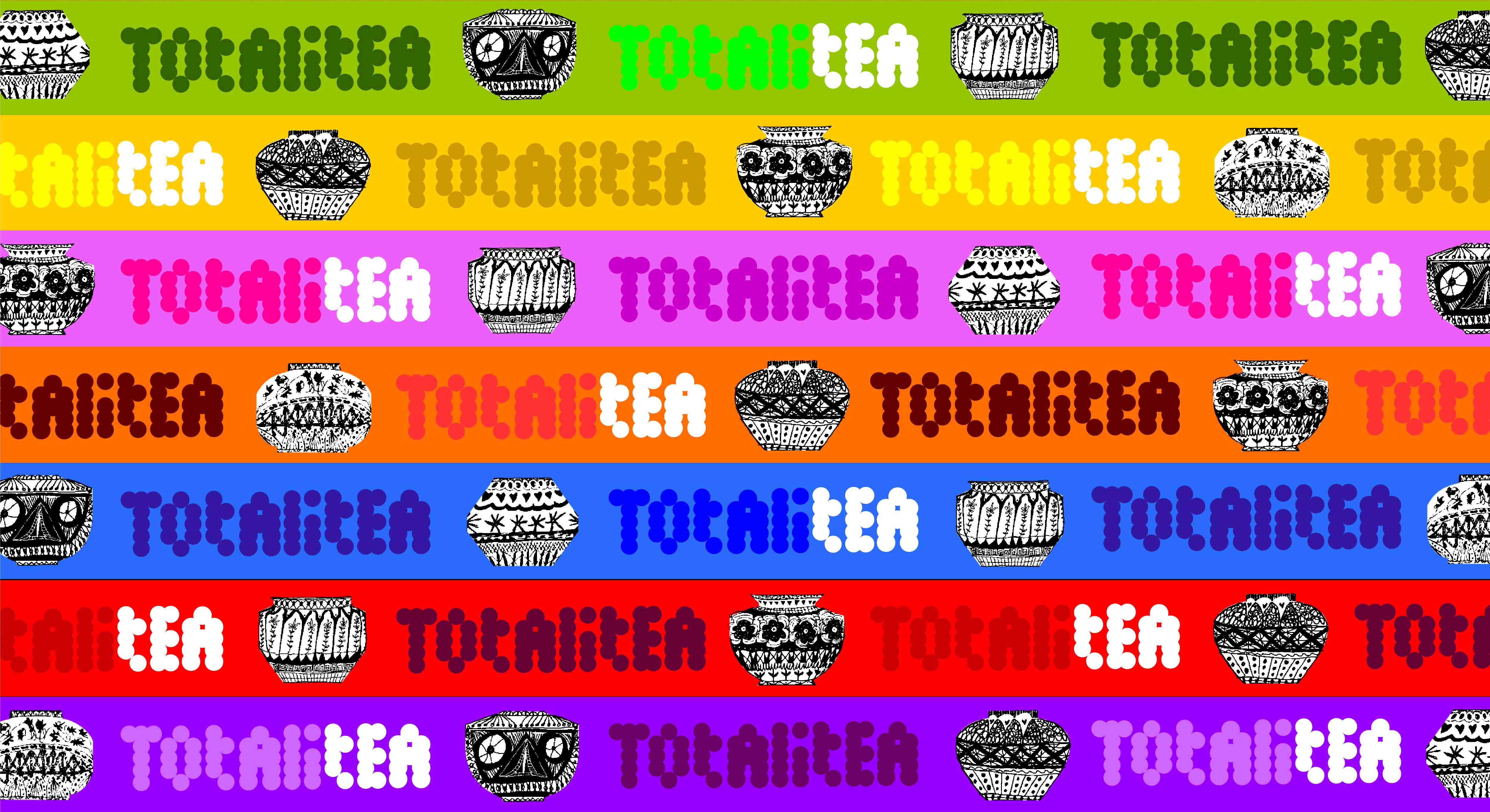
The graphic identity adheres to the visuals of porcelain inspired by traditional blue-and-white pottery and chinoiserie design. The porcelain is designed to be culturally ambiguous to reflect the brand's embrace of different ingredients sourced across the globe. The visuals attempt to tamper with tradition; something seemingly fragile and ornate, by use of a rough and organic hand-drawn illustration style.
Additionally, the identity and retail packaging dons a vibrant colour palette to represent the eclectic varieties of tea on offer.
The vision overall is to have the packaging captivate the wandering eye through full force as it asserts its visual presence on the retail shelves like ornaments atop a mantelpiece.
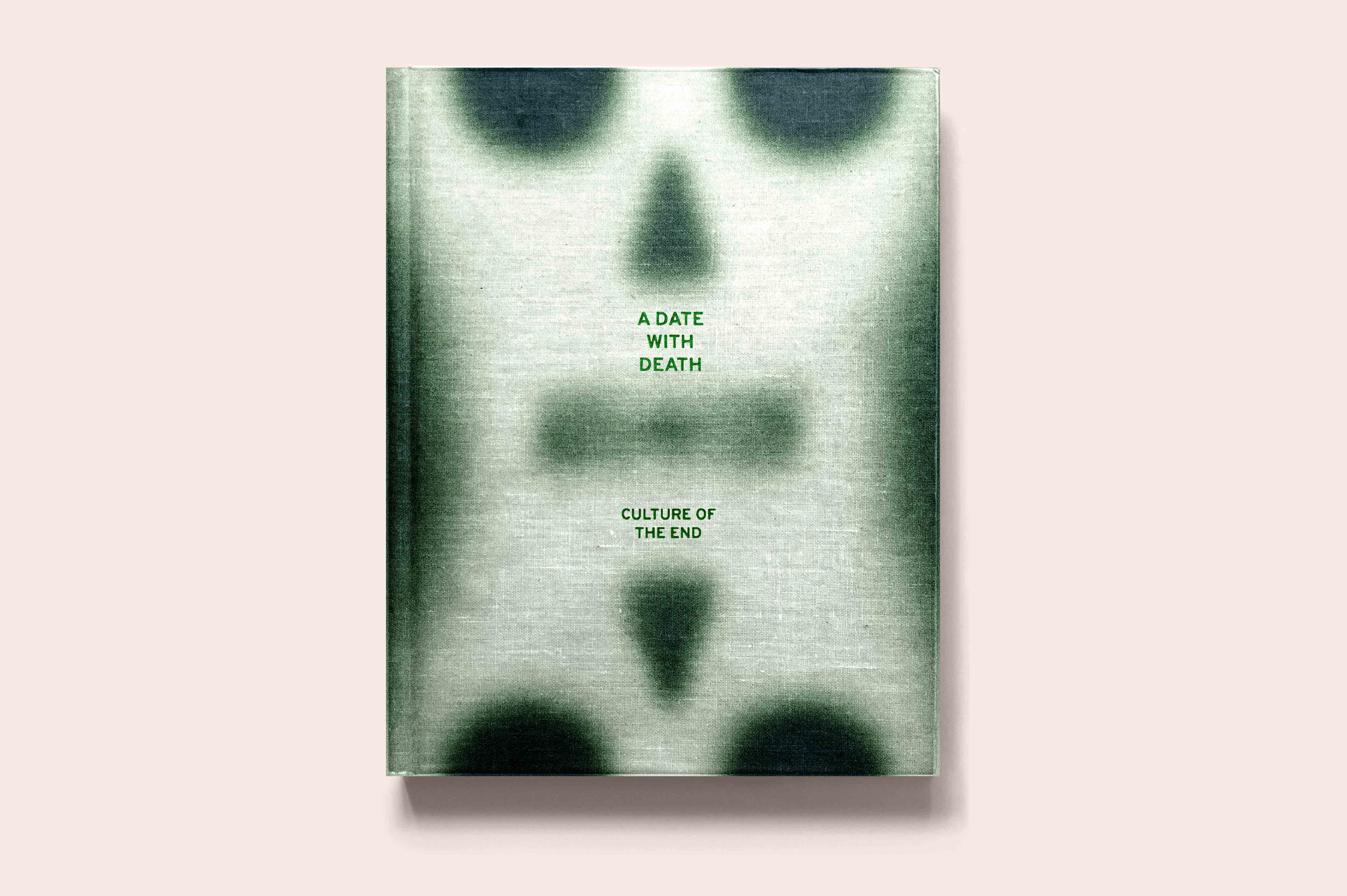
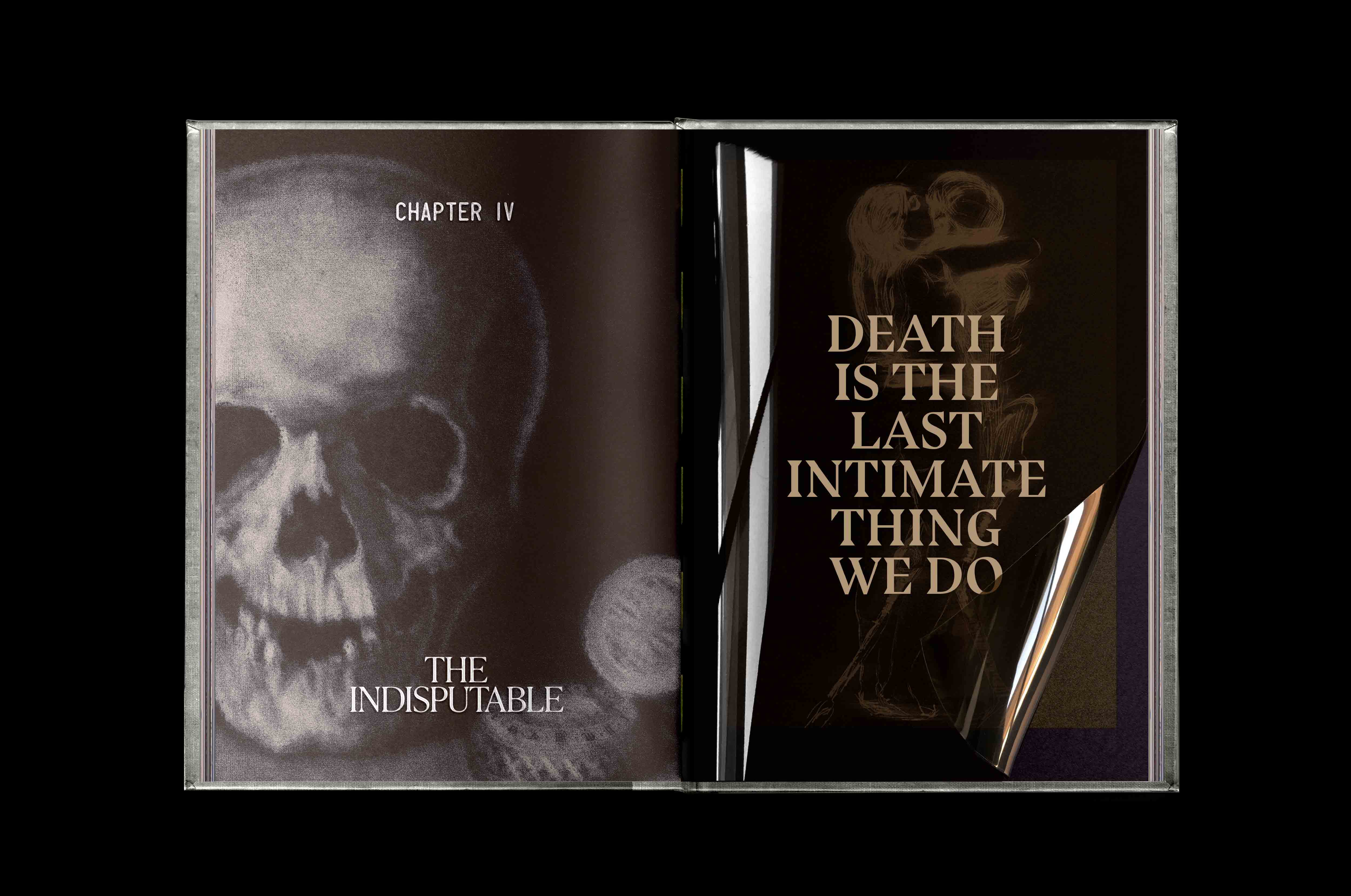
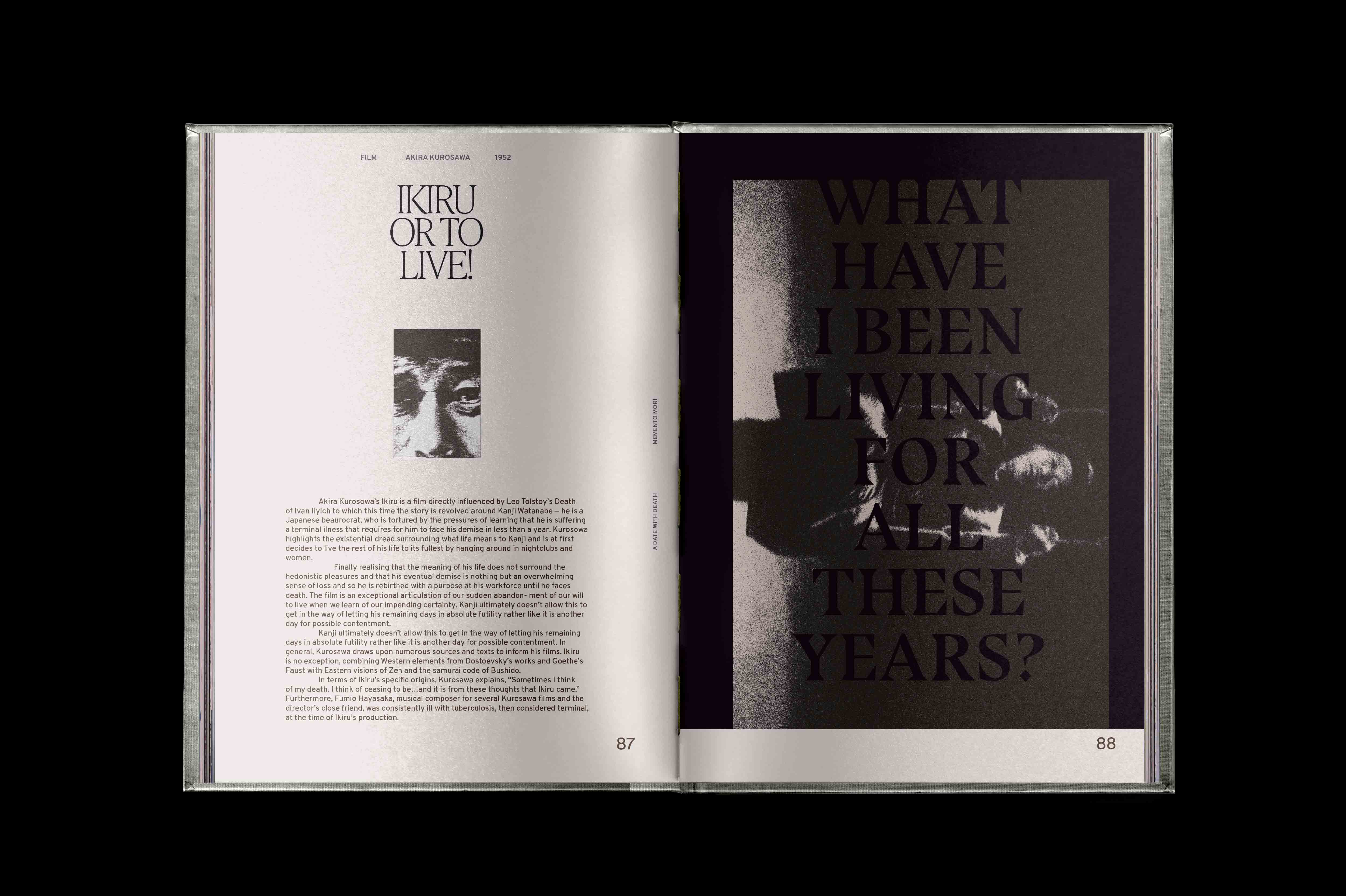
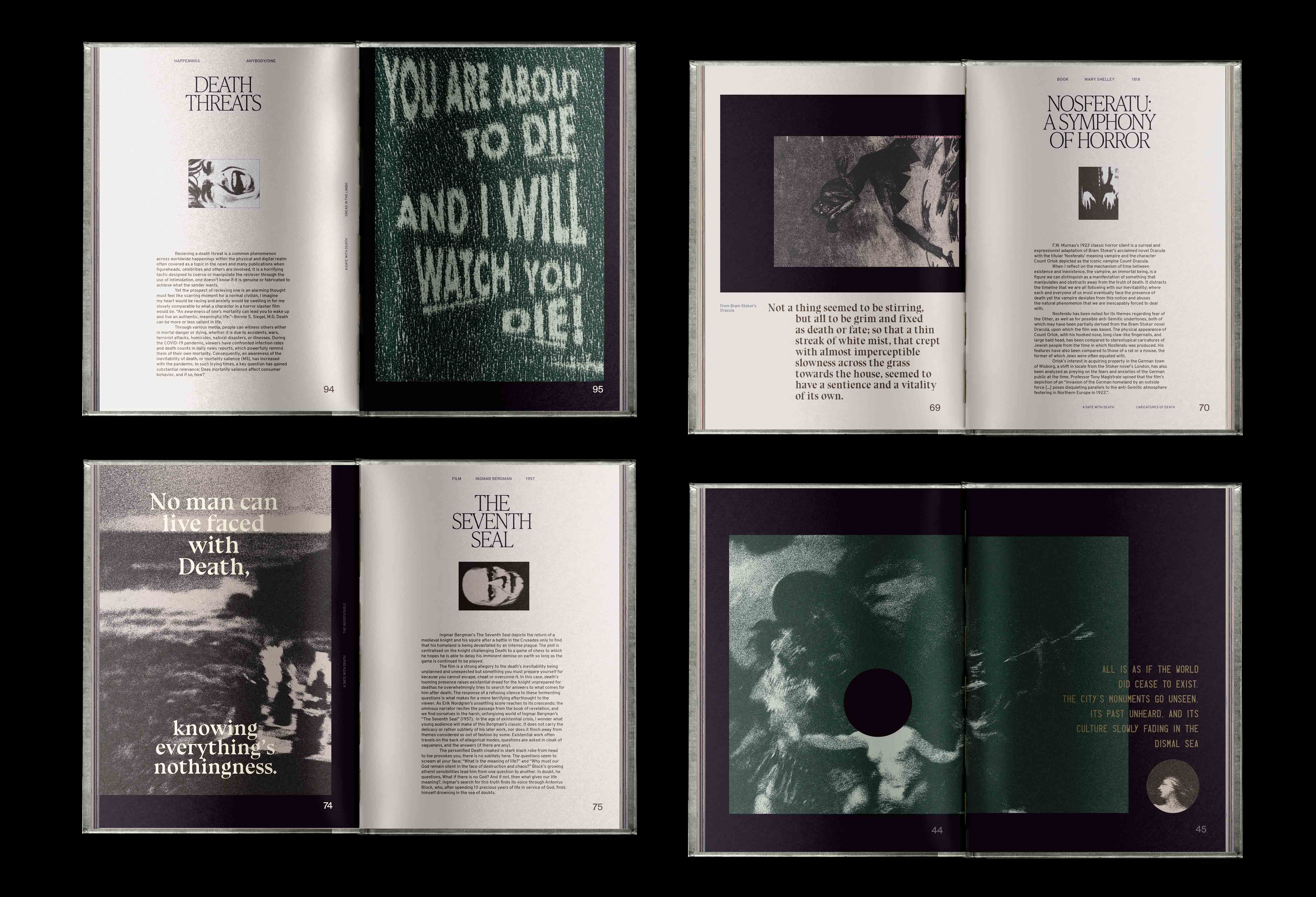
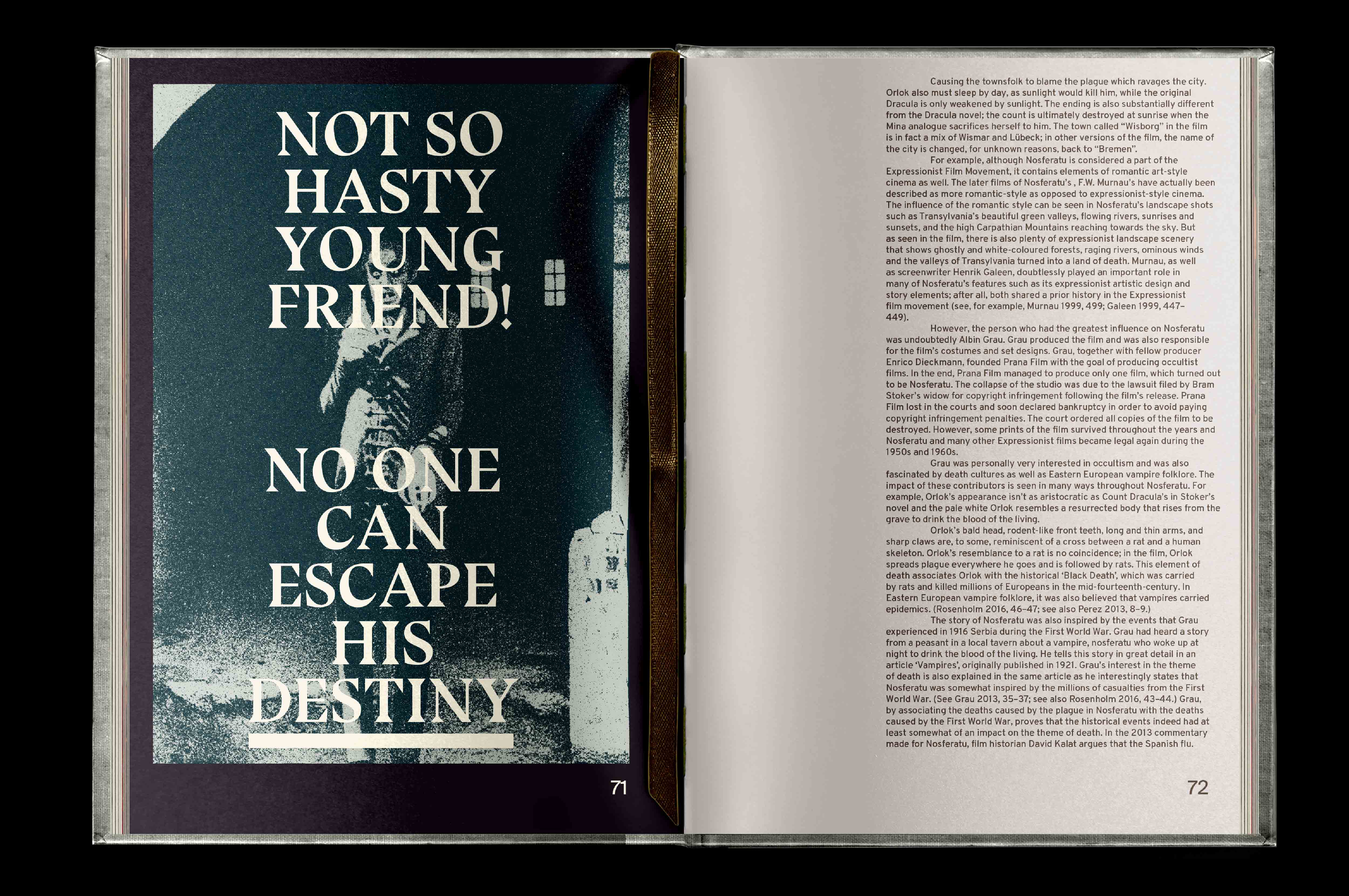
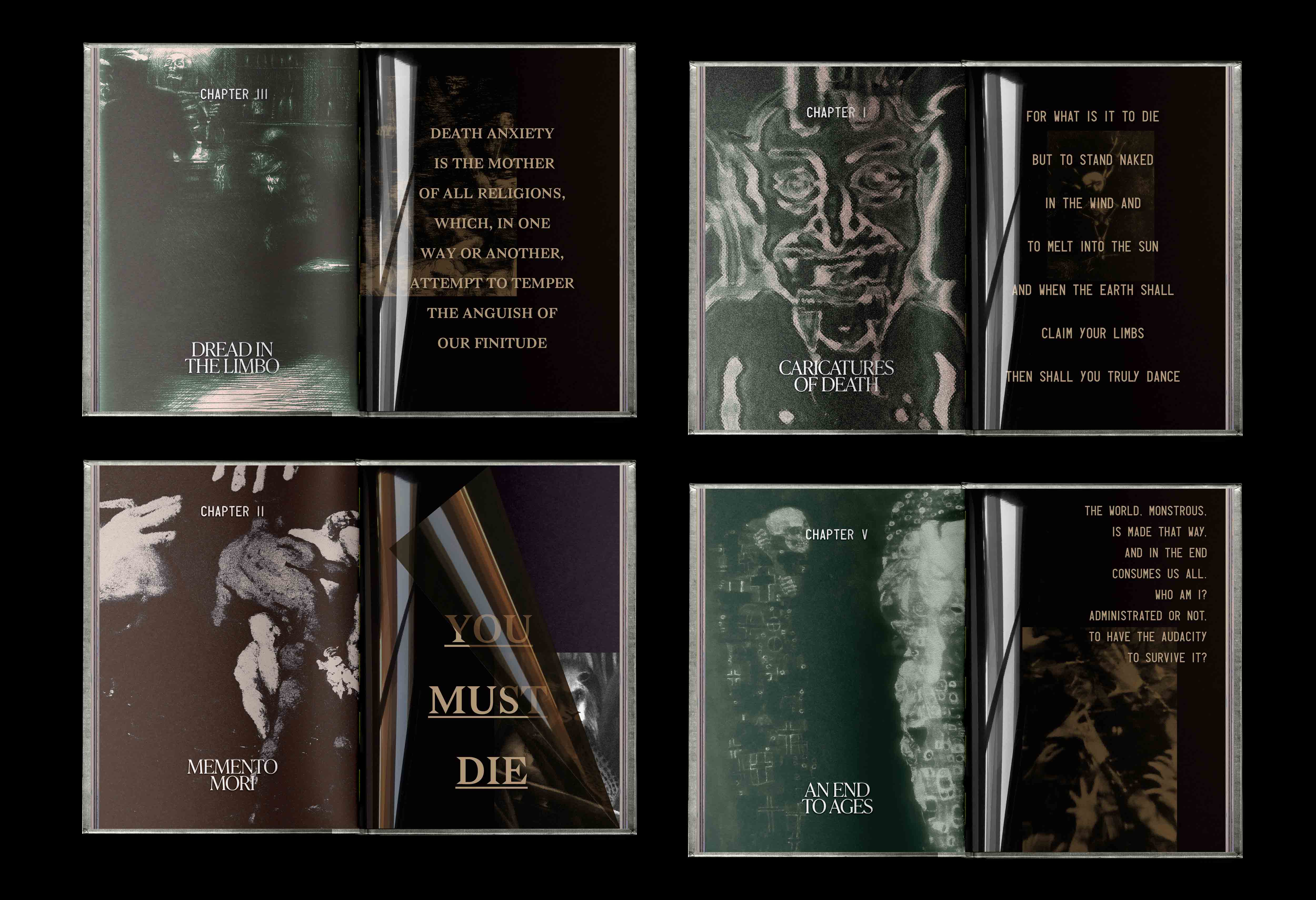
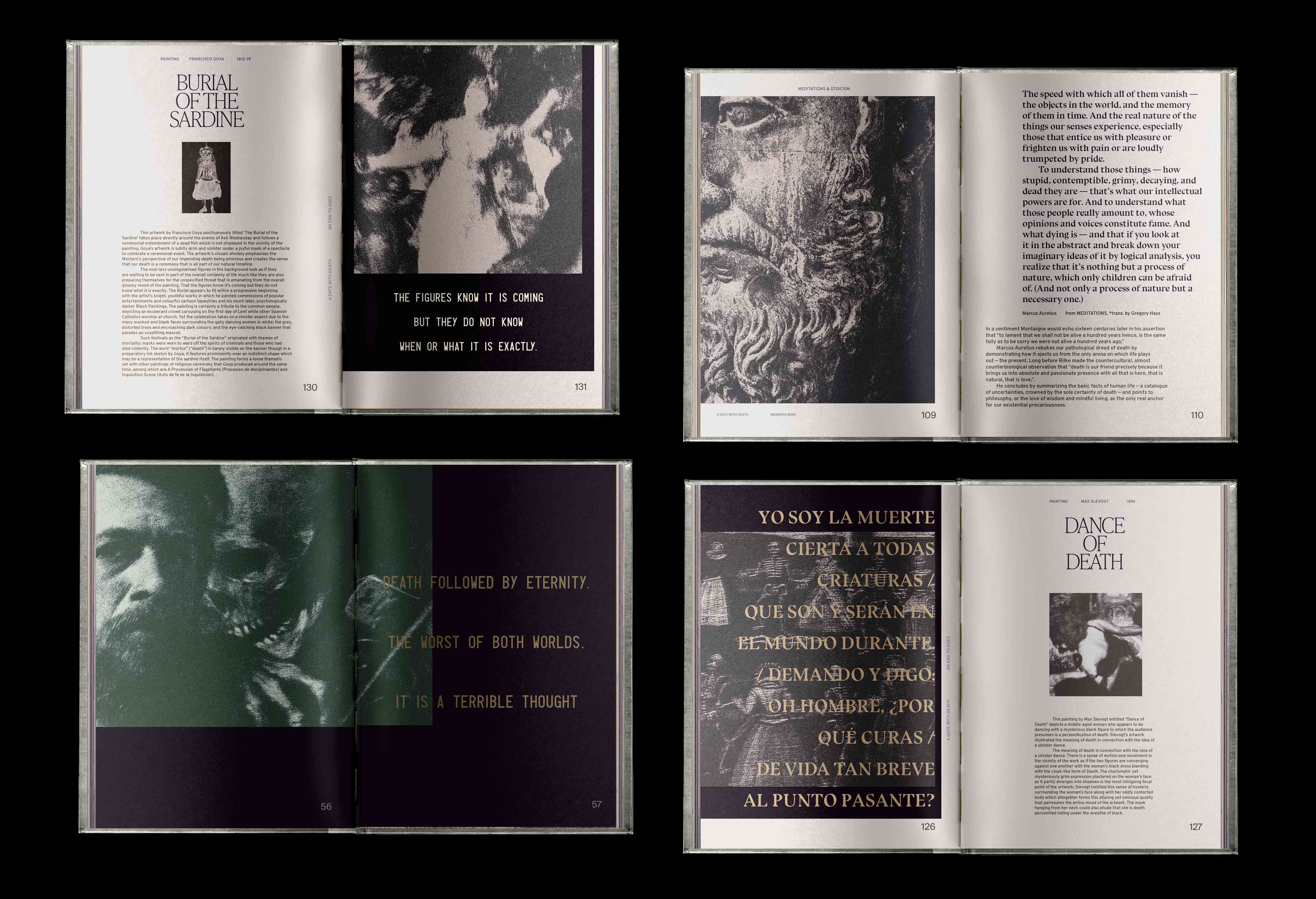
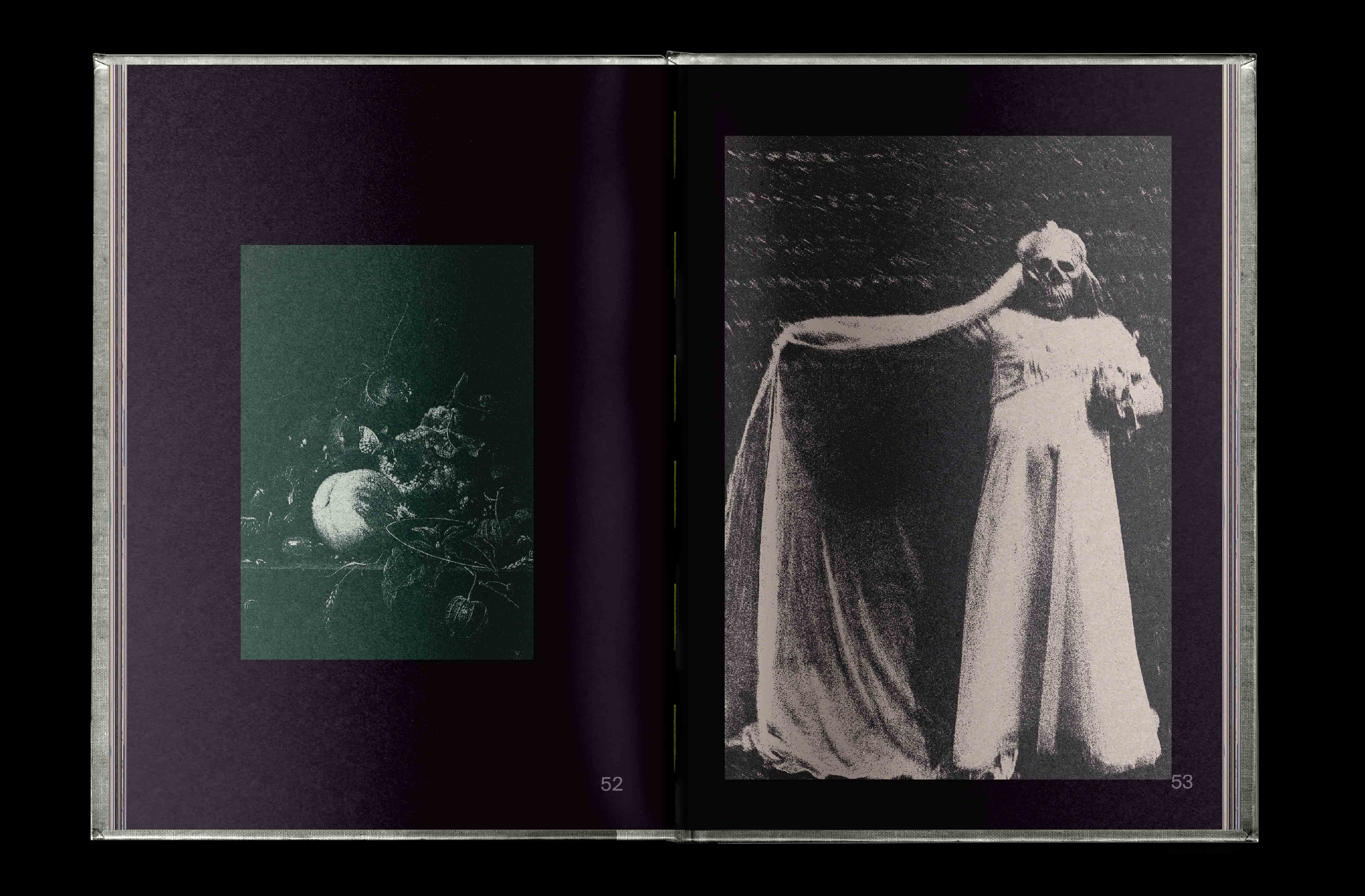
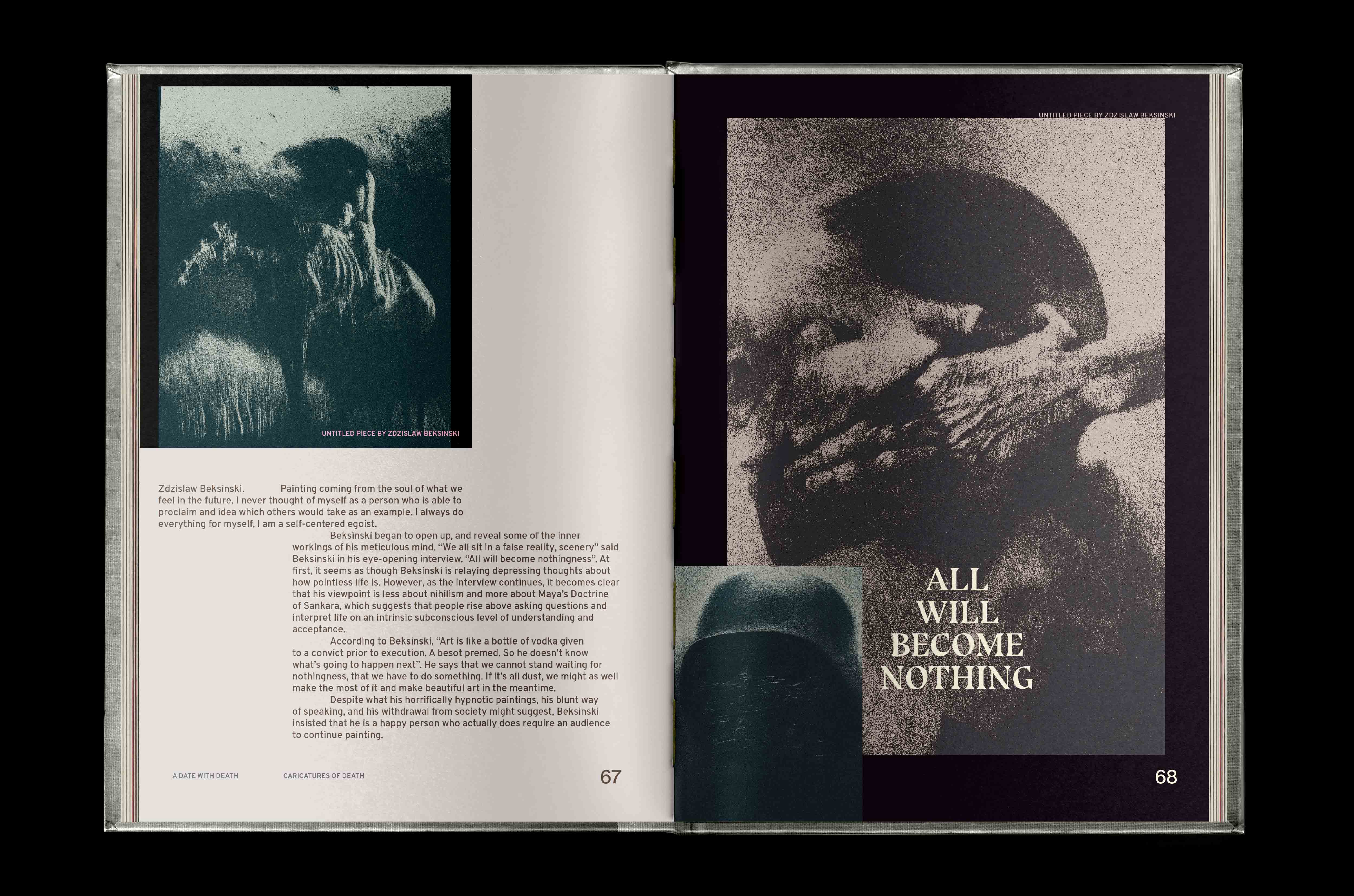
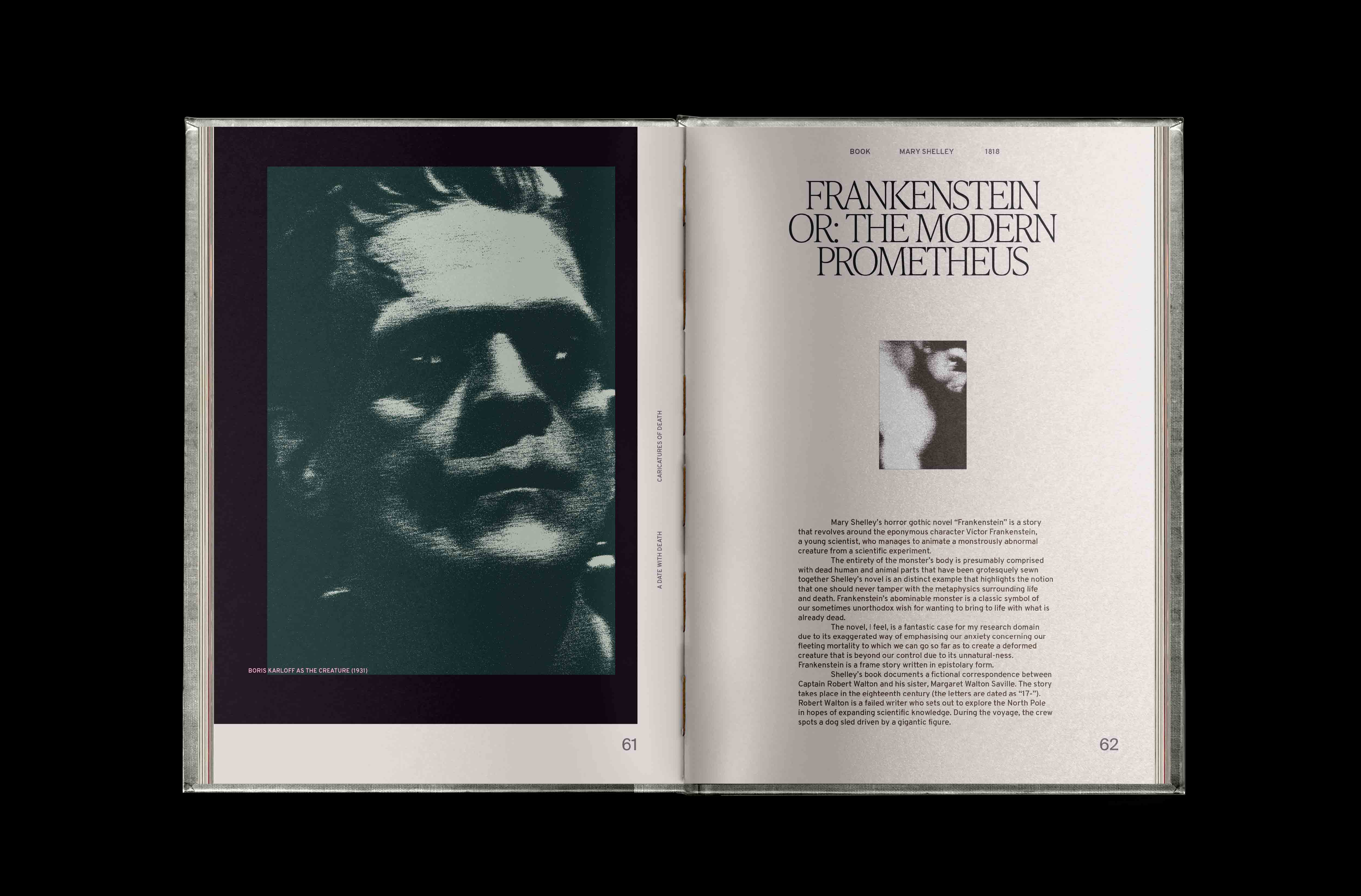
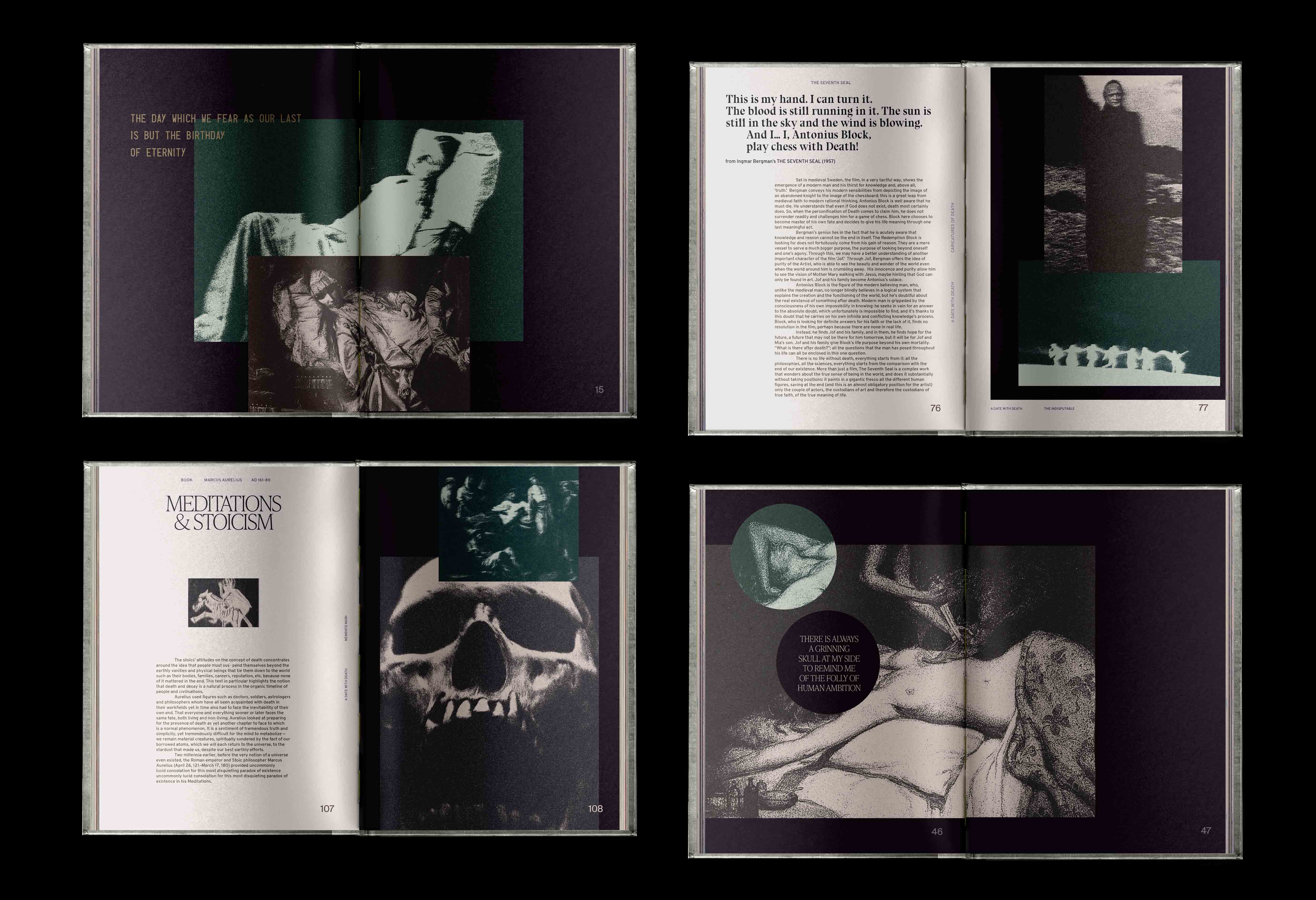
A Date With Death
Book, Art Direction, Digital Illustration and Collage.
Academic project for UTS: Insearch
Year: 2017 (redesigned 2023)
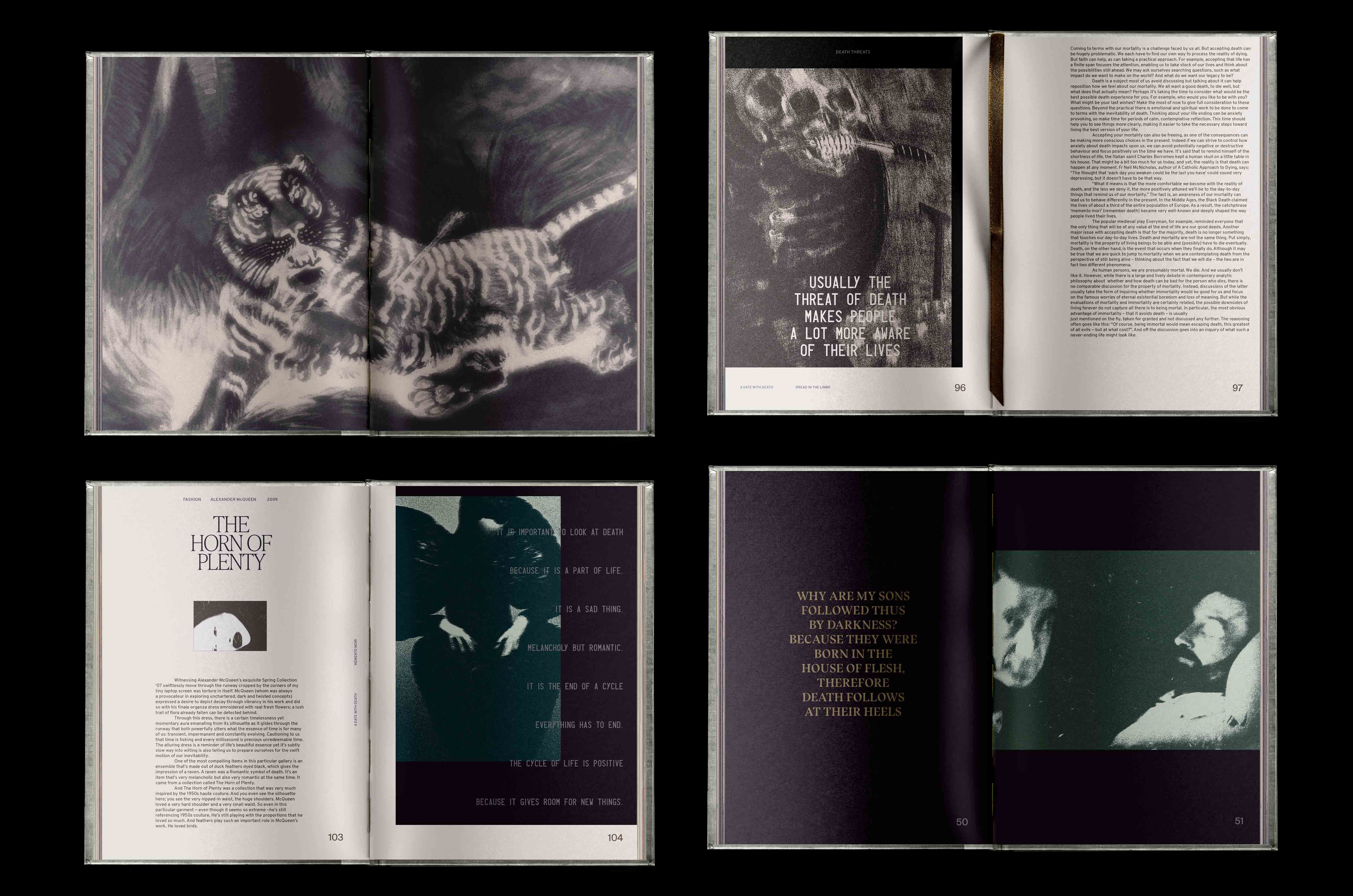
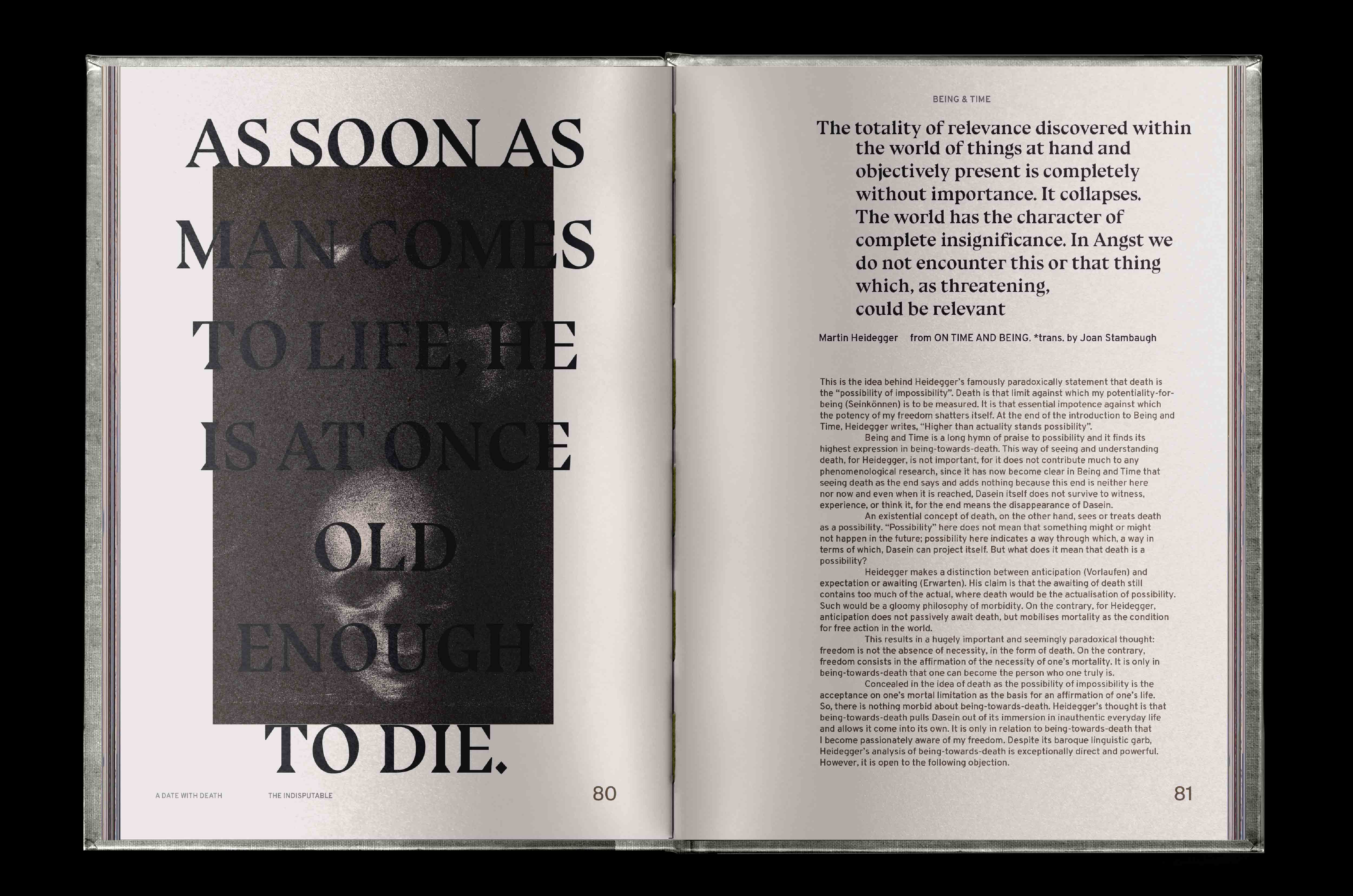
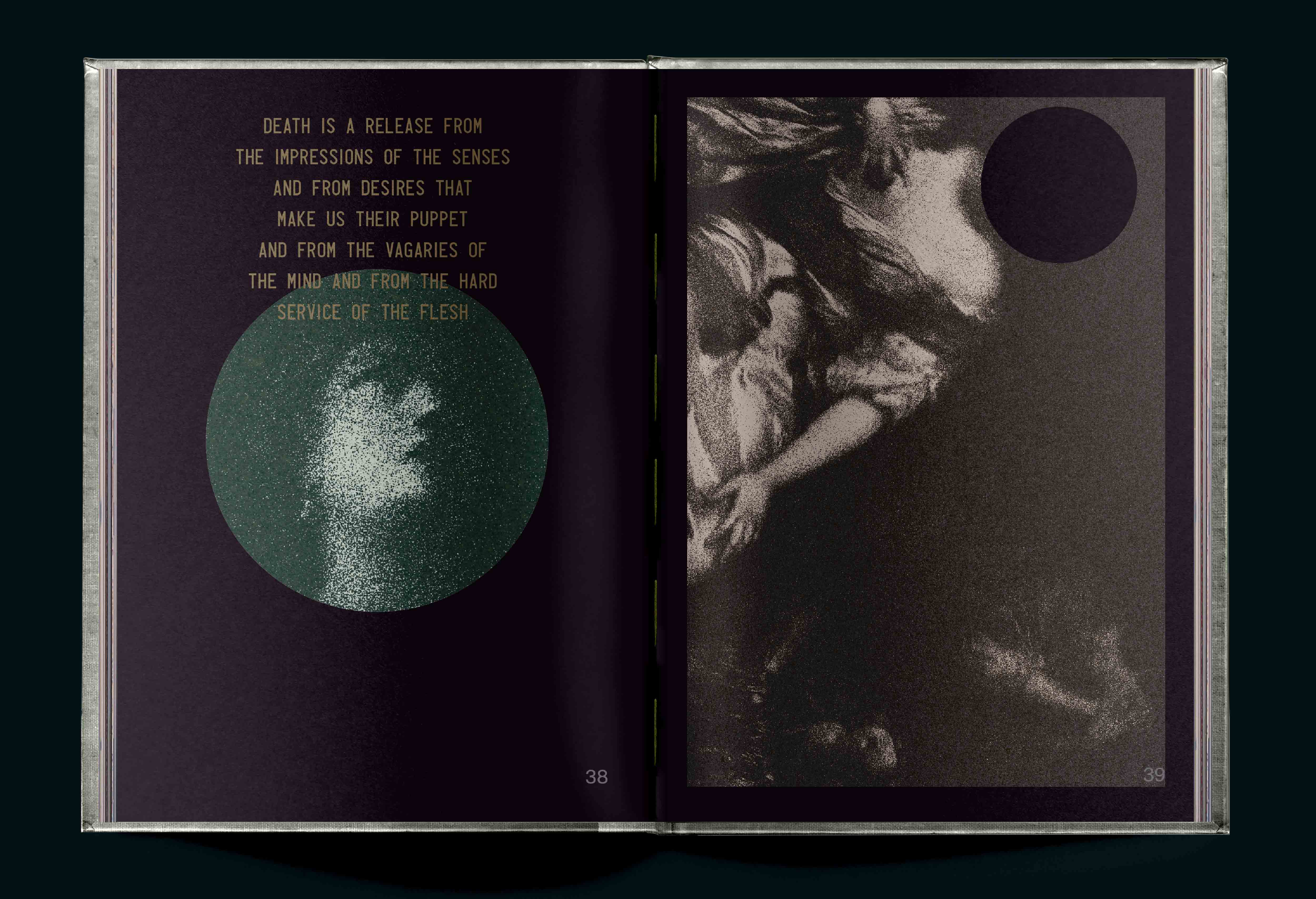
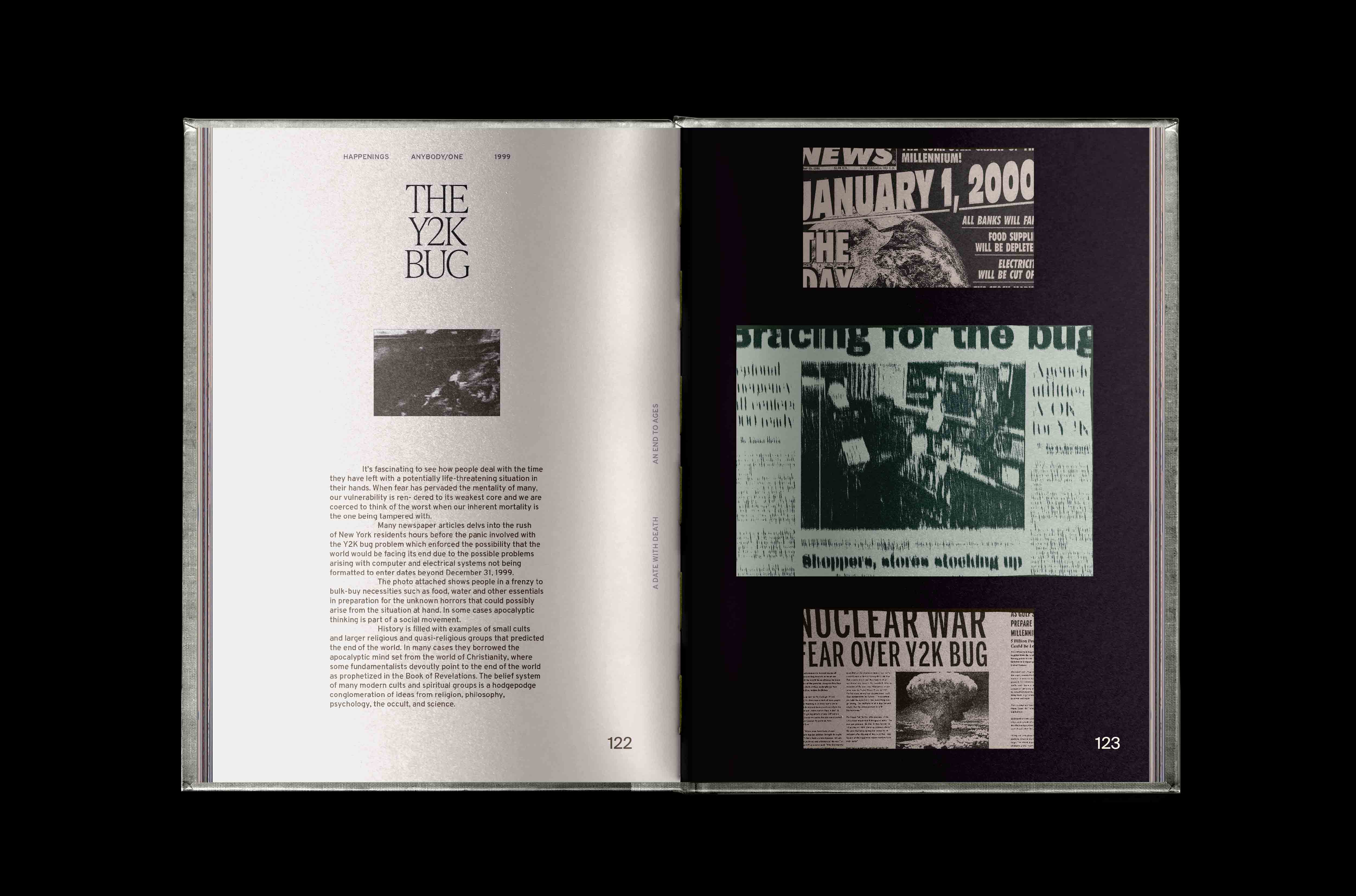
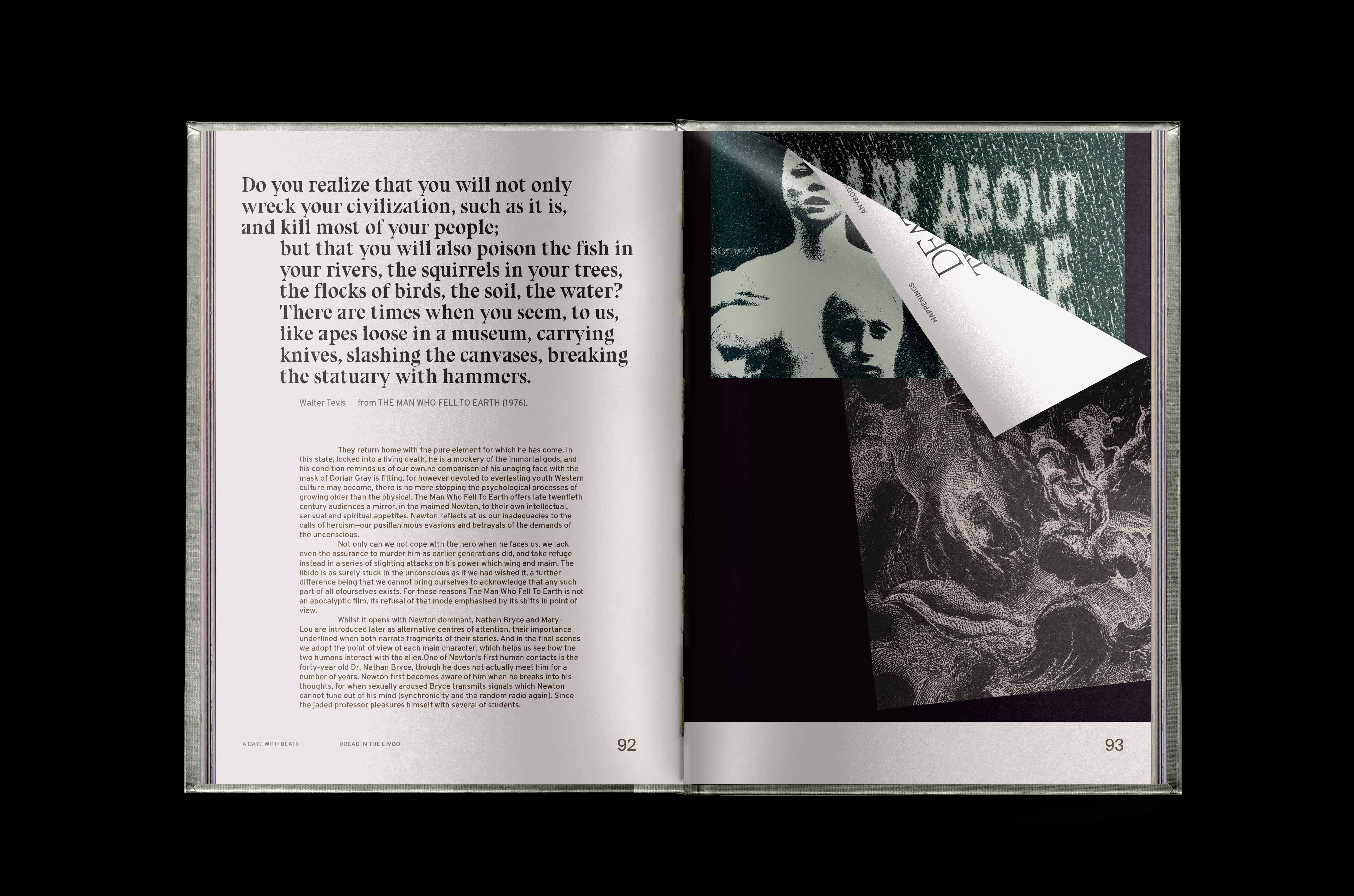
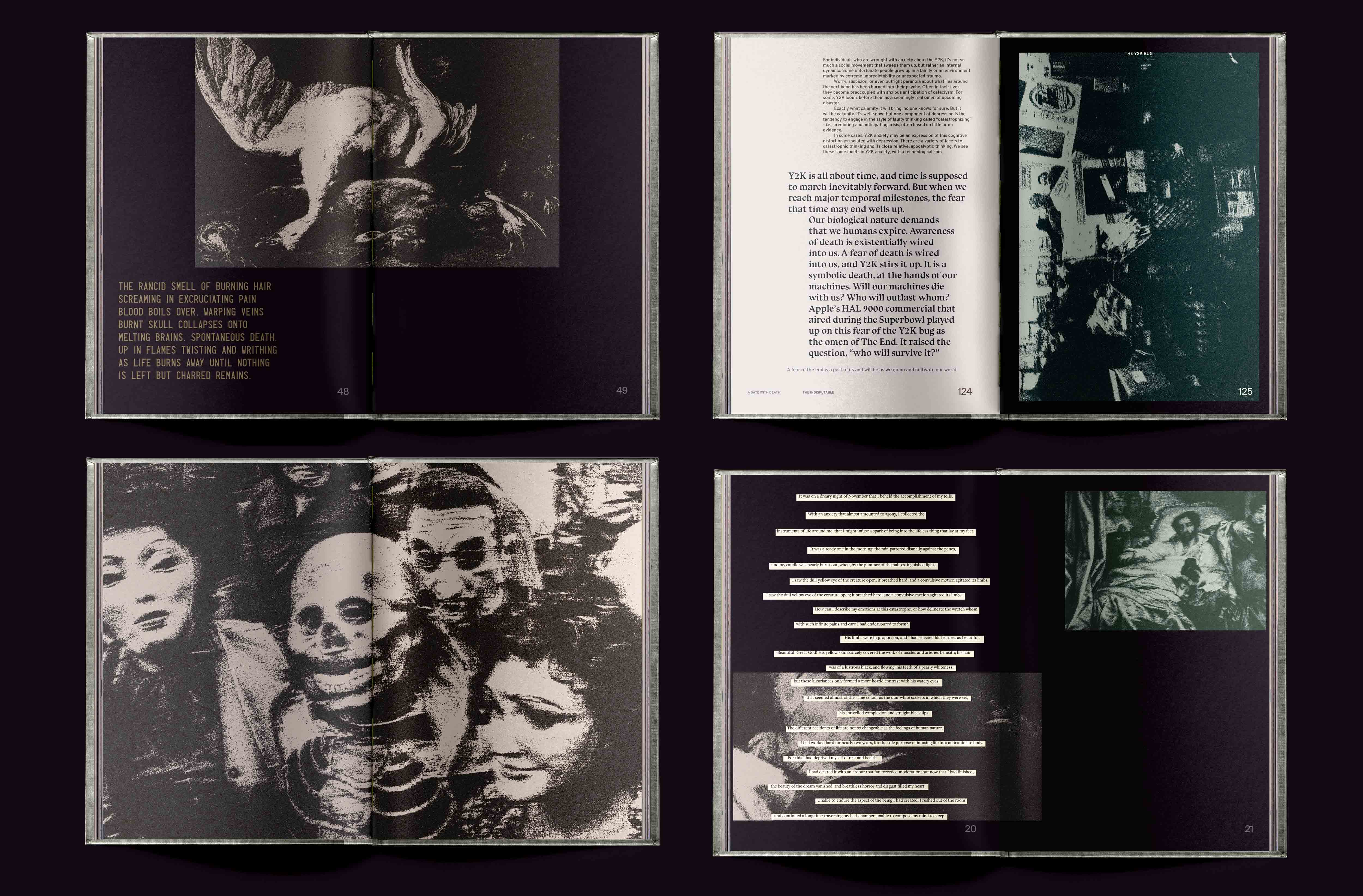
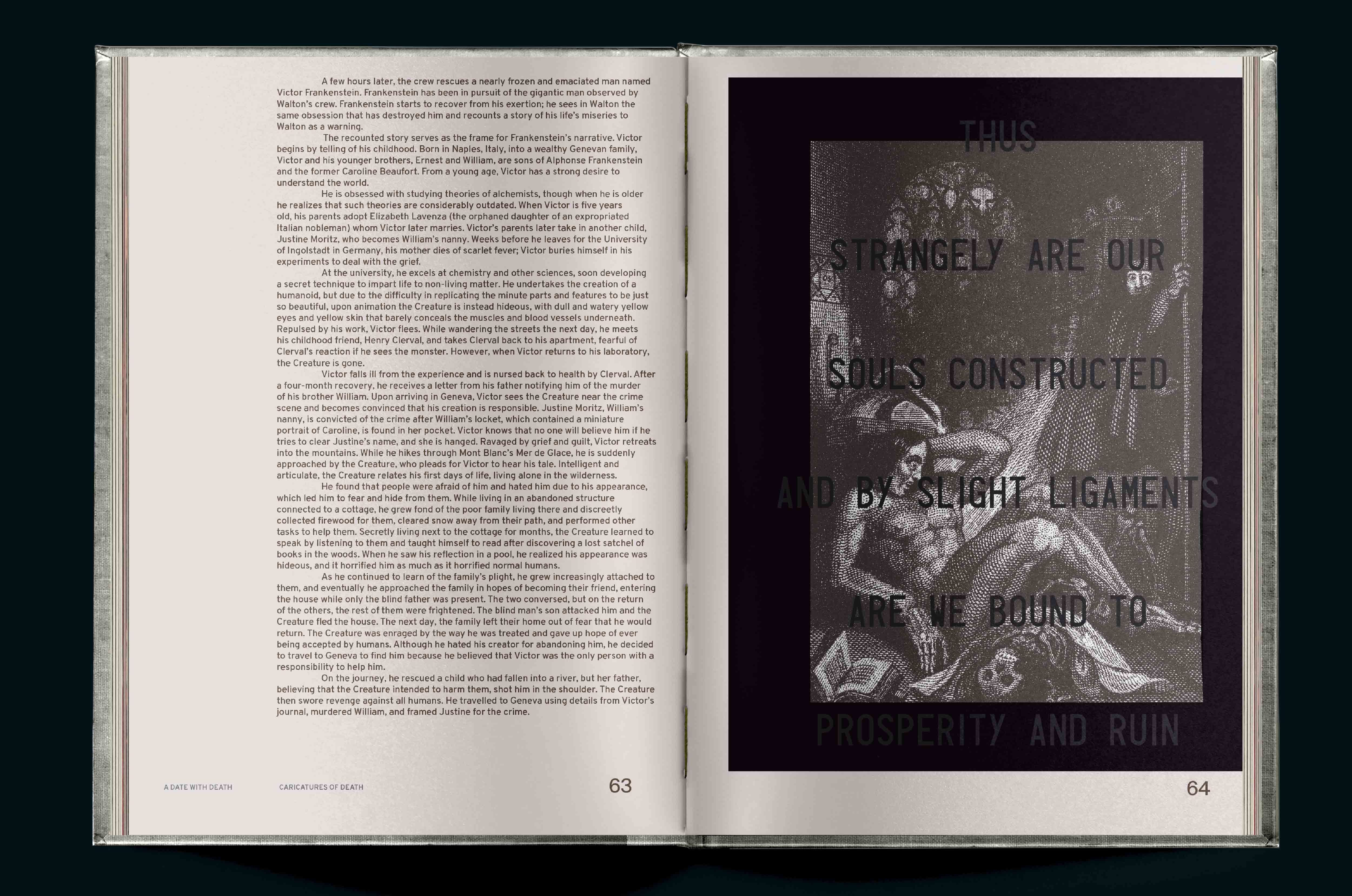
A memento mori in the form of a book that indexes the random and interesting ephemera I personally engaged with on the matter of death.
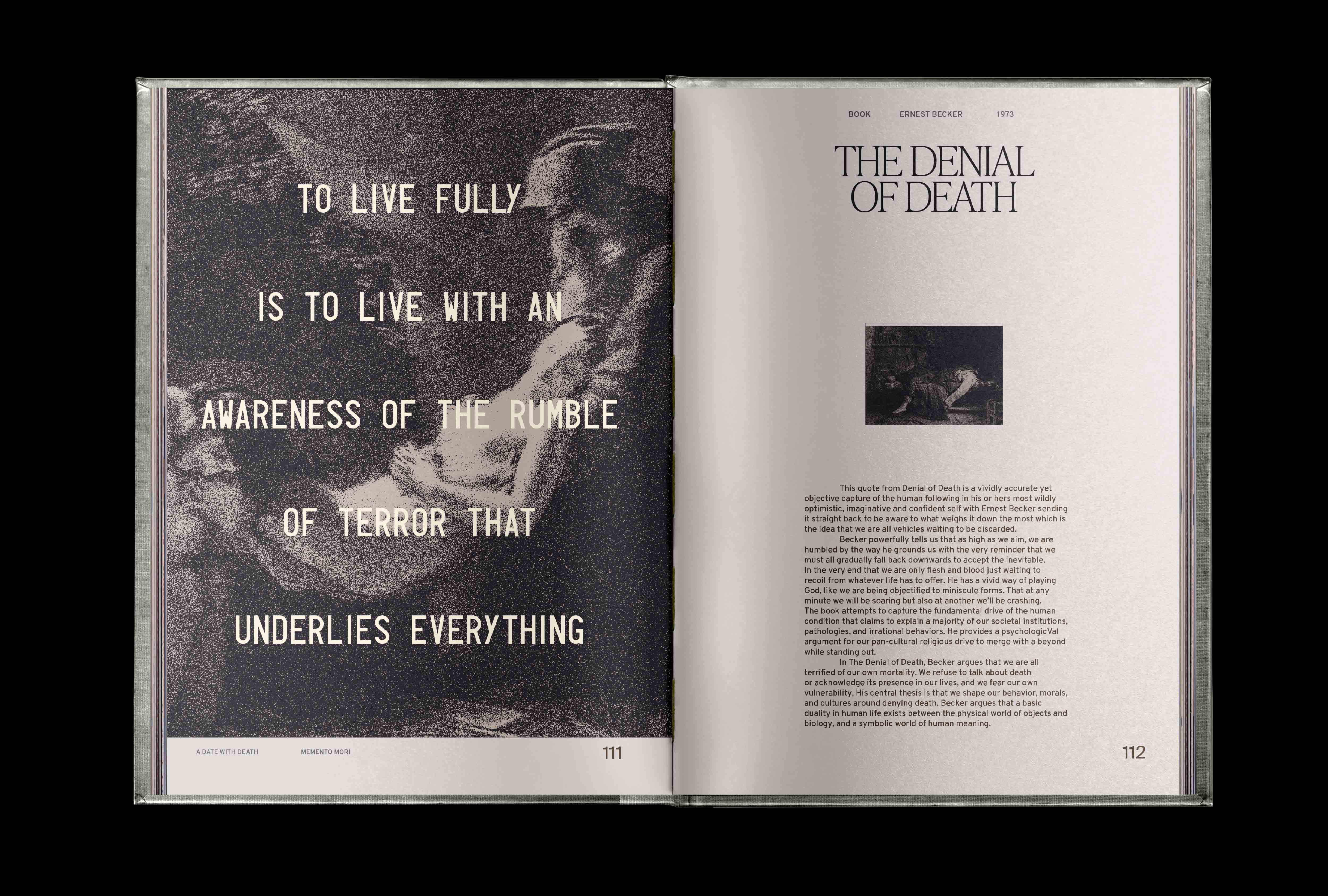
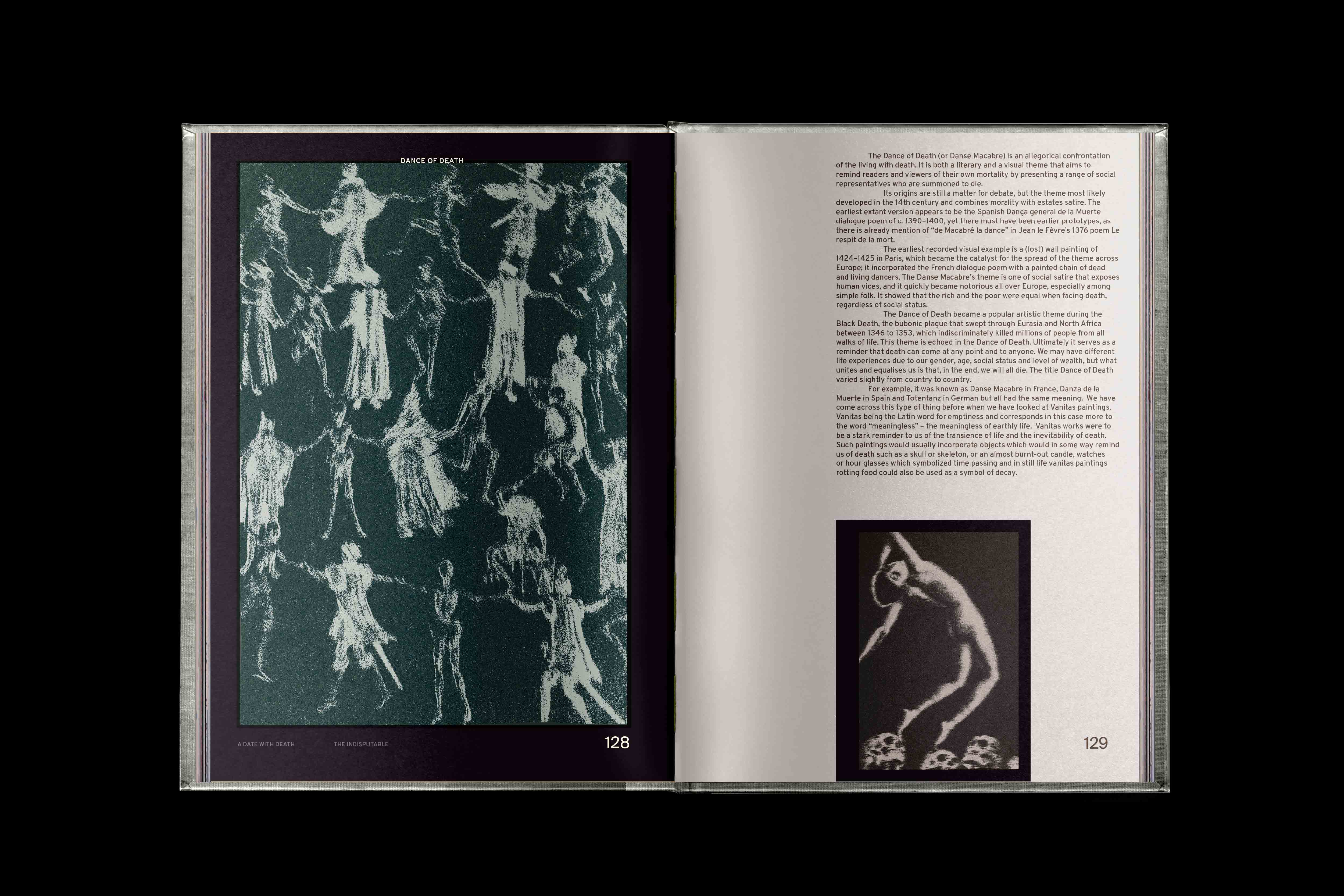
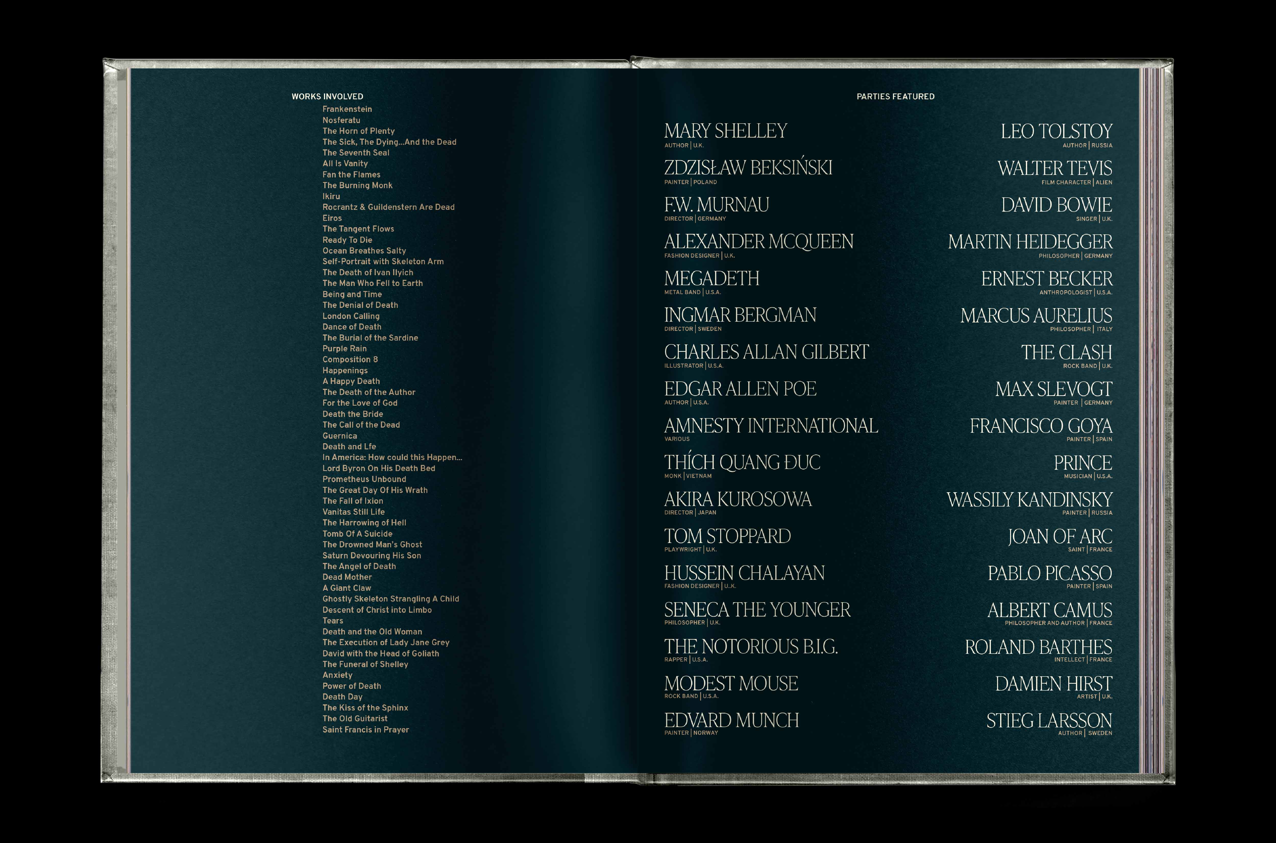
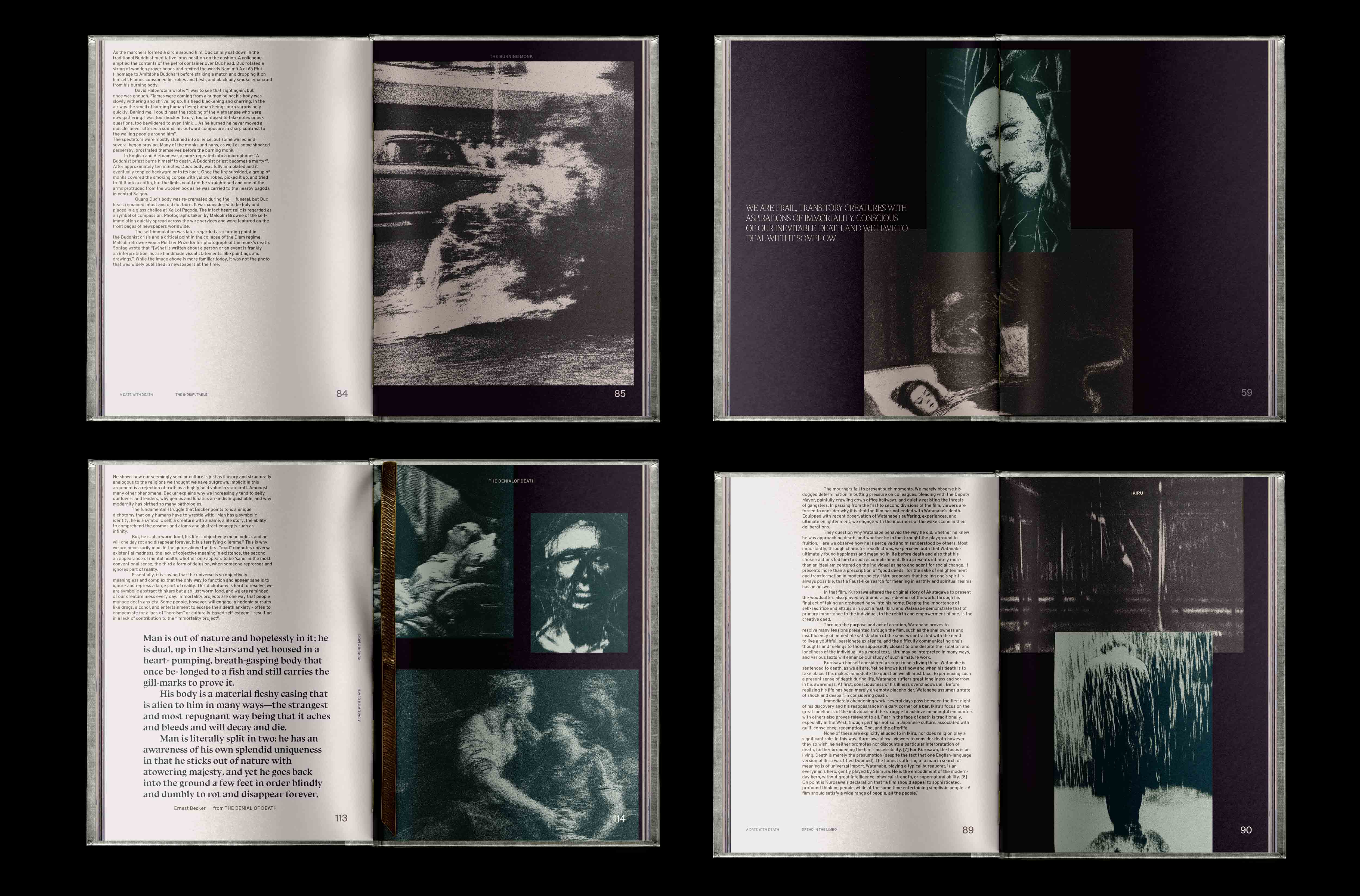
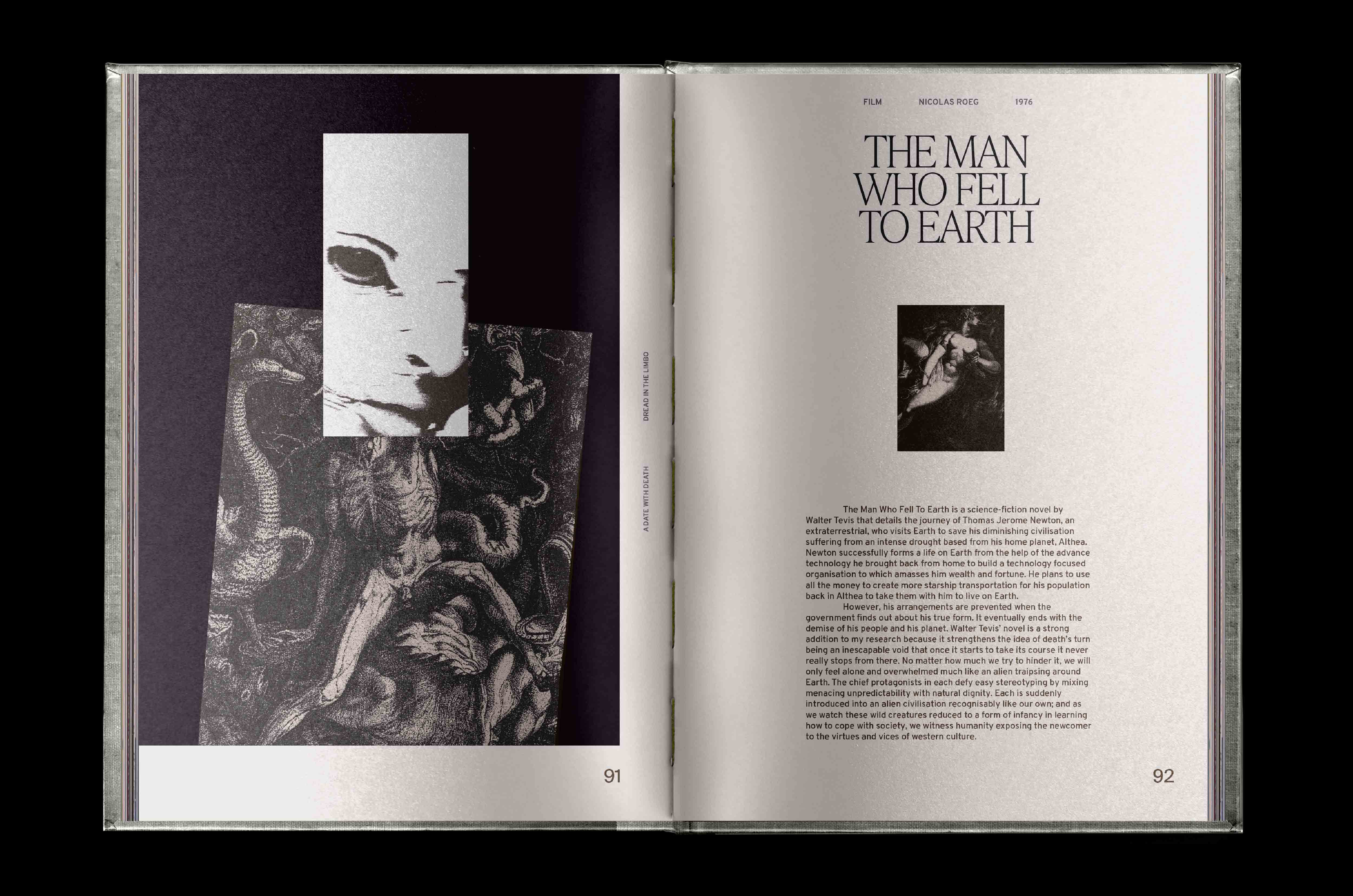
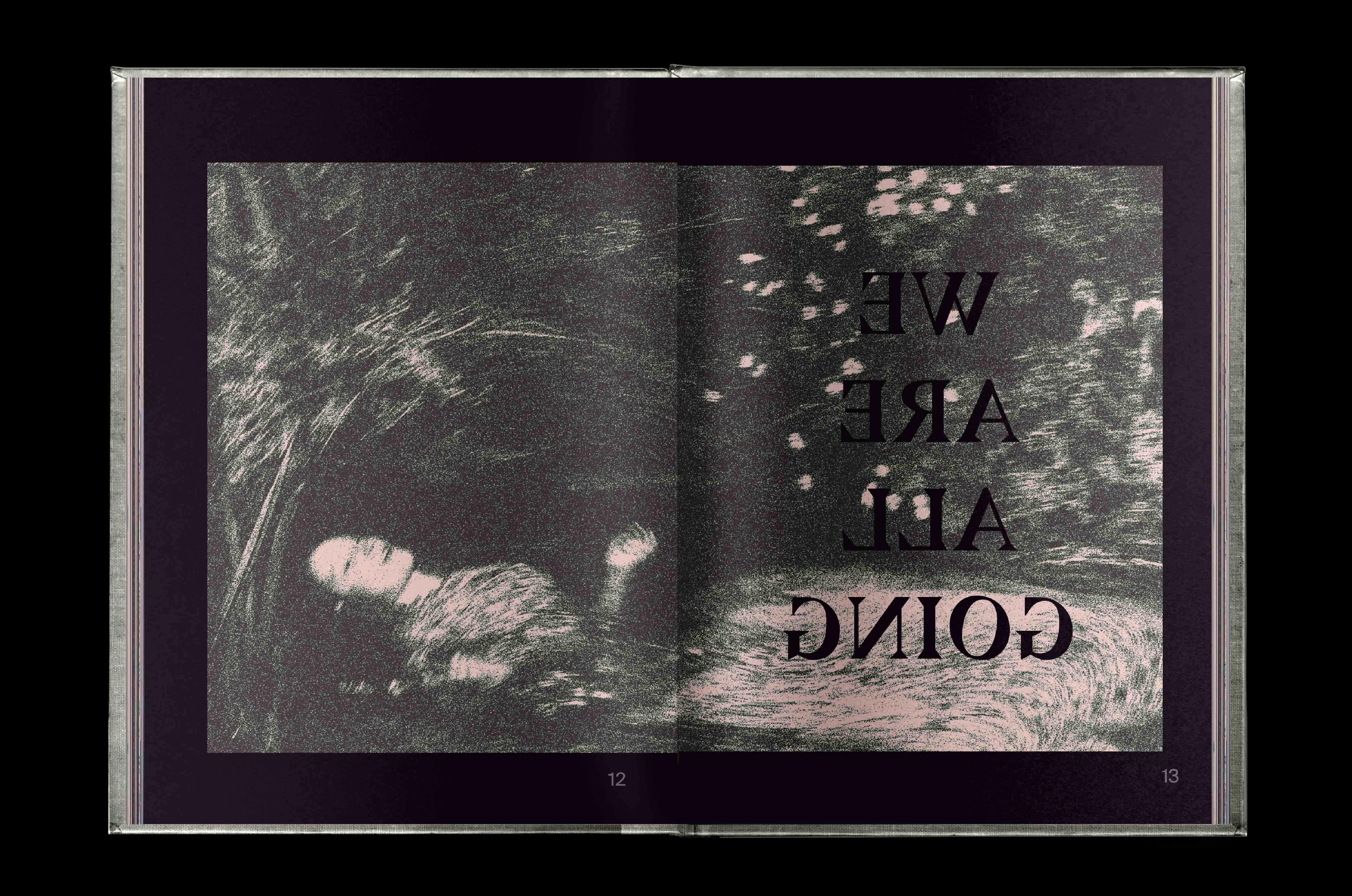
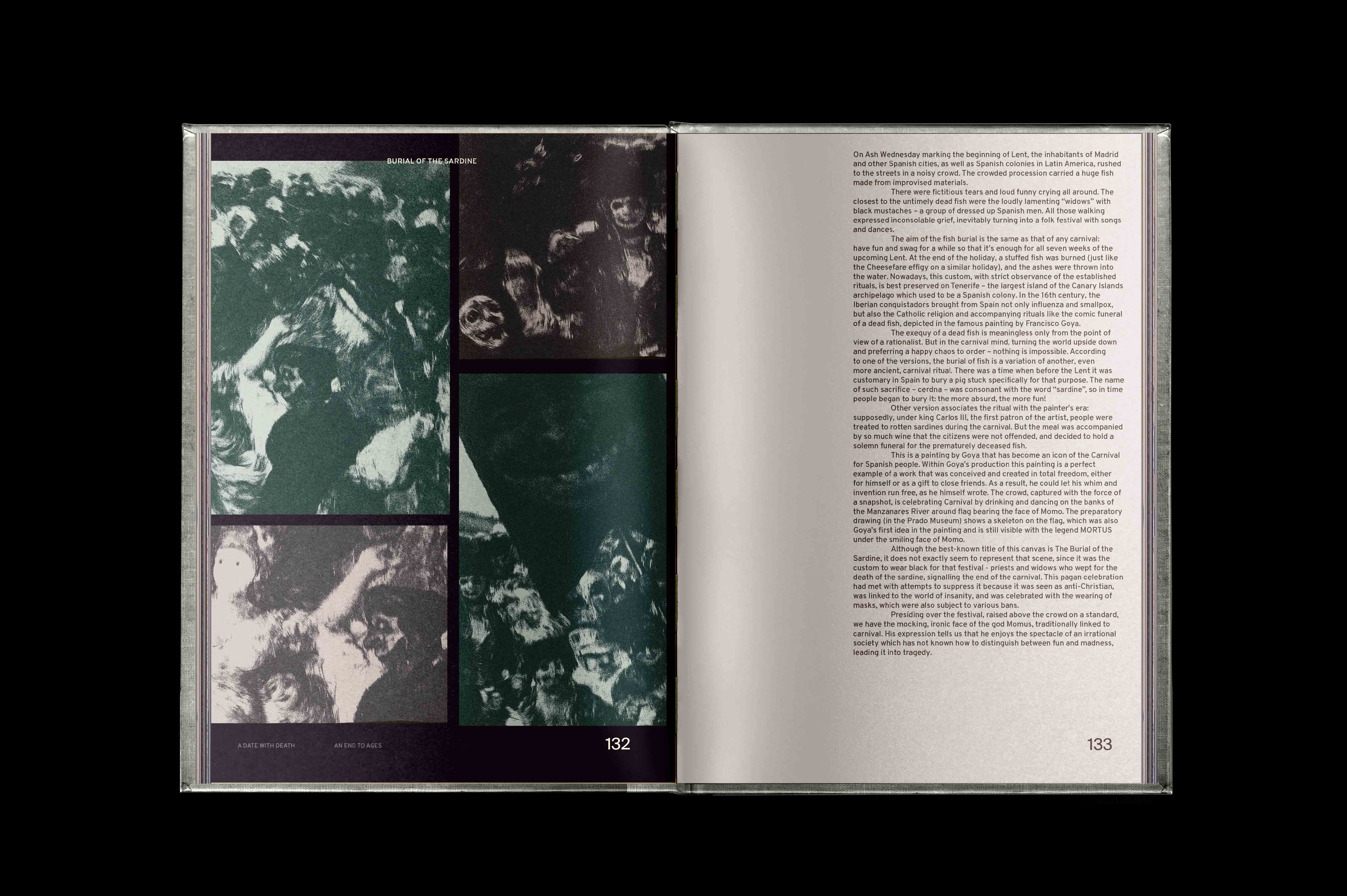
From cataclysmic anthems by The Clash to the Buddhist monks that sacrifice themselves in the name of their nation as well as humbling teachings by Marcus Aurelius and Ernest Becker about the transitory nature of life; this compendium foregoes a riverboat journey to our visual and material culture with death. It is a project that embraces the spectrum of human reactions to the notion of it; all the different shades of grey that culminate between the seemingly black-and-white nature of life and death.
Bound between the pages is a visual experience of our long history with it and its timeless camraderie with our past, present and future.
A Date with Death is a summative reminder that our mortality is an inescapable blueprint etched into our fate as soon as we are born.
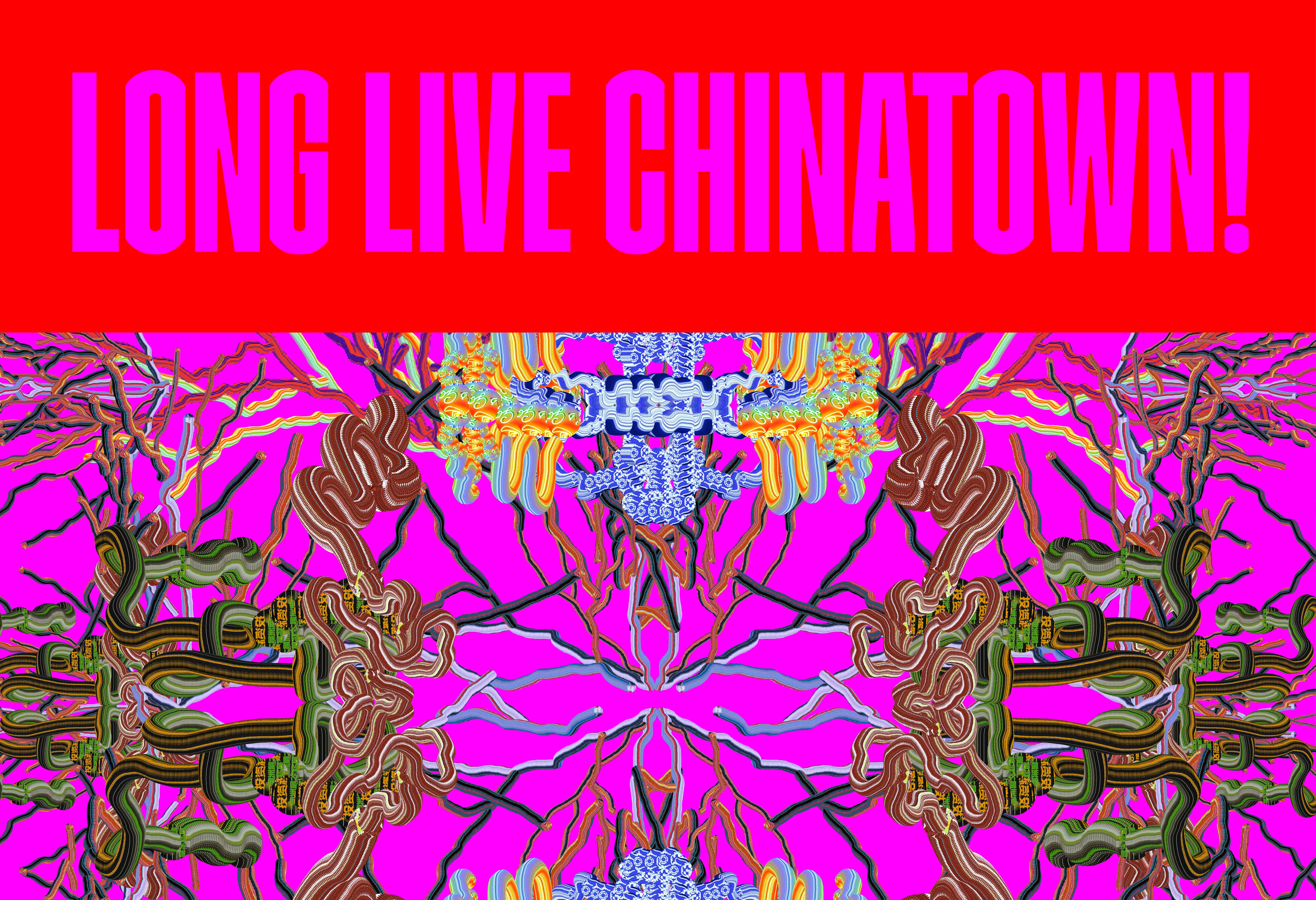
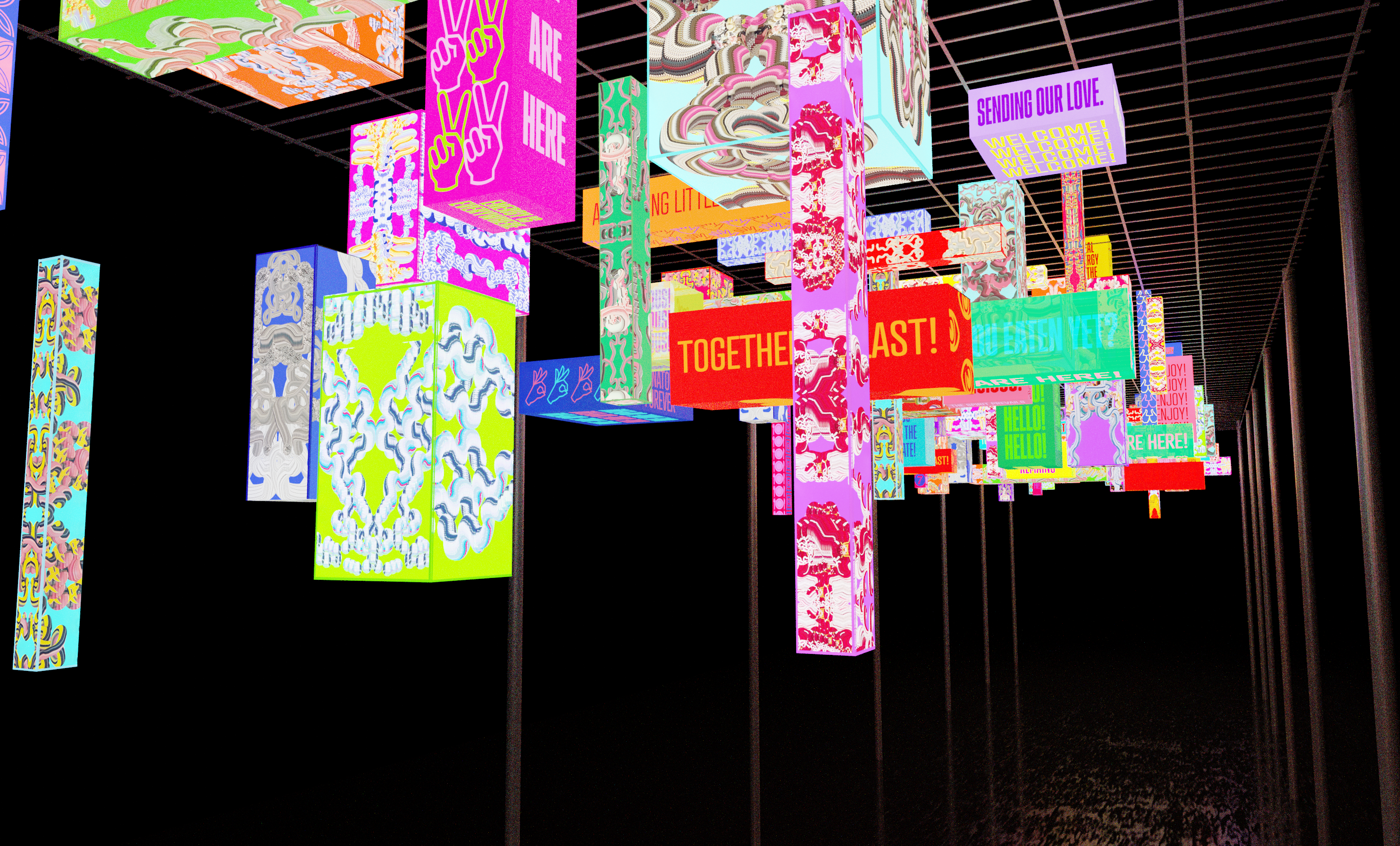
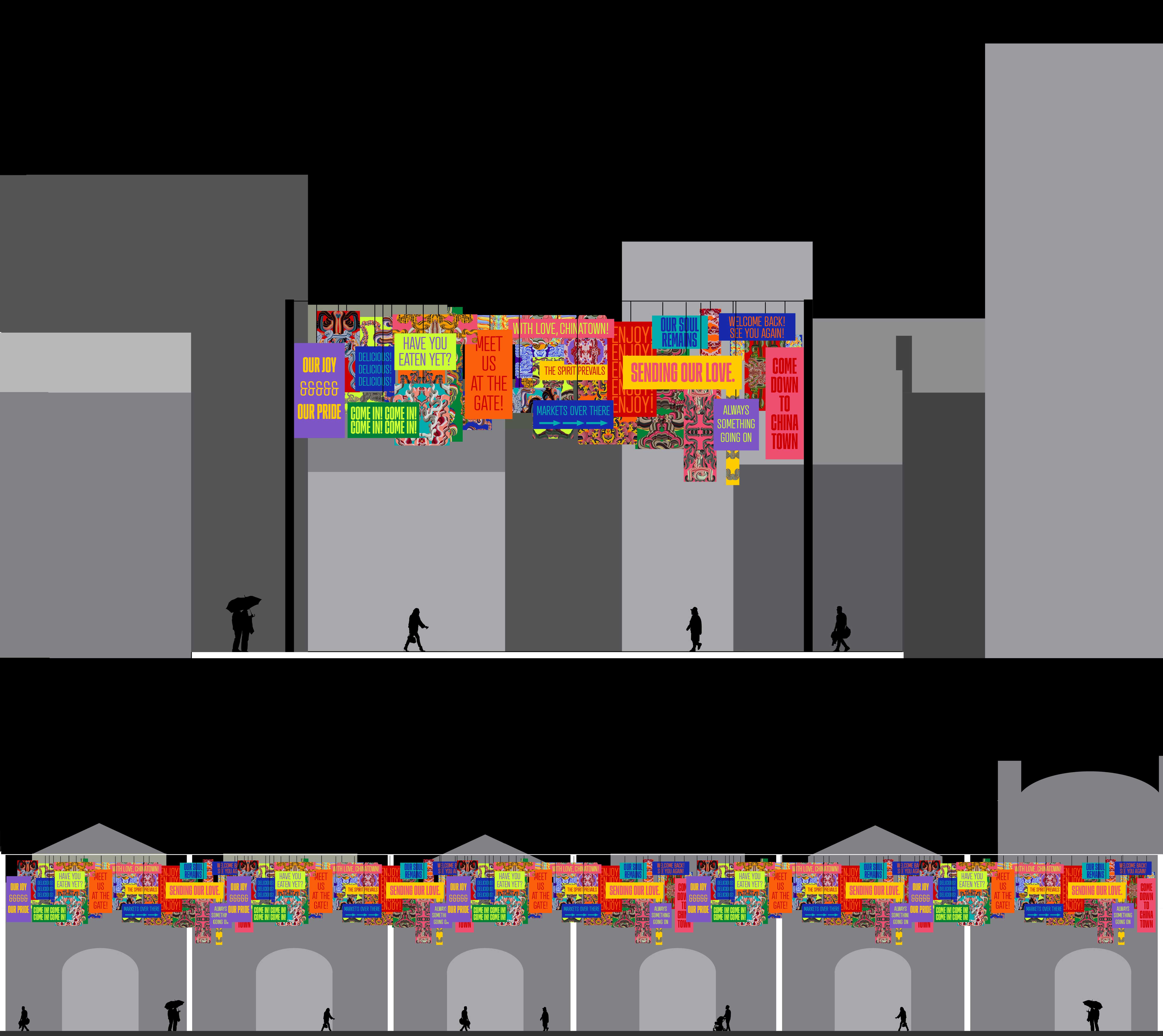
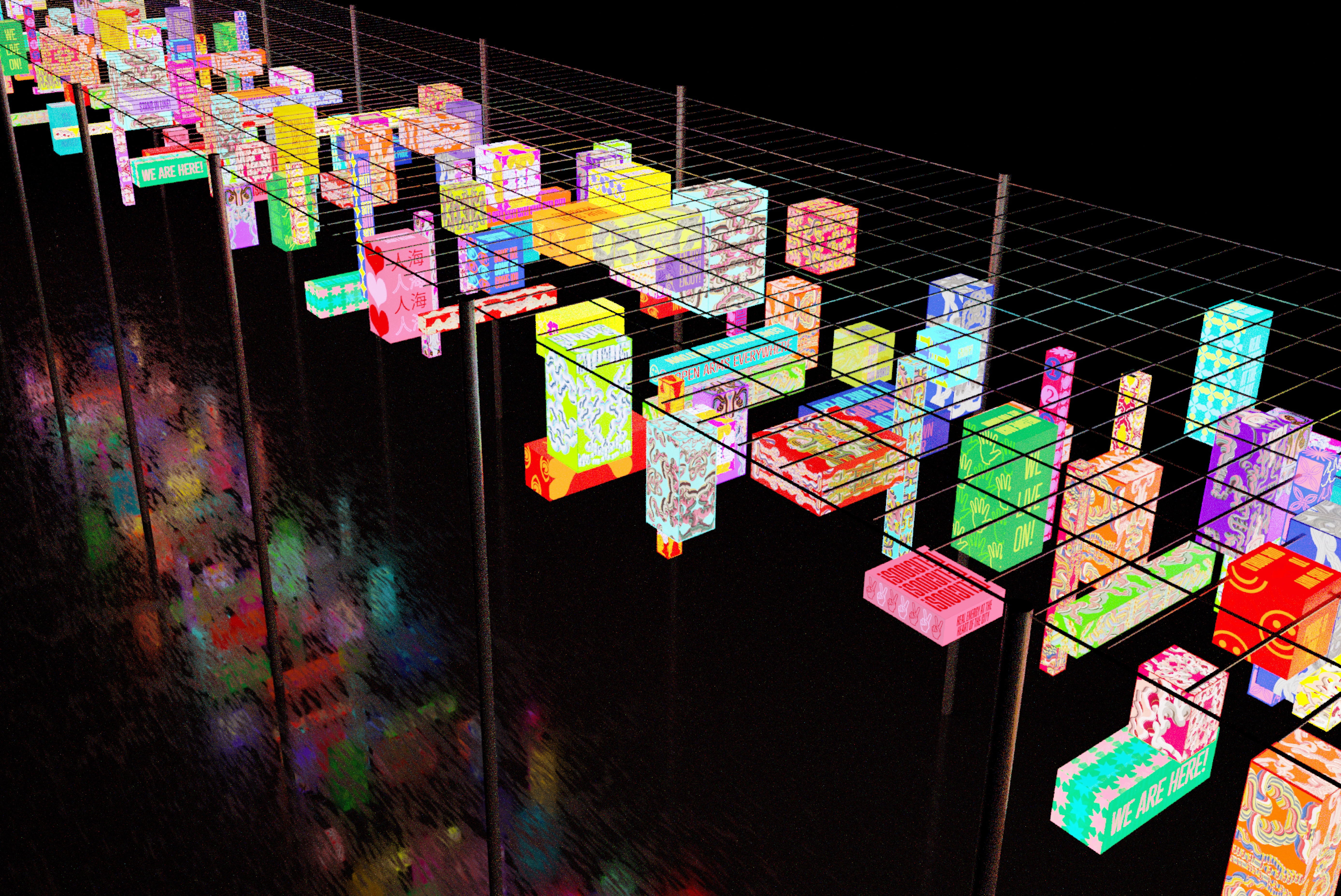
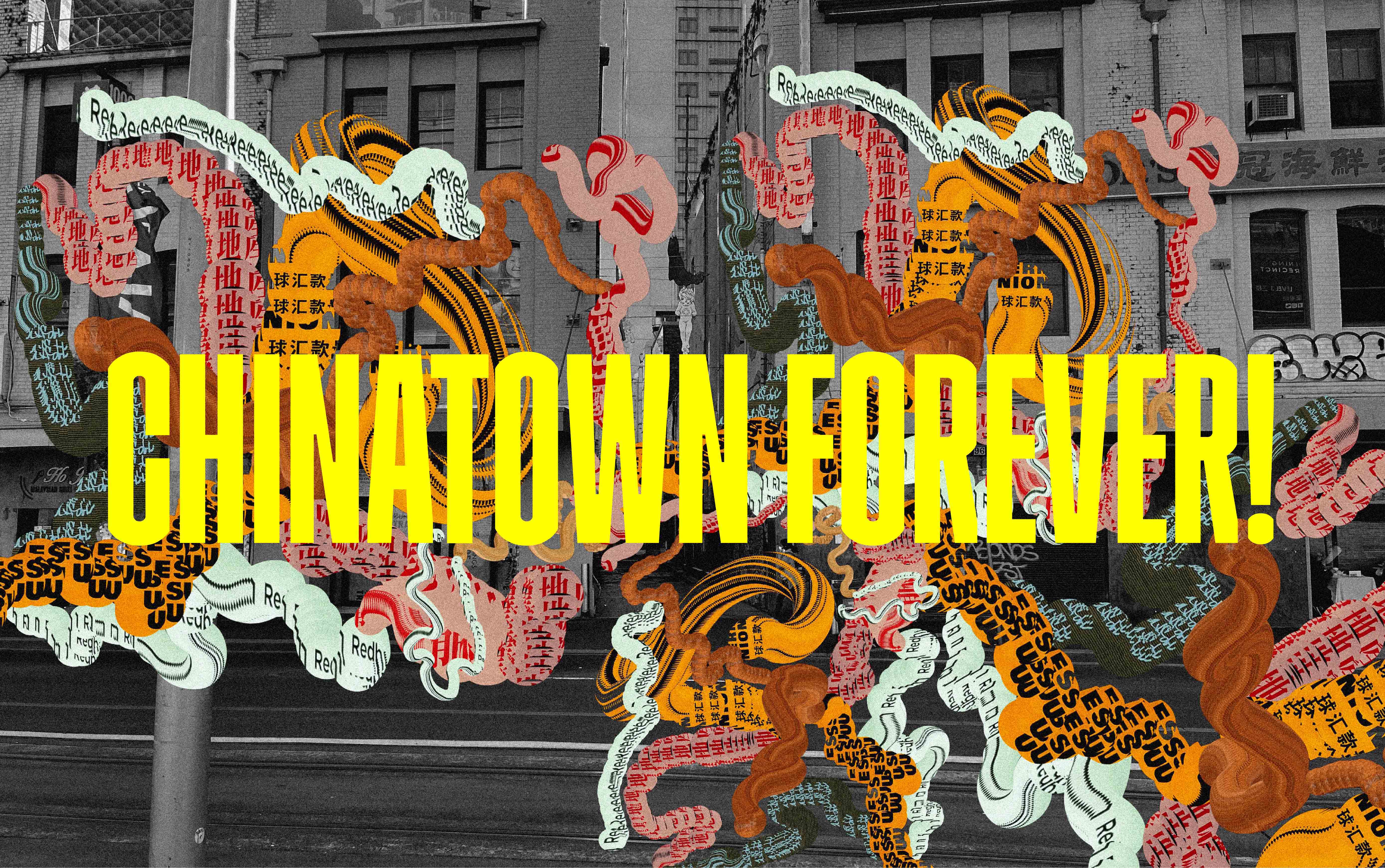
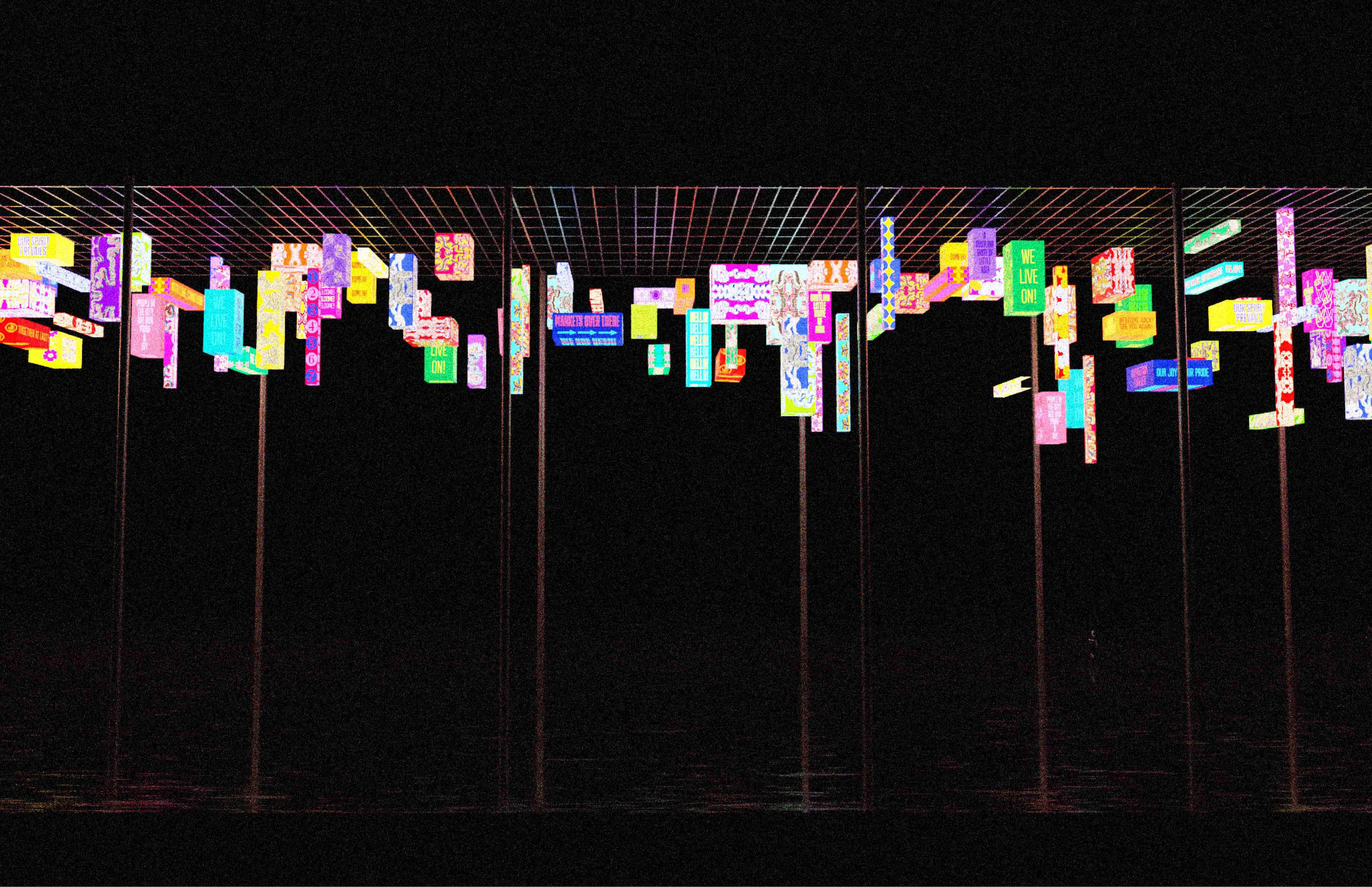
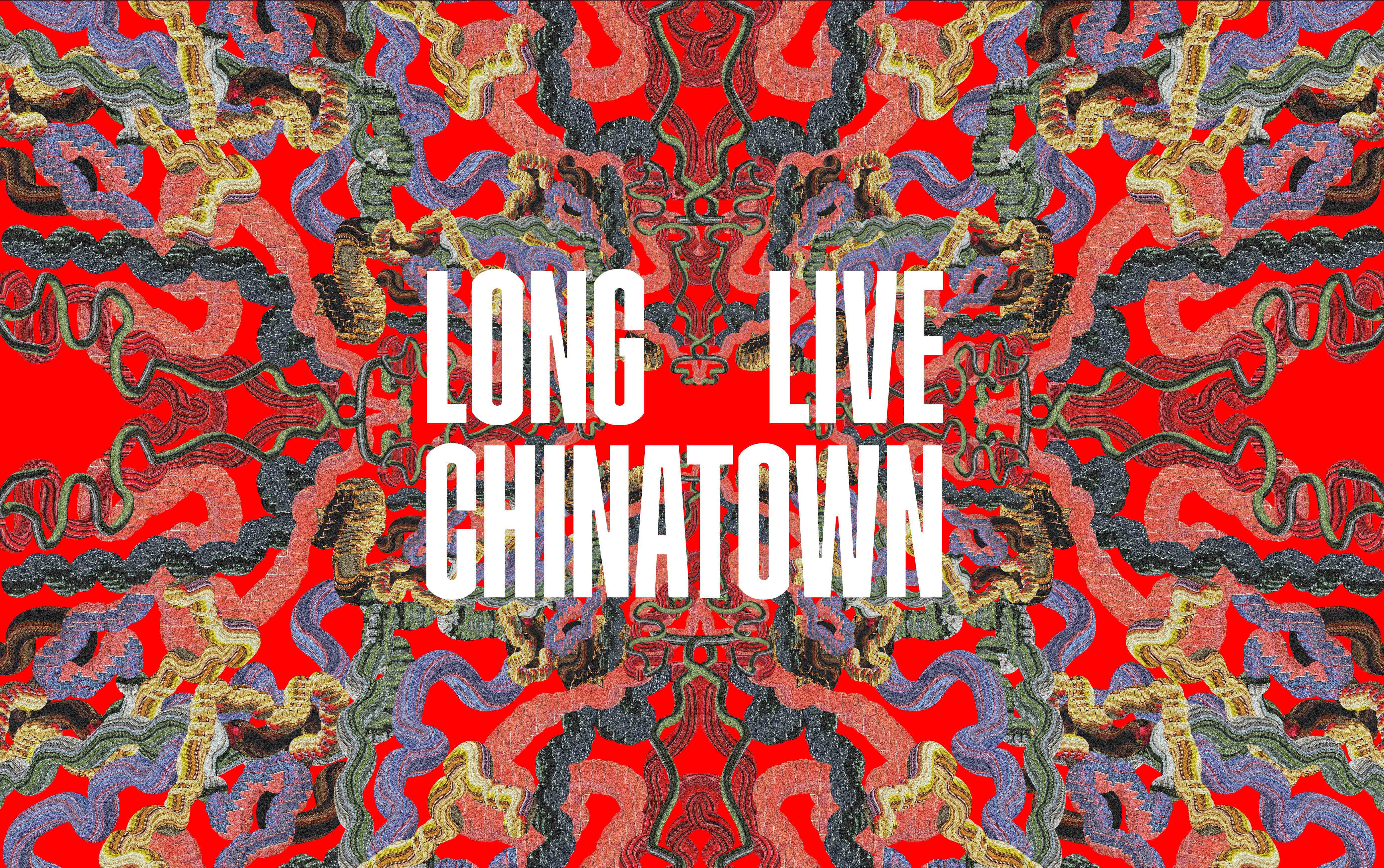
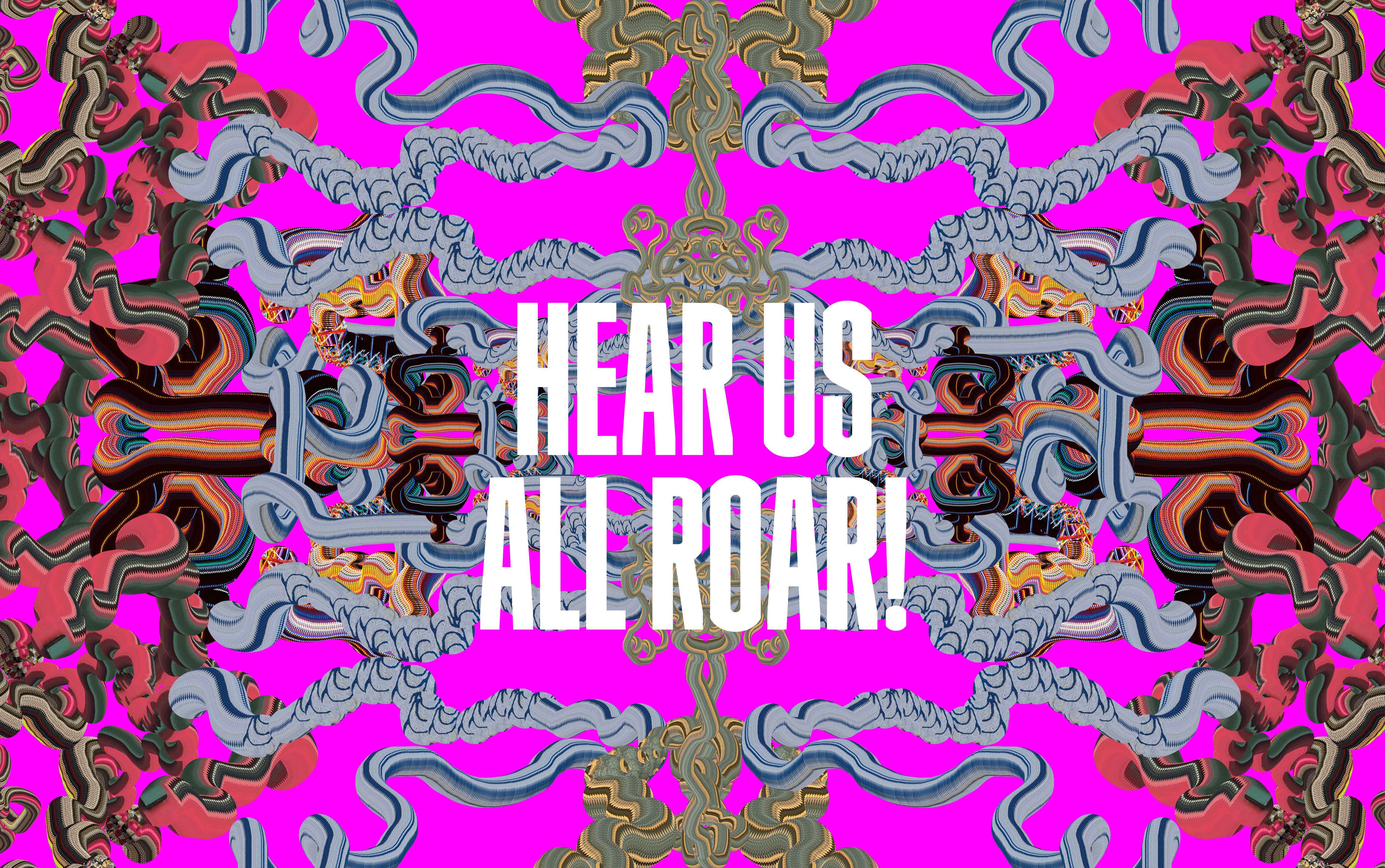
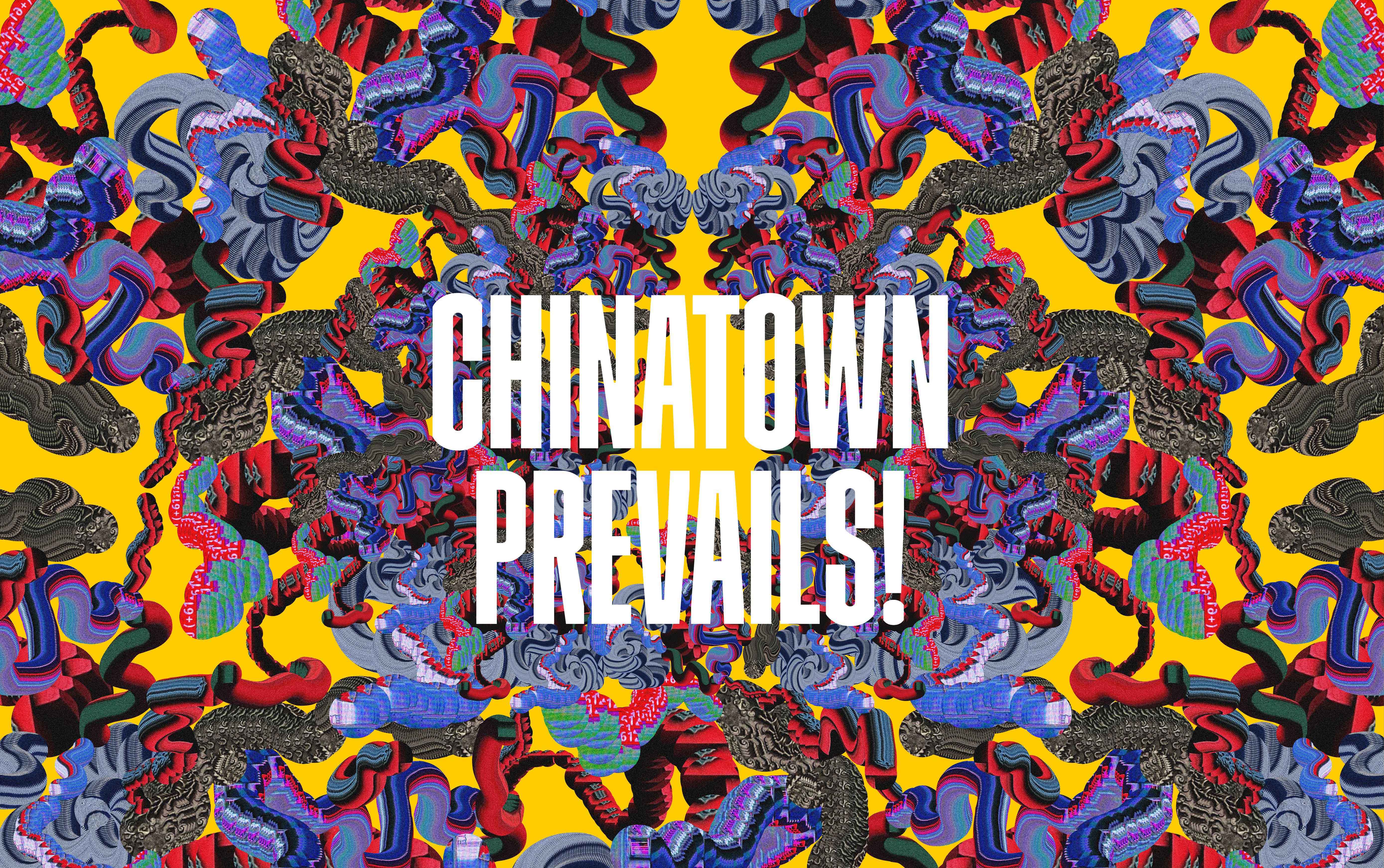
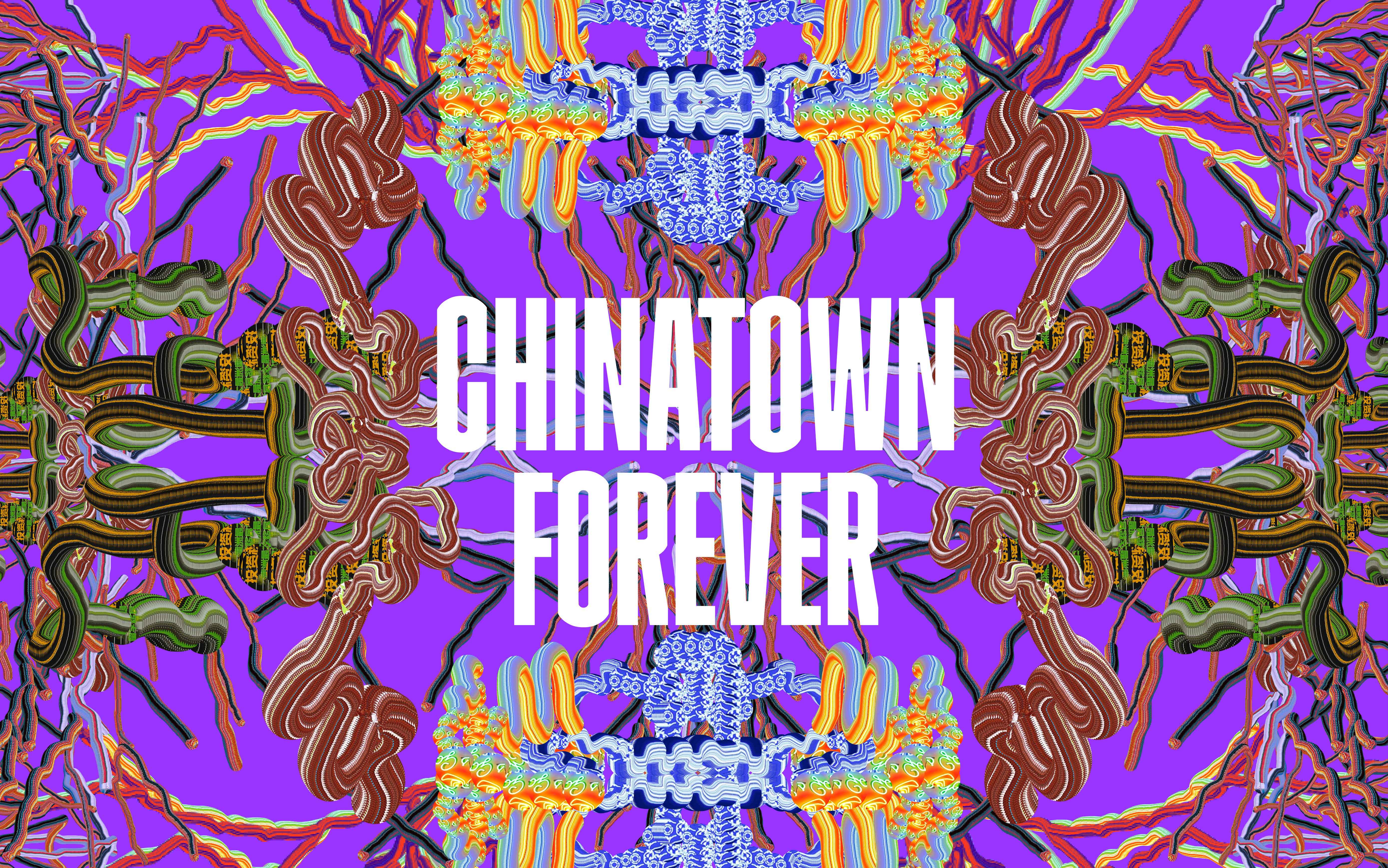
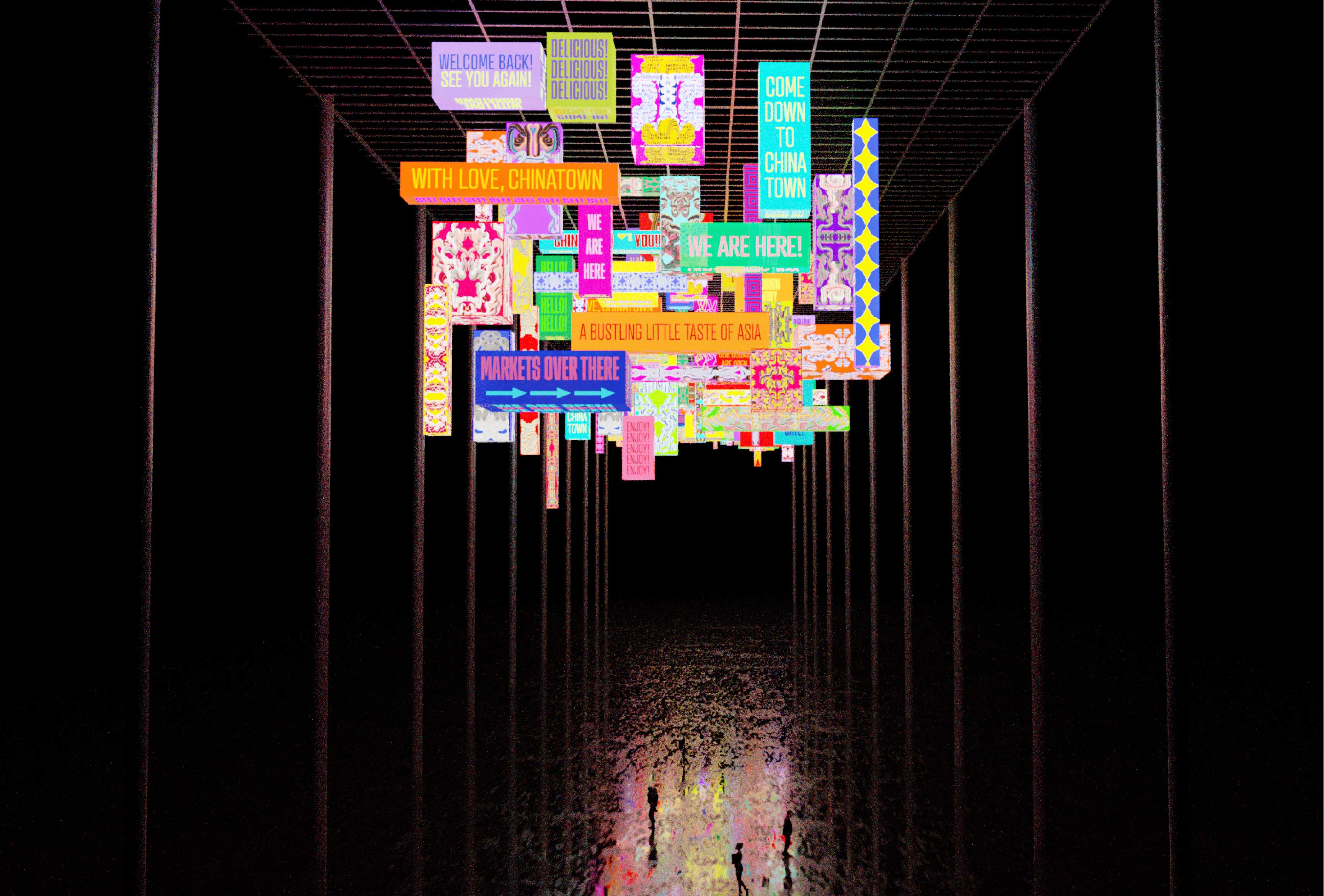
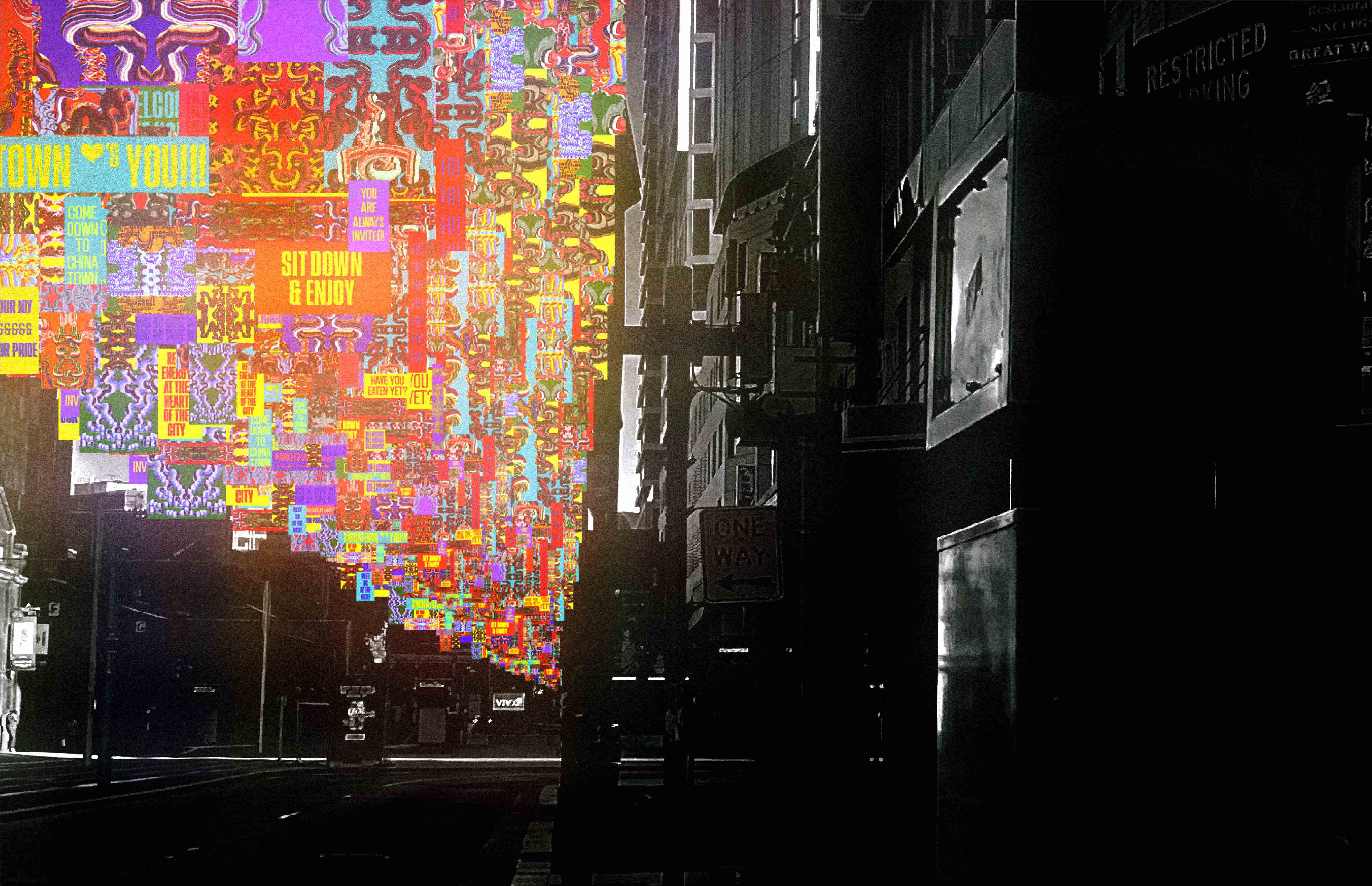
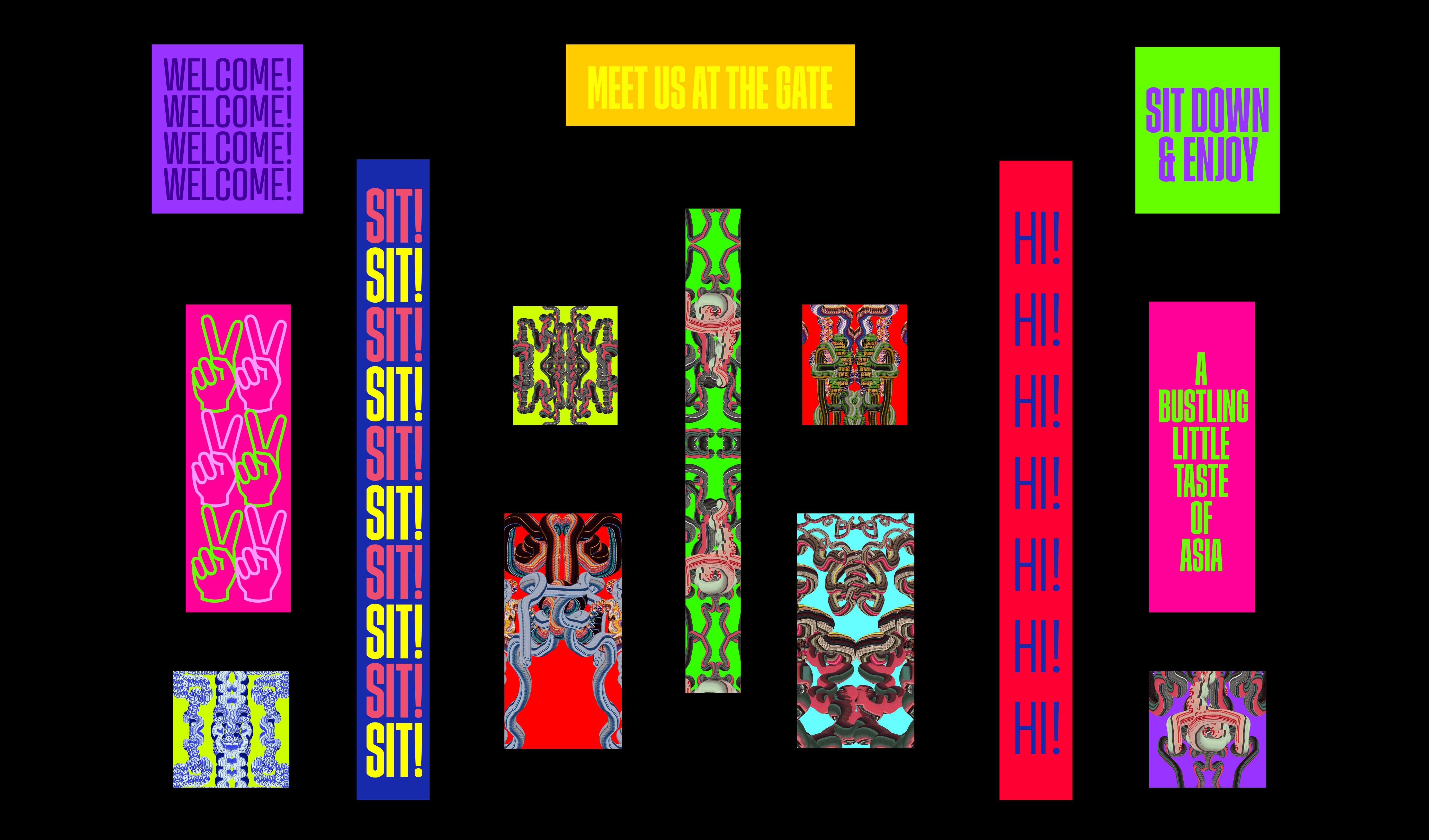
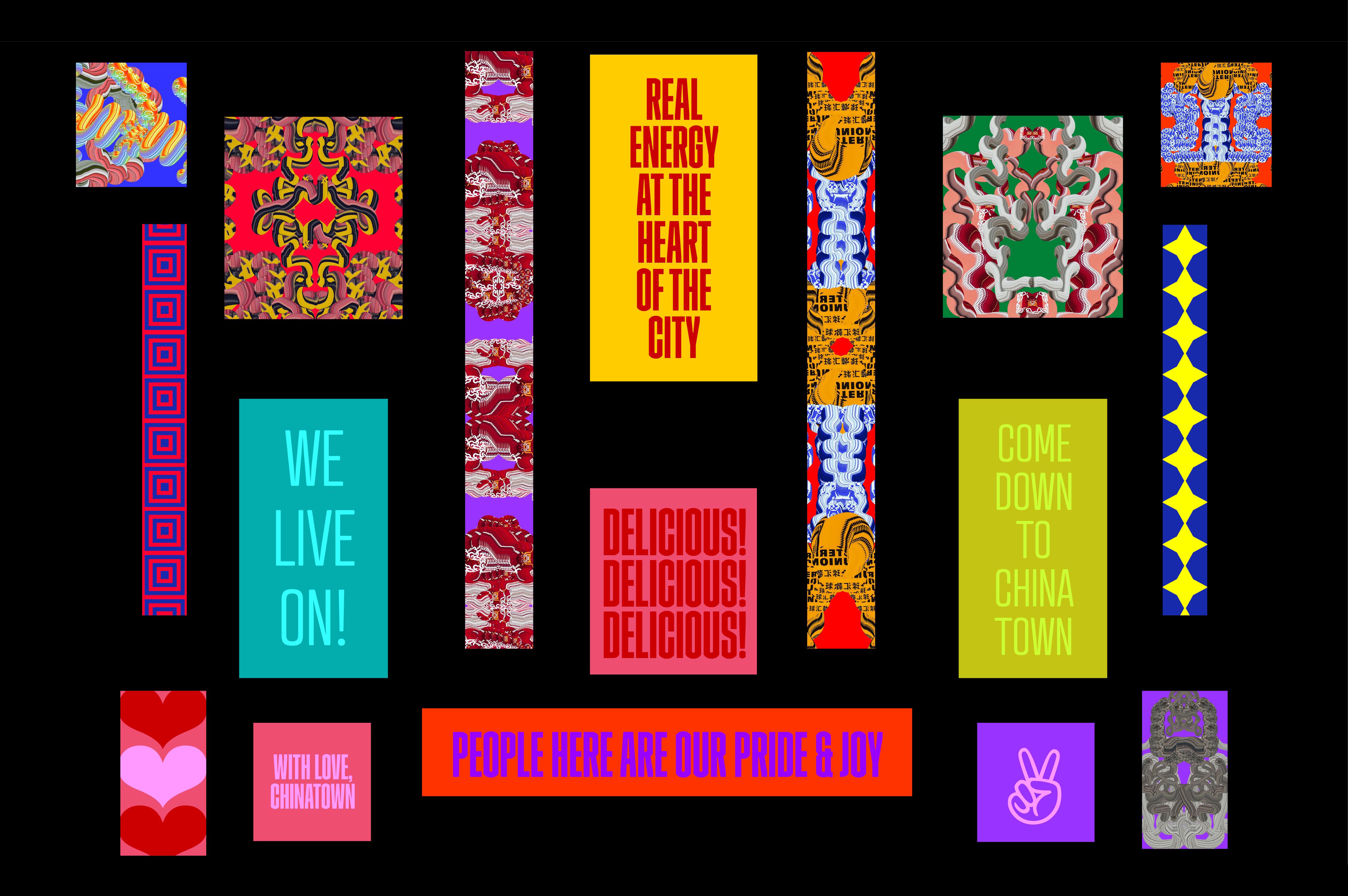
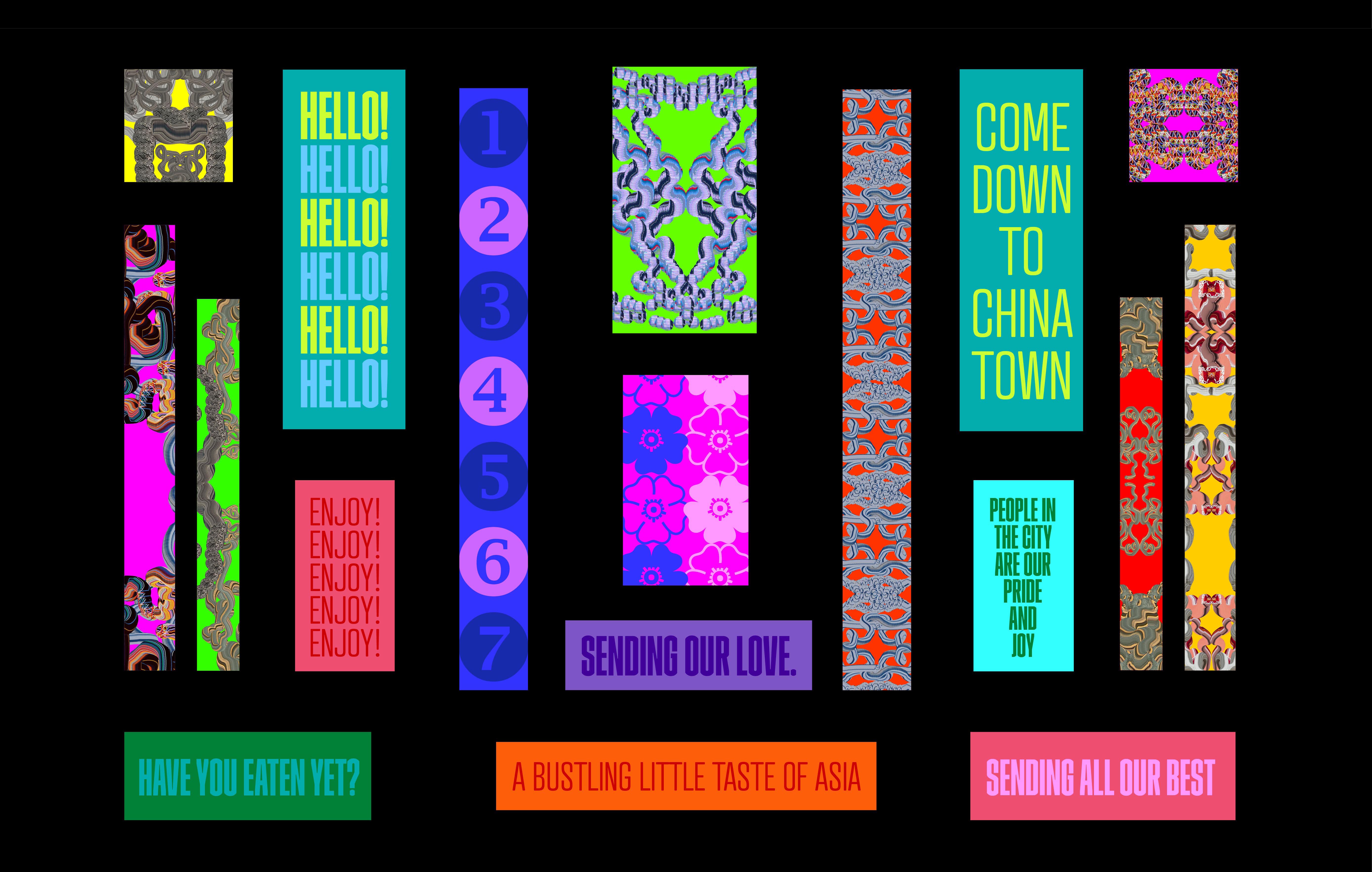
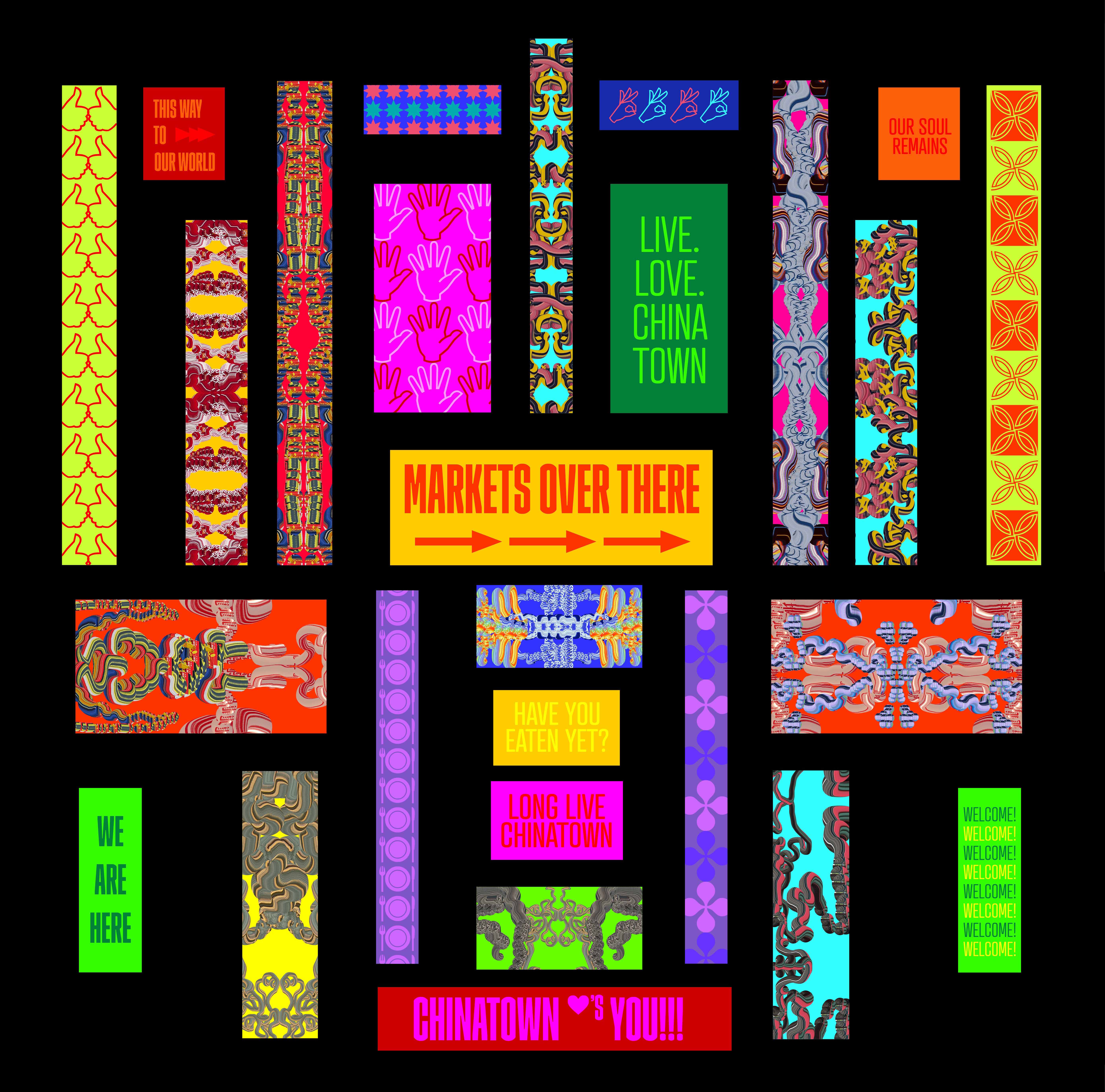
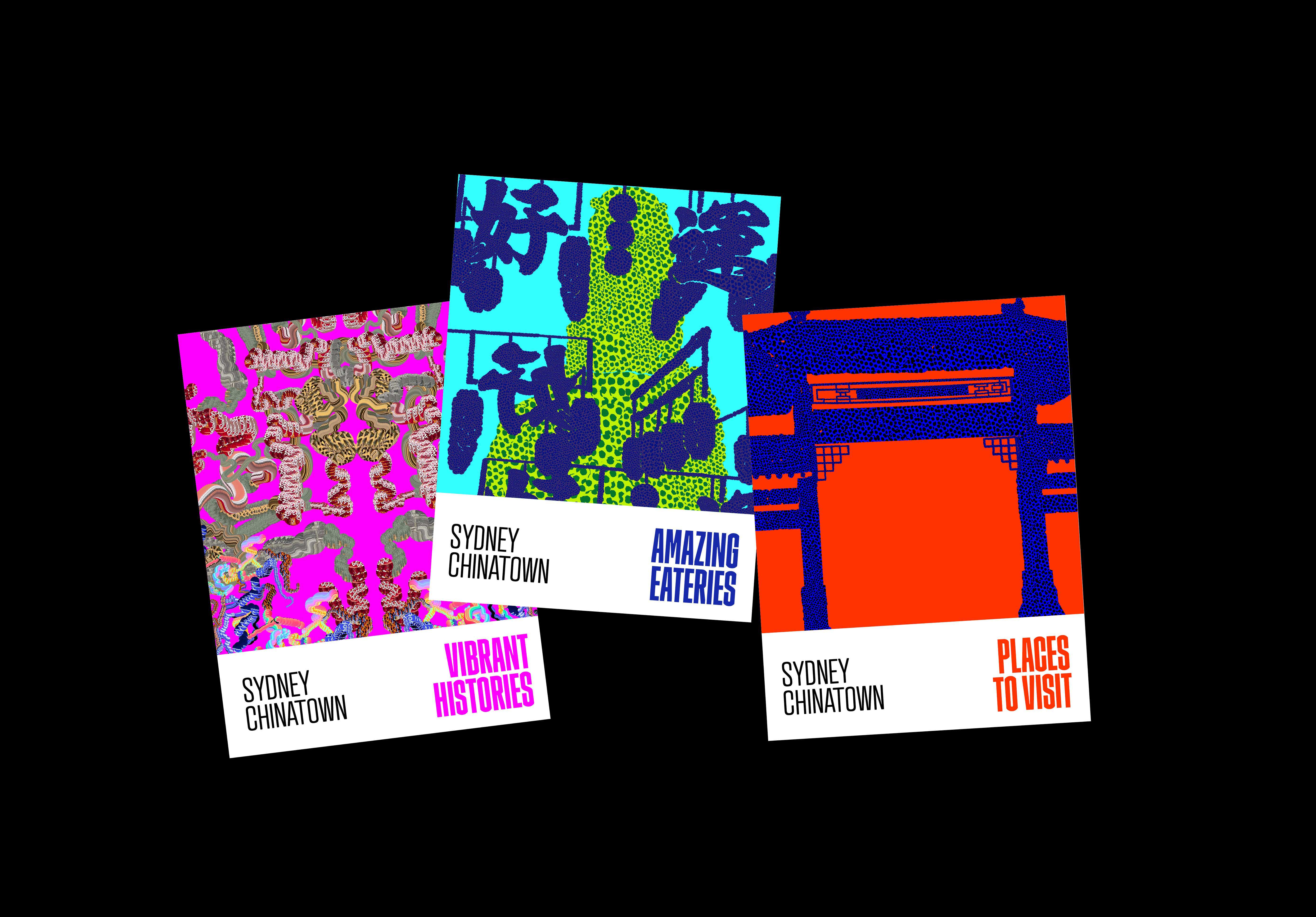
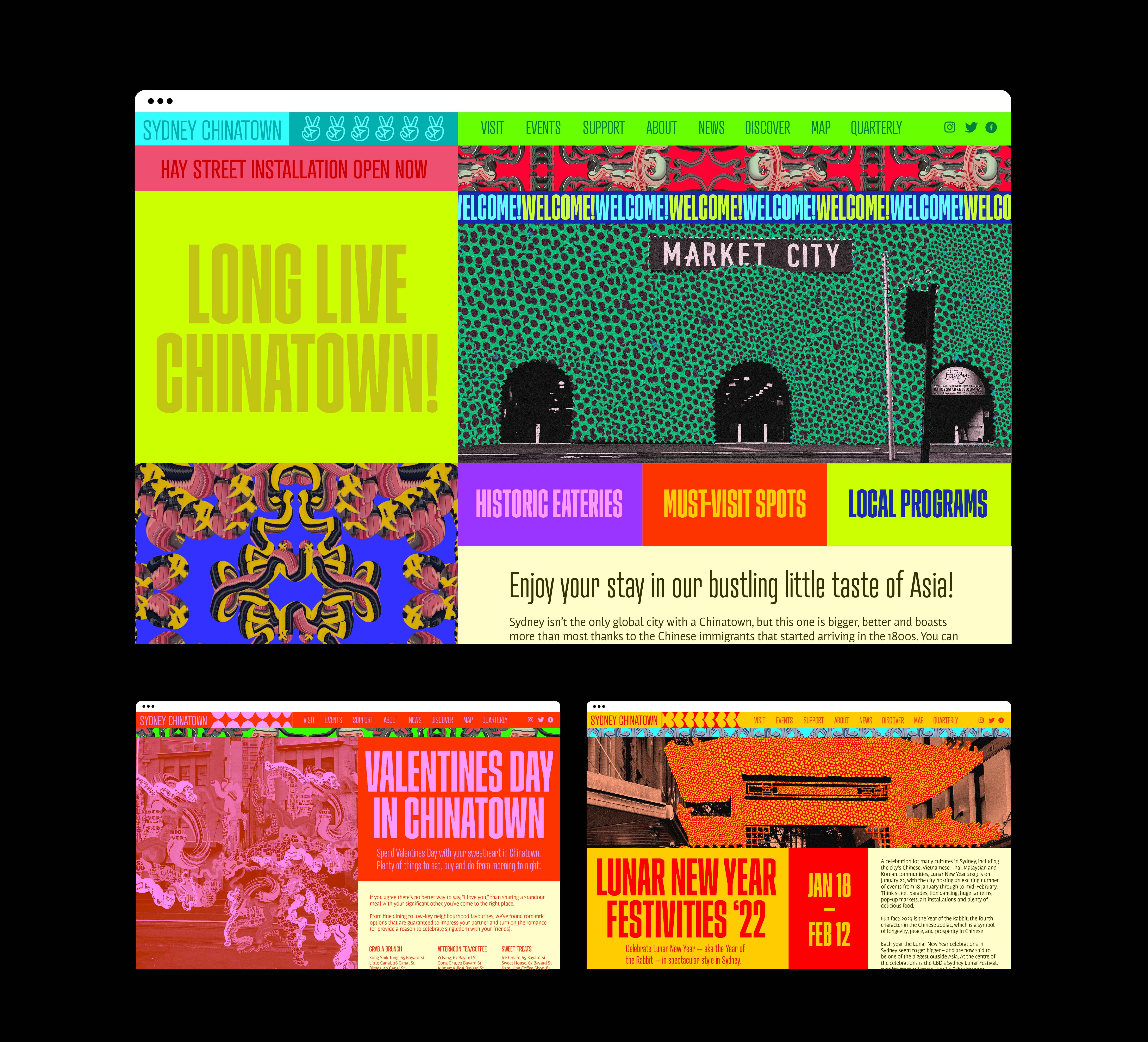
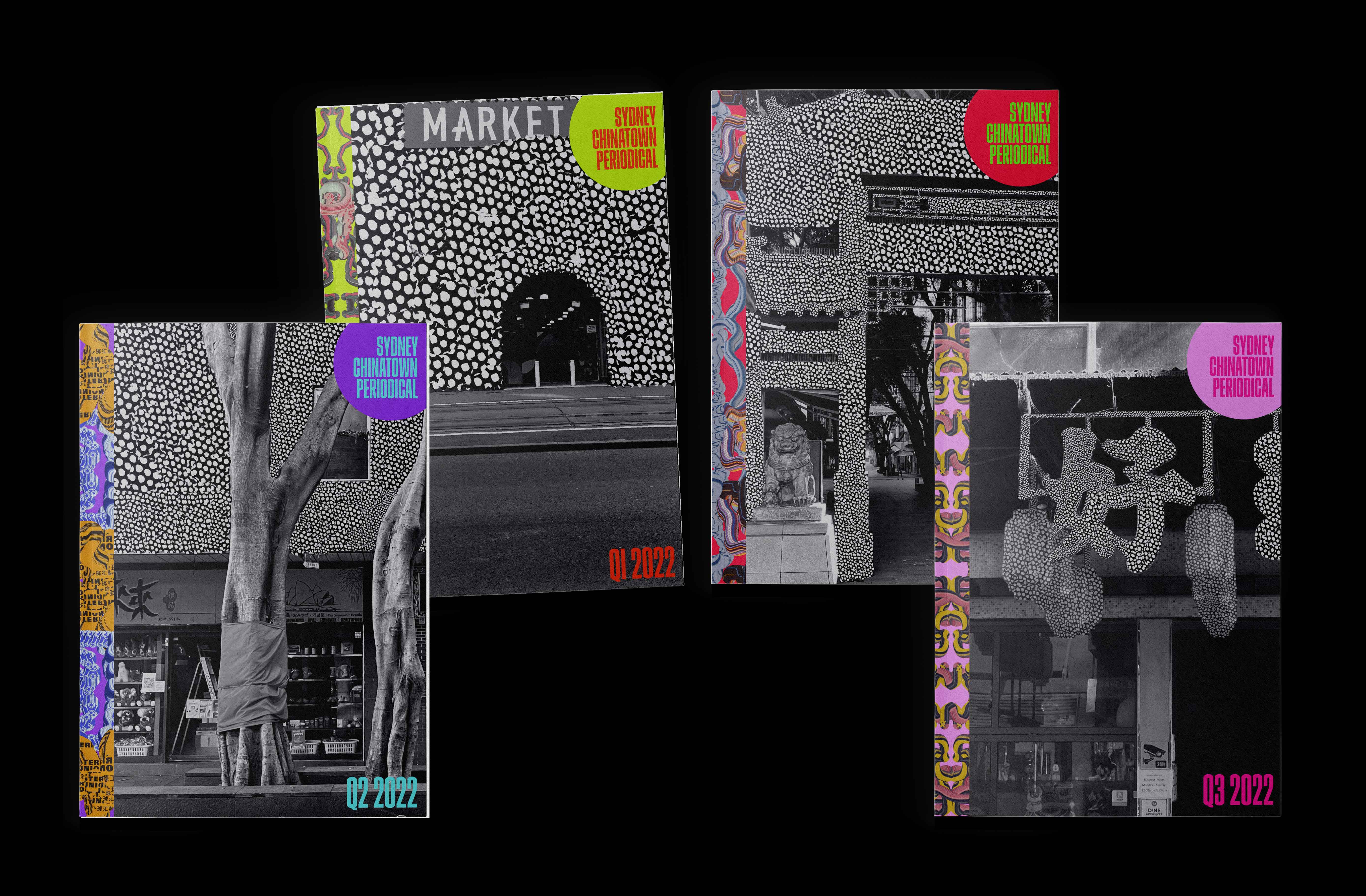
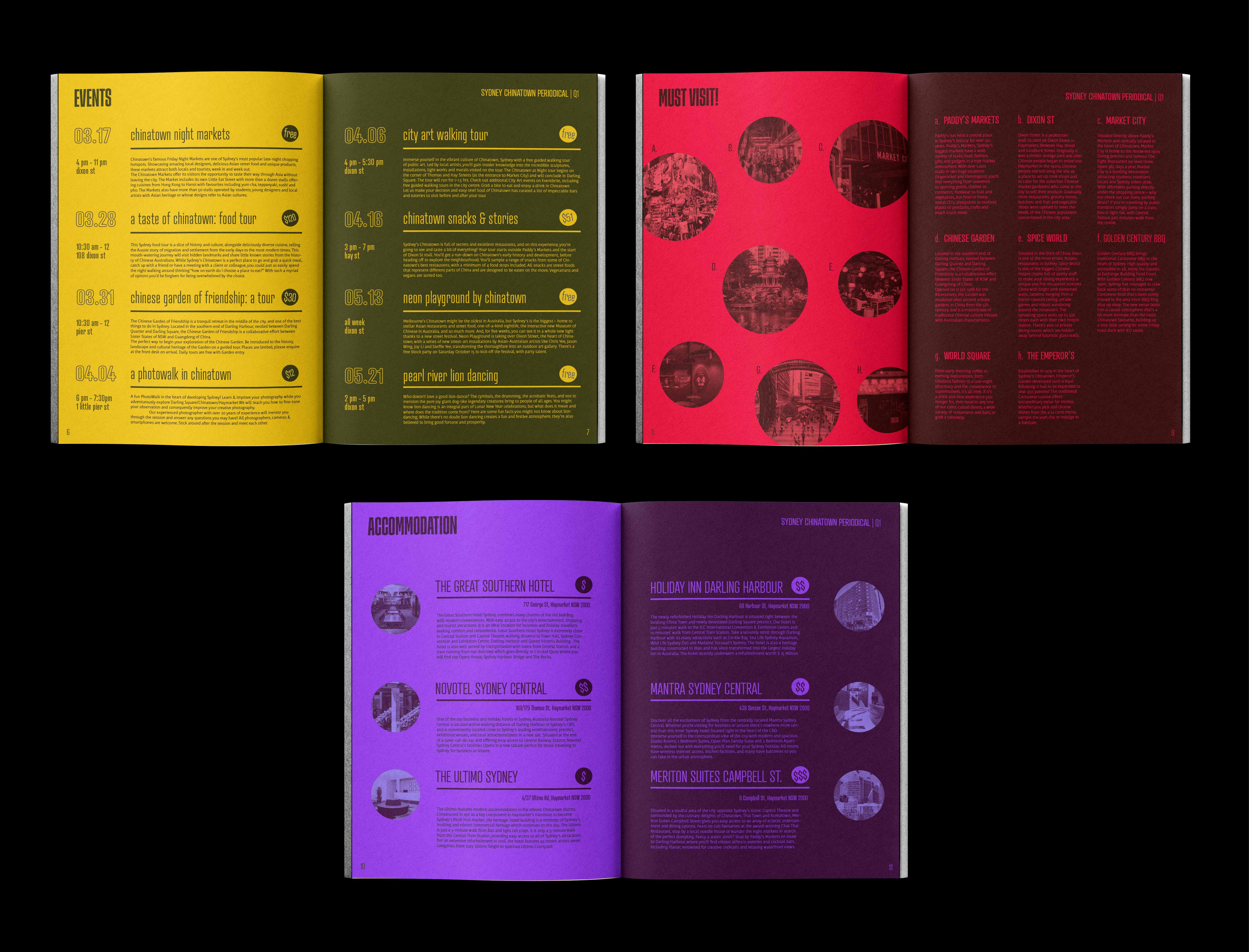
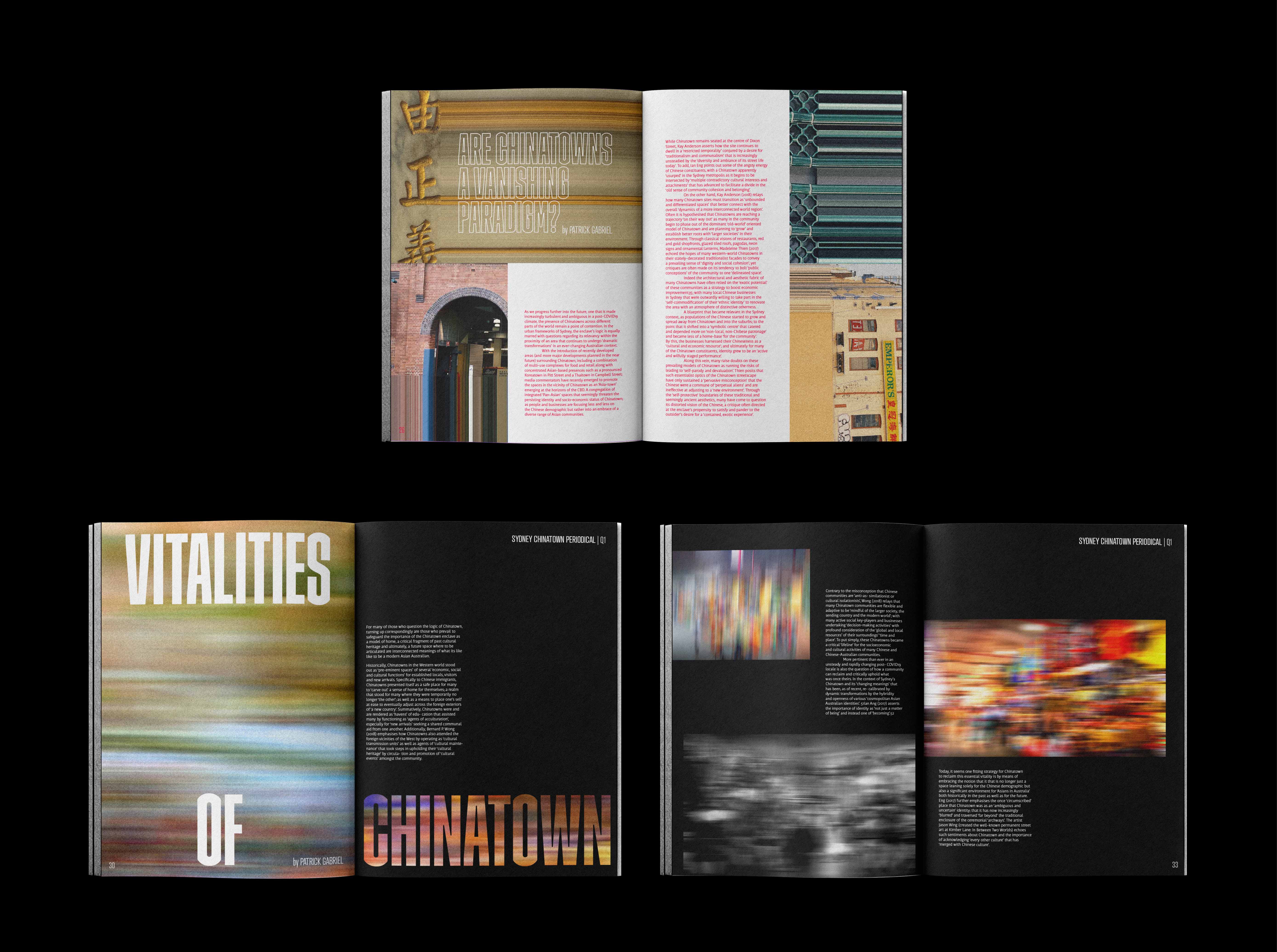
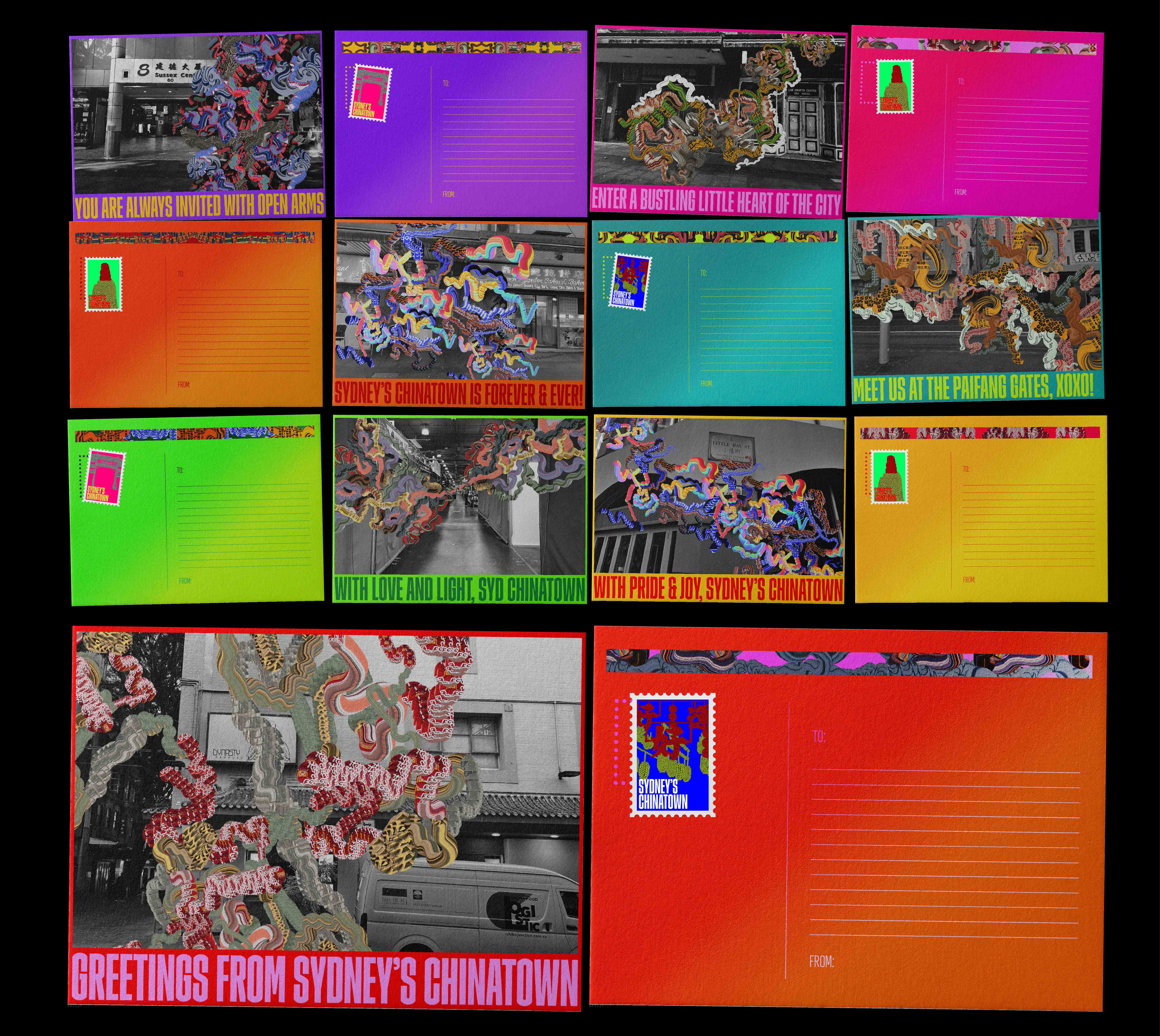
Long Live Chinatown!
Installation, Placemaking, Environmental Graphics and more.
Academic project for UNSW Art & Design
Year: 2022
Long Live Chinatown is a graphic installation conceptualised as an expressive, not-to-be-ignored love letter to a fundamental cultural precinct right at the heart of Haymarket in Sydney.
With the objective of conveying a revived sense of pride in Chinatown’s dynamic and richly complex streetscapes; the project attempts the task by enriching placemaking through the implementation of new visual markers for Chinatown in the form of variable large-scale installations.
Resembling an infinite sea of floating lanterns during Chinese New Year, the installation consists of more than 120 light boxes, ranging from 2 to over 6 metres tall, that are suspended at differing heights to elevate a dynamic rhythm of the forms as organised against the street horizon.
This project was prompted in response to the tense uncertainty in Sydney’s Chinatown as a result of COVID-19 affected businesses as well as rapid development of residential buildings/multi-purpose complexes.
The objectives are aligned at the pursuit of agitating a streetscape from the day-to-day urban lethargy and hum-drum. Thus, this narrative ultimately serves as a respite from what is now ordinary as well as a break from all the cynicism and drab prompted by a site torn by its questioned fate.
Ultimately, this installation’s endgoal is to revitalise interest in the site, celebrate activity and help small businesses struggling in Chinatown and to eventually bring foot traffic back into the site.