DOREMI Magazine
Digital Publication
I was in charge of the editorial’s identity and concept along with the art direction for the spreads.
Academic project for UNSW Art & Design
Designed together with Edna Lam and Emily Chan.
Year: 2022
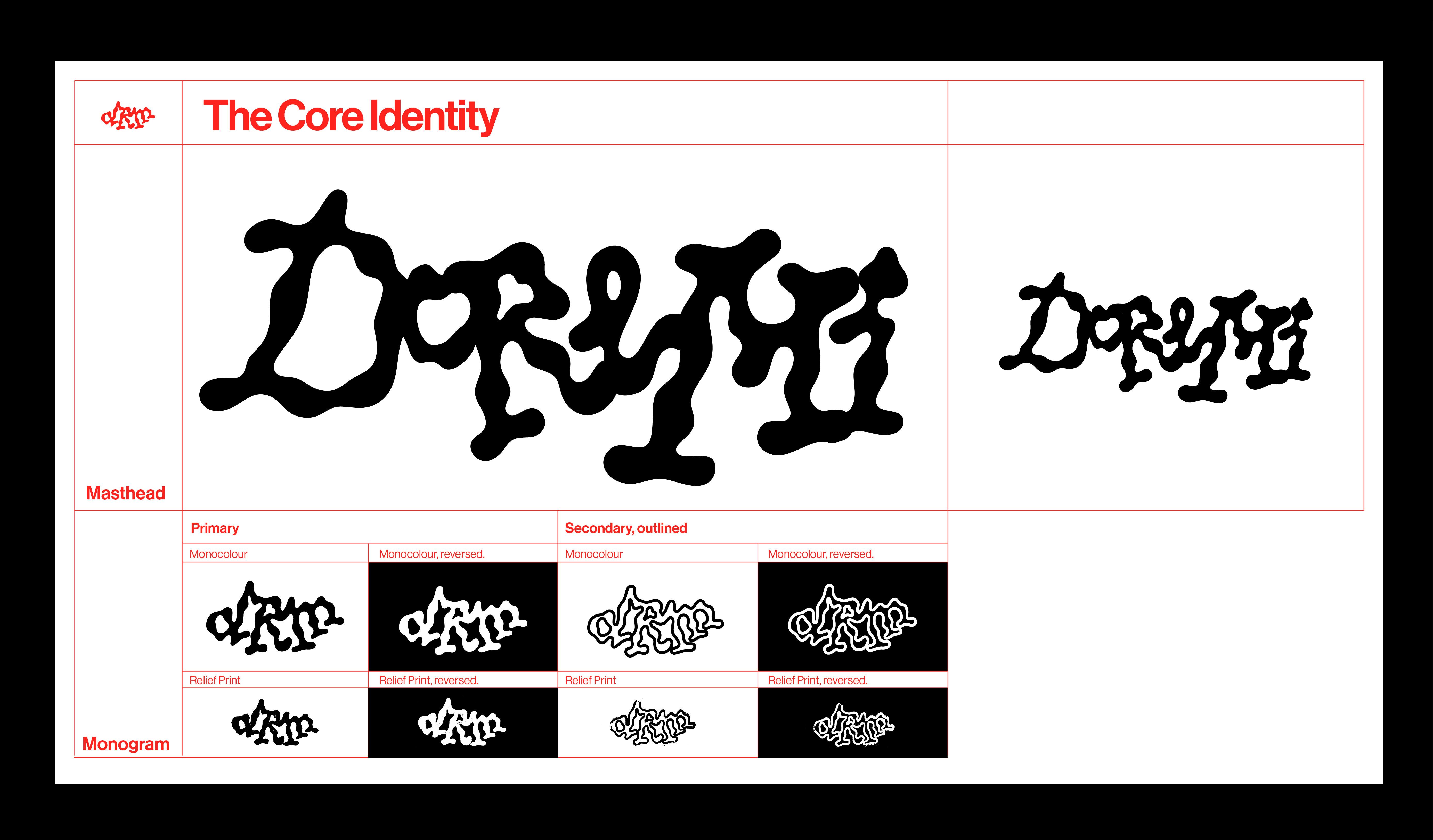
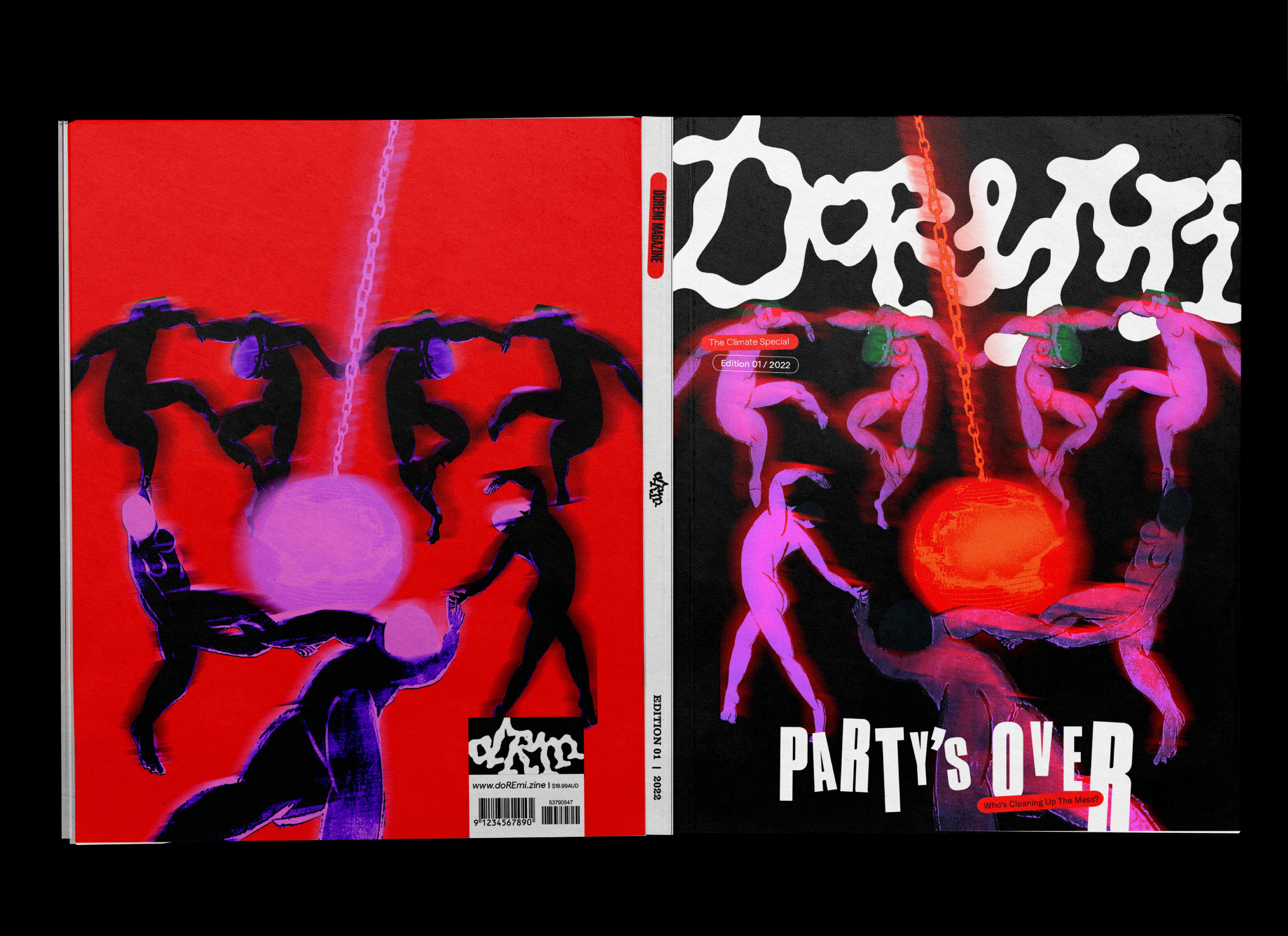
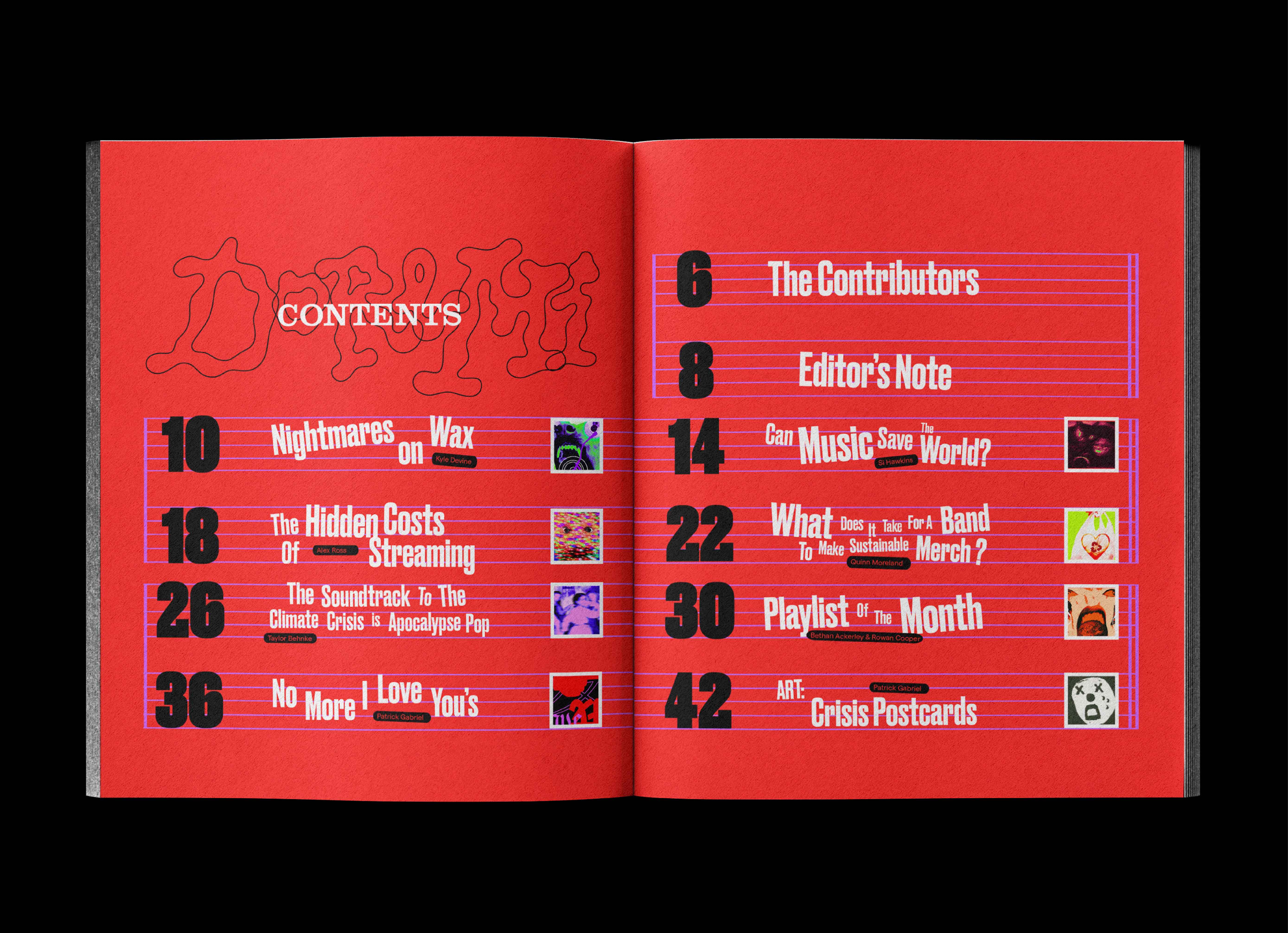
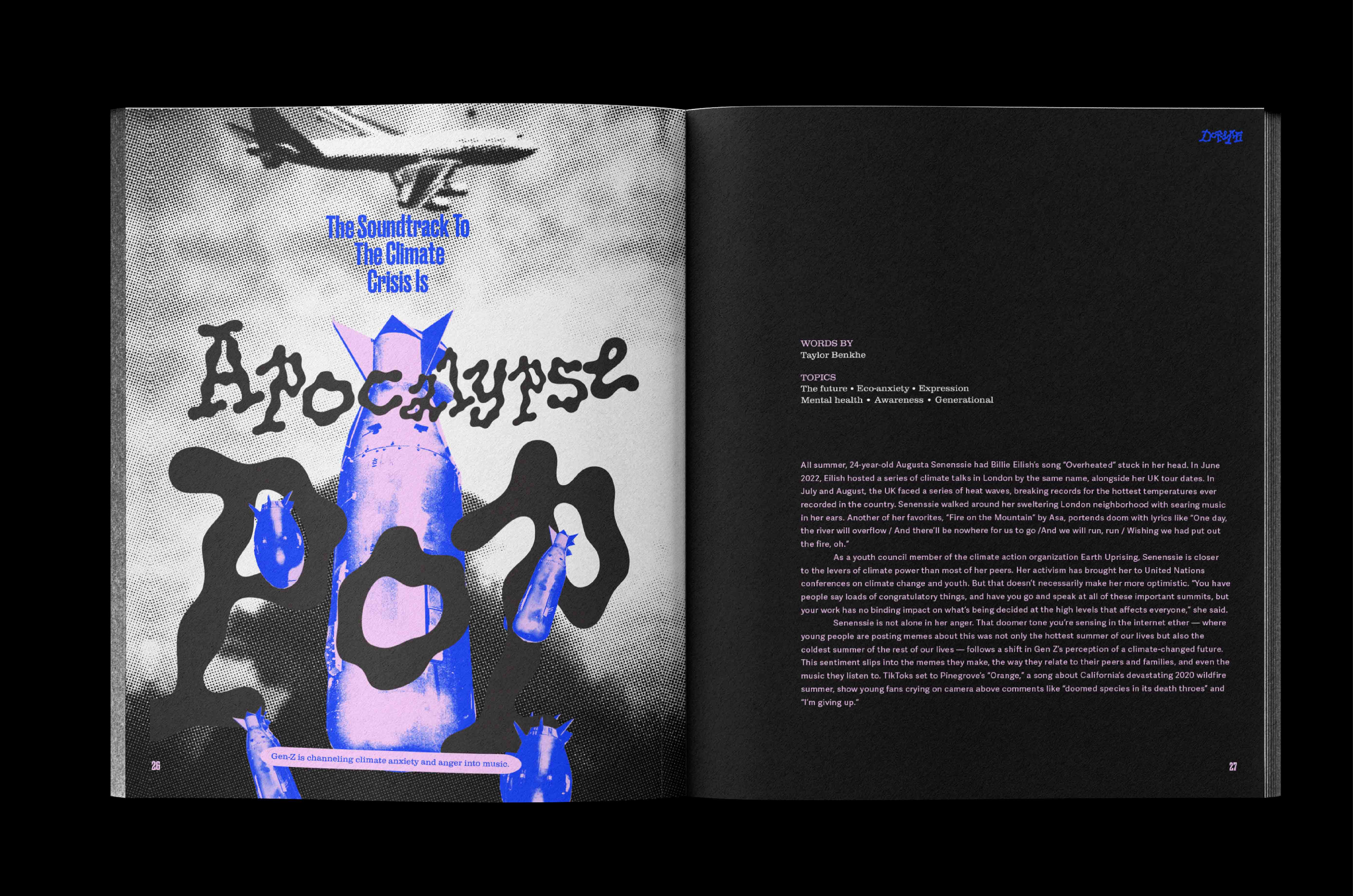
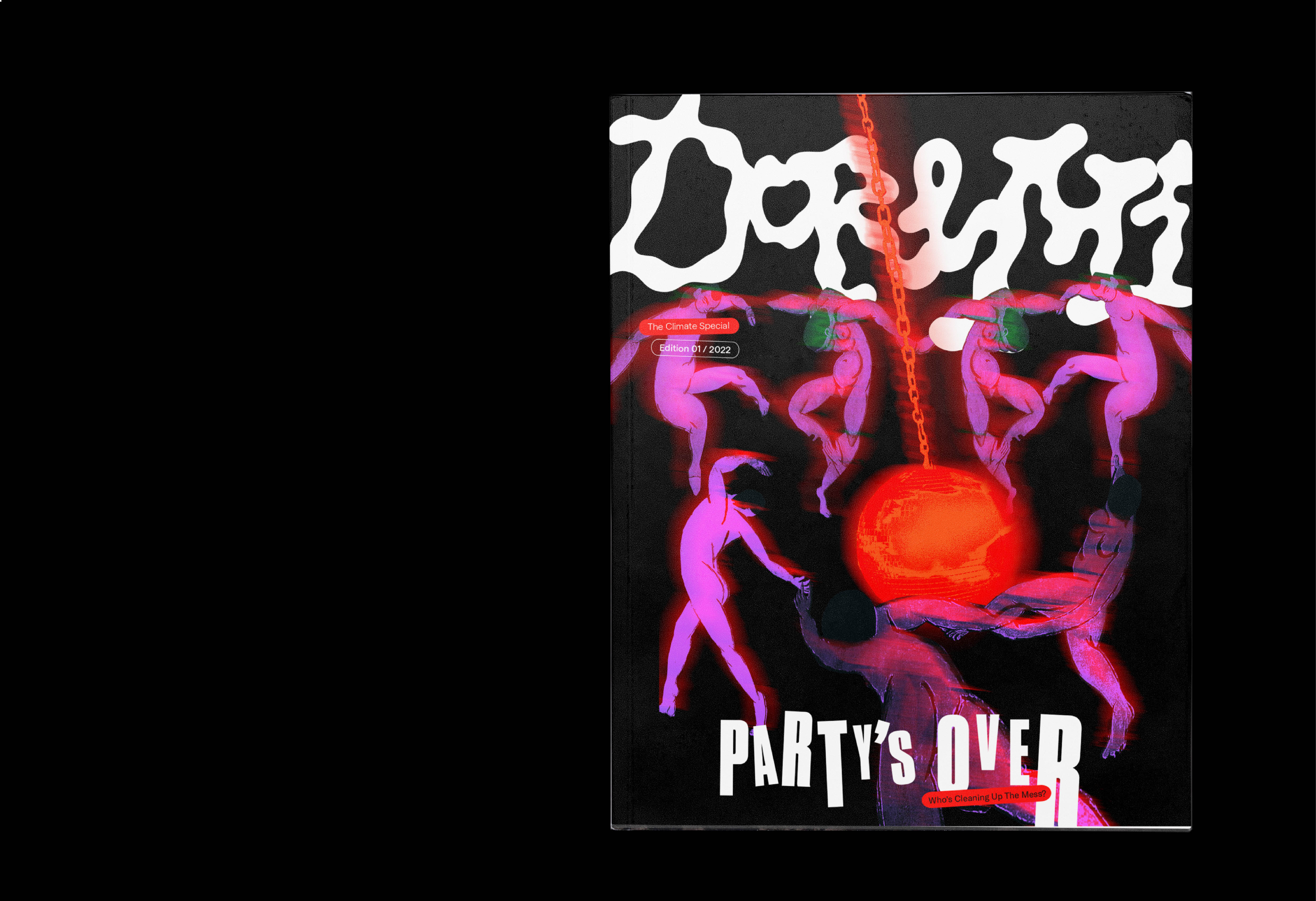
Doremi (DRM) is launched with the hopes of articulating a new space for lovers of music to be receptive of new directions and perspectives in the music landscape. We love all forms of music, digital and analog, lofi and hifi, new and old. We celebrate it all in full colour and sound.
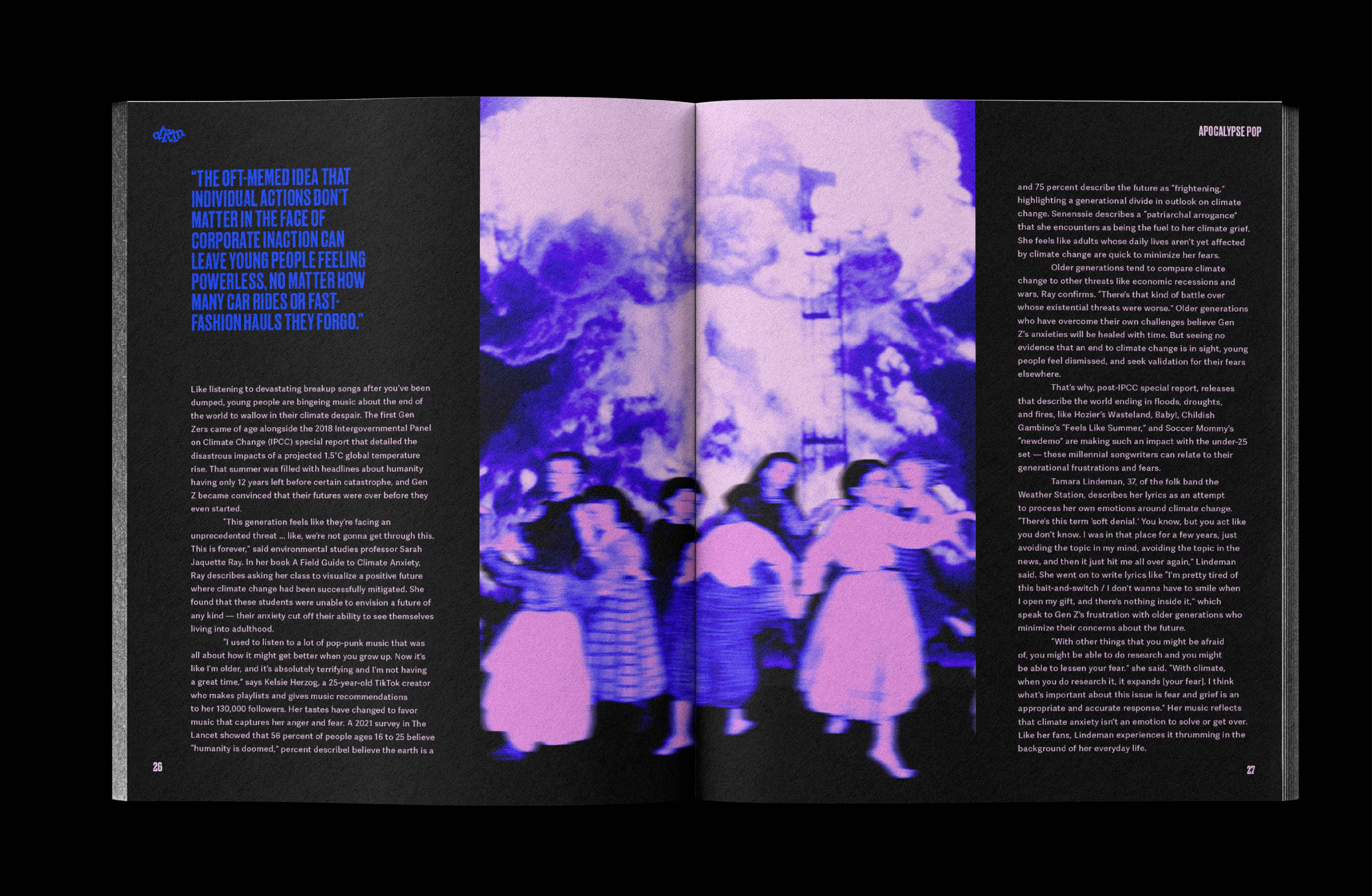
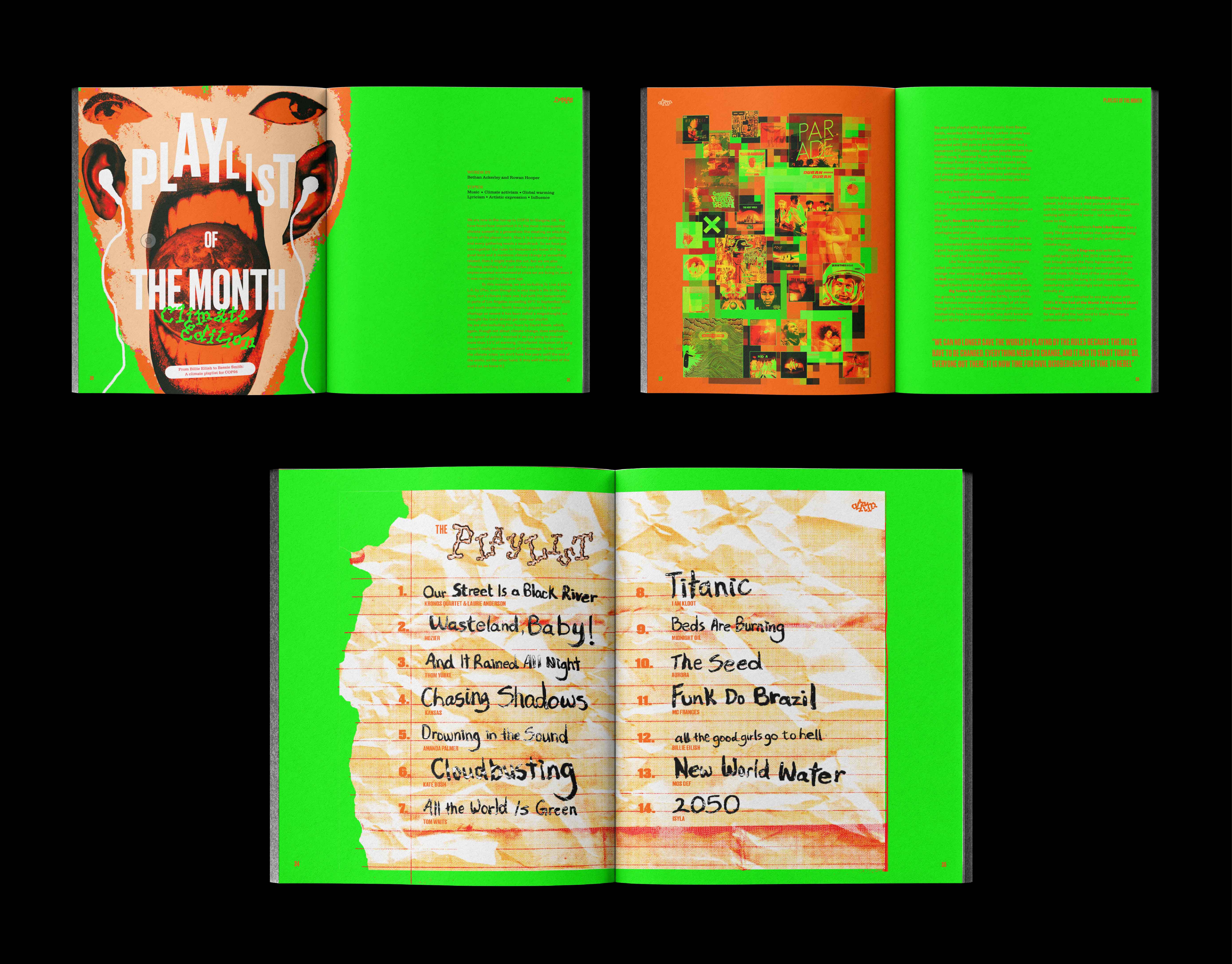
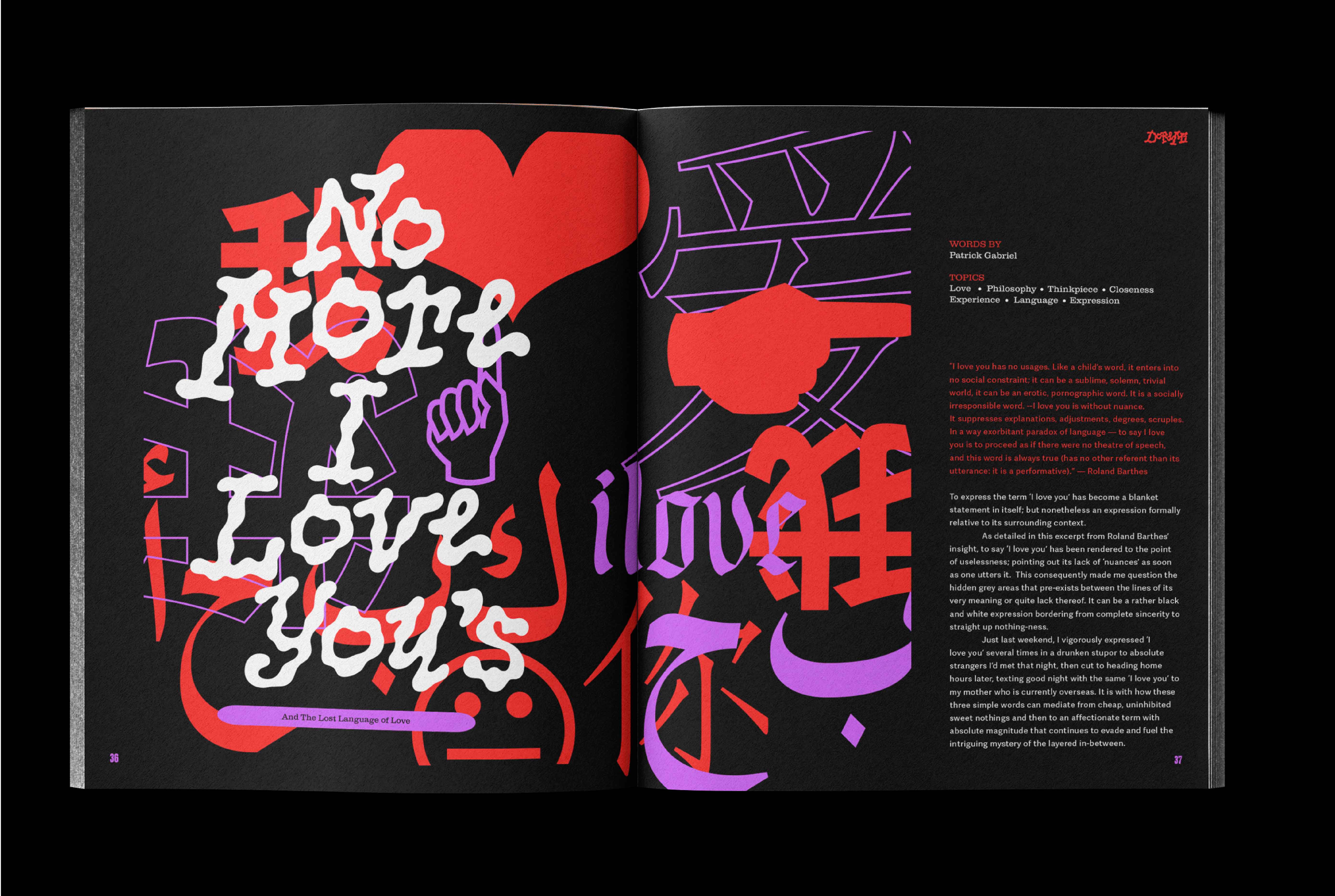
The publication's distinctive style is bold, fluid and fully liberal in editorial application. This styleguide is a directory for our designers to lead them into a realm where they can use the following visual and typographic assets with full creative freedom.
Much like music, we go with the groove and this reflects our visual identity. Fluid, everchanging and irregular. The flow of the sound is what defines the Doremi look. Our signature masthead and monogram marks are a vivid reminder of that. We are a celebration of deviation. and each lettertorm visually corresponds with finding consistencies in the inconsistencies.
The colours that make up the palette are dynamic, bright, and loud. They can be grouped in pairs or trios to create different personalities and aesthetics. Combining a mix of neon and pastels for the perfect contrast.